We are experts in the crucial first stage of brand development.
We specialise in creating innovative logos and positioning lines and developing strong, unique and ownable brand identities. Lucas has decades of experience naming large & small brands, for a range of sectors, across Australia and throughout the region.
For us, logos and words must live together. They are both crucial elements, and getting them right creates value and growth for businesses and brands.
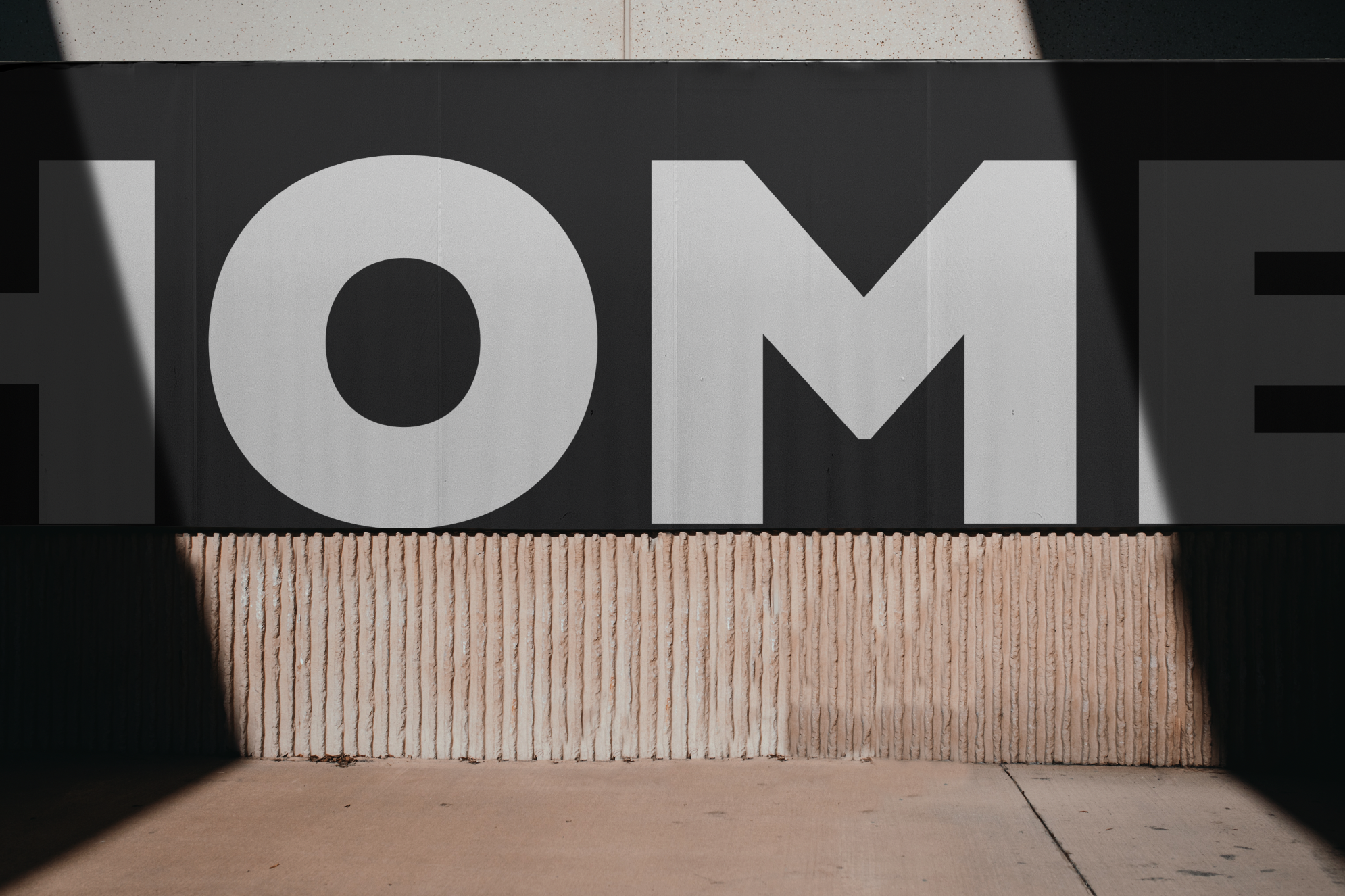
Bremworth
Brand Identity Above.
Design language Below
Hand written script communicate smart, direct, genuine and honest attributes of the brand. The word mark is approachable, real and human. There’s no tricks, its transparent, just like Bremworth
-
![]()
Bremworth Moments
Talent shoots focus on people interacting with carpet, in genuine personal ‘moments’.
-
![]()
Still Life Moodboards
A unique approach has been developed to showcase material. The art inspired moodboards explore relationships between wool and quality natural materials.
-
![]()
Bremworth Materials
Wool is in. Plastic is out. Bremworth is backing wool. Bremworth’s material images collection highlights the brands appreciation of New Zealand wool.
-
![]()
Handmade, human and honest Illustrations
A simple hand drawn style has been developed to communicate product benefits. The style aligns with Bremworth natural positioning.
-
![]()
White frame templates
The simple white frame device differentiates Bremworth brand communications. It’s flexible enough to apply to any brand touch point. The minimal design aesthetic compliments a wide range of content.
-
![]()
Bremworth Spaces
Location shoots are strategically selected and curated to align with Bremworth’s design values. Locations typically feature quality natural raw materials. Objects within the space are contemporary and considered to compliment Bremworth carpets and rugs.
-
![]()
‘World of Wool’ Quality certifier
An aspirational wool symbol designed to help the brand lift itself up to a new kind of ‘eco-premium’ positioning. As a likeable and engaging graphical device, the symbol acts as a brand certifier, or a symbol of quality to help us build out the broader wool and natural materials story.
-
![]()
Typographic tone of voice
We introduced a bold, graphical and distinct typographic style to offset the hand-scripted logo and confidently communicate messages. The upper case italic style modernised their message. It’s at its strongest with bold short, sharp sentences.


Hilon
‘The strength inside’
Hilon and its tagline ‘the strength inside’ are synonymous with quality throughout Asia. Hilon Nonwoven products are at the core of many and varied industries from mining to construction, agriculture, manufacturing and infrastructure. Hilon Nonwoven products are used in millions of different ways to improve the lives of millions of people every day.
Hilon approached Lucas to rebrand their organisation. The new Hilon logo and corporate branding gives one of Indonesia’s largest and most diverse companies a bold new look. The new design represents the groups size and scale. Look closely and you’ll see many of the different industries and products that use Hilon products every day.
New Atlas
Brand identity / Animation (Concept)
NewAtlas understand lots of things. The online blog has published more than 60,000 articles. They cover covering advances in technology, science, transportation, architecture and design. With more than four million unique visitors a month and over 200,000 reading the email, NewAtlas has a global Audience, with massive readership across the USA, Canada, Europe and Australia. New Atlas is dedicated to delivering reliable, no-nonsense journalism. The brand reflects this transparency. There is no fixed version of the brand. Experimentation is encouraged, so it’s flexible enough to thrive in a world where change is constant.


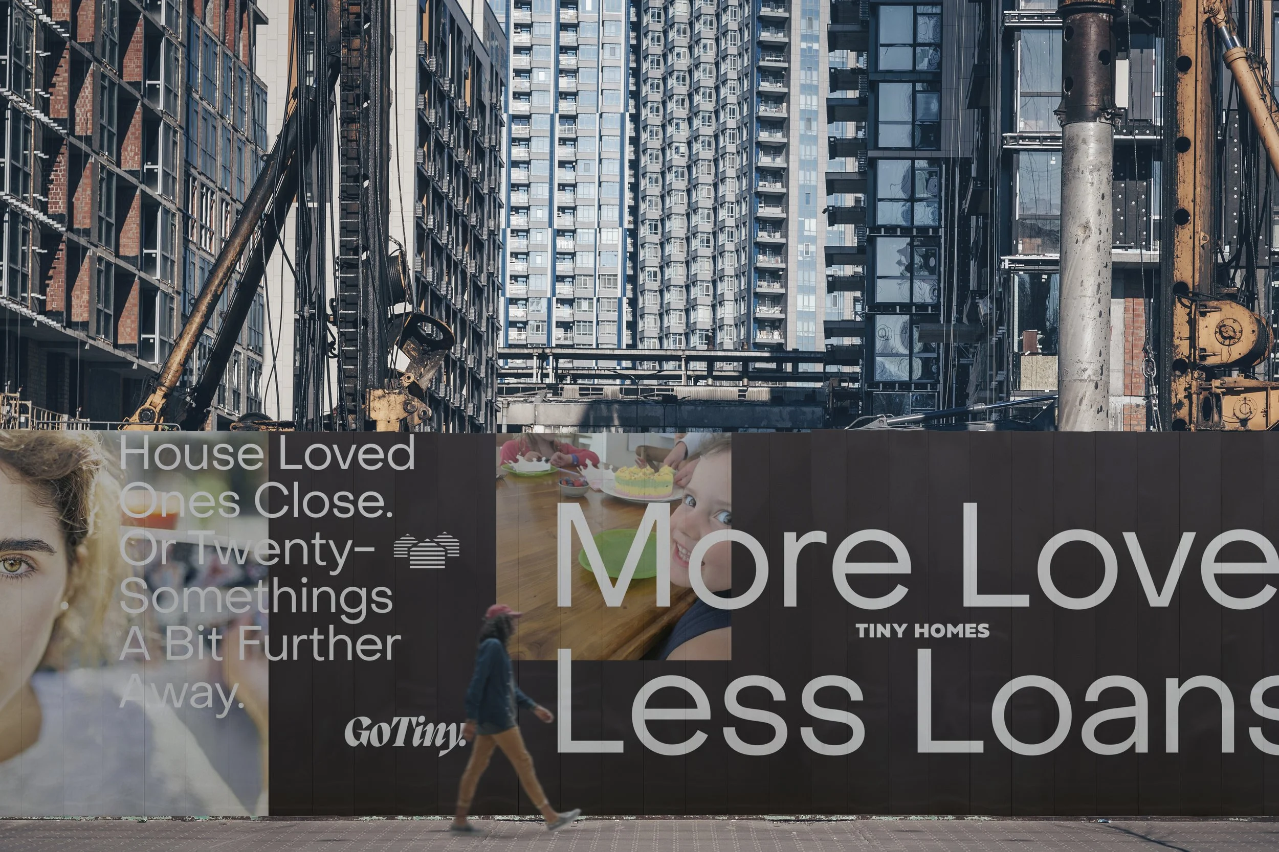


Tiny Homes.
New Zealand.
GoTiny.
Every life needs somewhere to live
Small homes can deliver big dreams,
to everyday people.
TinyHomes have been helping people into high-quality smaller homes for the last 3 years. From first discussions to final delivery, their smart-value-build process celebrates genuine value. Smart Budget Smart Living is good for everyone. The revised brand identity, new promotional sub brand and brand assets confidently communicate TinyHomes value focused positioning.

Mike’s Kitchen
Queensland
Mike’s Kitchen is a Gold Coast based family restaurant, famous (locally) for it’s pork rib dishes. Mike’s Kitchen wanted to grow the business by nationally franchising the brand.
Lucas Melbourne was asked to update the flagship store brand identity. Our solution considered how ‘Mike’ could be leveraged. In the future our work will be used and applied to franchisees and products in the future for other franchisees. Eating at Mike’s Kitchen is a no fuss experience. Customers come for the pork ribs, that’s what they love.
Staff pride their service on being personal. The new identity reflects this experience, its direct, friendly and focuses on Mike’s most popular dish – ribs.
Mike’s Kitchen won an AGDA identity award


We have experience creating and transforming brand identities for material, manufacturing, retail & technology companies.
We have a strong track record getting new brands approved by large organisations.
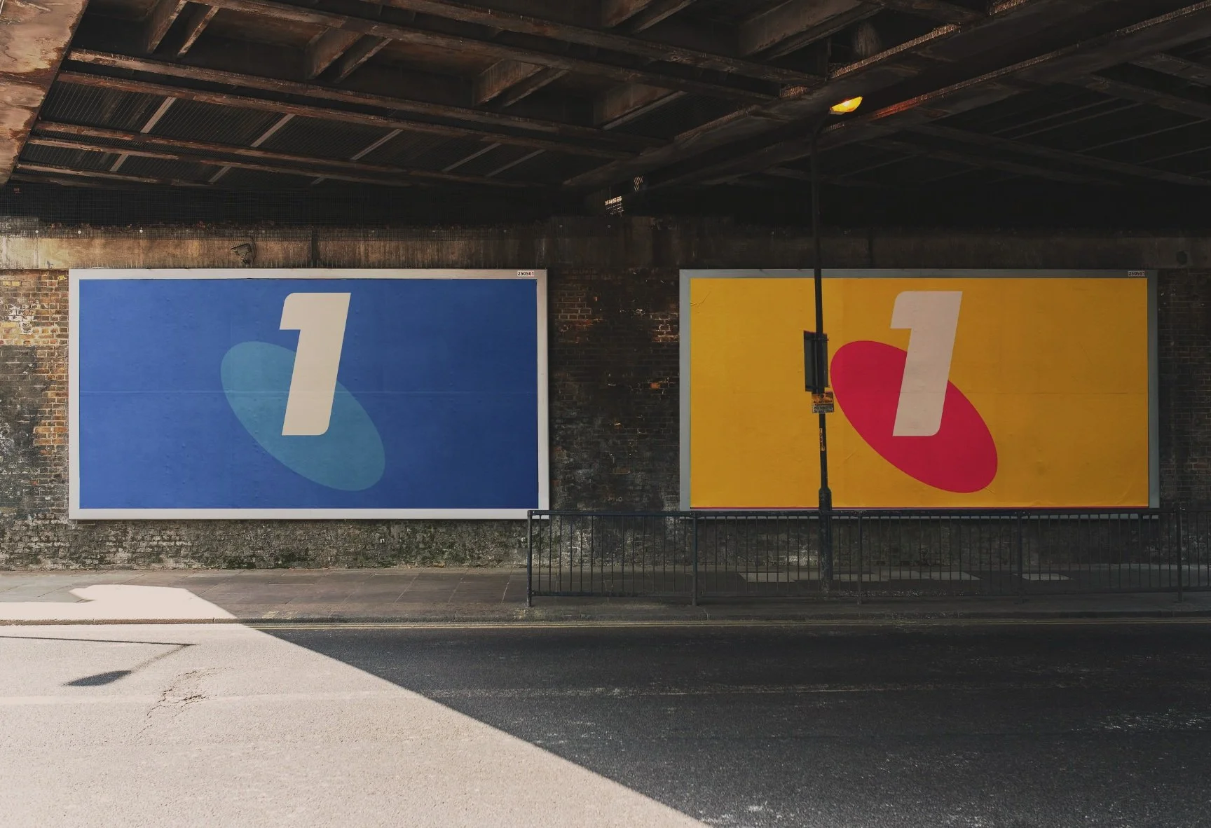
Developing Telstra new mobile asset in response to new markets.
Telstra mobile and devices UI and IOS platform design development

TelstraOne
Mobile Platform Brand

PlasticPay
Collect Bottles.
Get Rewarded.
PlasticPay is a recycling rewards programme that motivates and financially empowers people and businesses who participate. Bottles are collected.
This project and brand launch was a key part of a highly successful Jakarta Stock Exchange IPO.

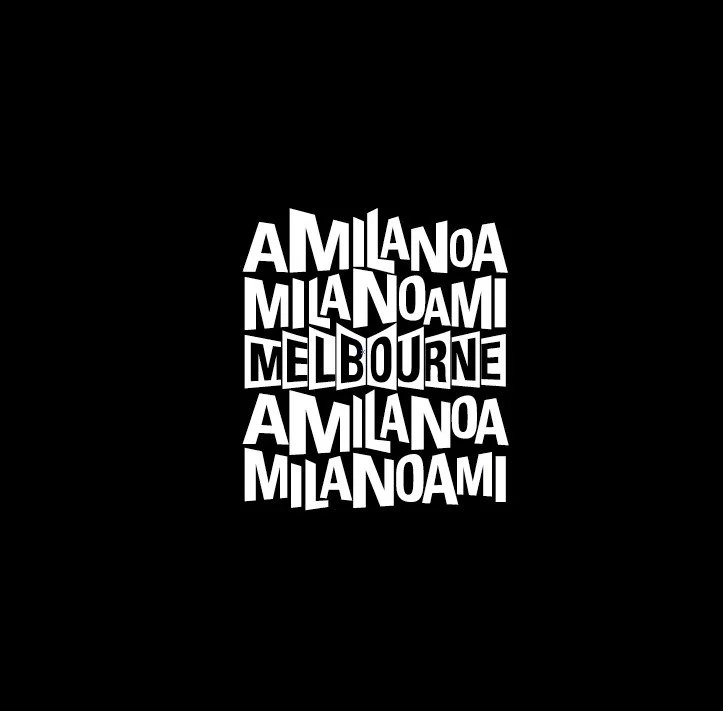
MunchaCruncha
Melbourne
MunchaCruncha was a (pre-uber) tech based start-up that will promote local ‘meal deals’, between restaurants and customers. Lucas Melbourne was approached to transform a business idea into a tangible working brand.
Our response was a fresh, unique and friendly brand identity that’s easily understood by everyone. We designed a flexible identity that can be tailored to suit different venues. The company is now building its database of venues via its web-site. In the future, customers will use an iPhone app that takes advantage of GPS – new customers will be alerted about specials in their area and directed to venues. The identity has been central in ambient brand campaigns and events held across inner Melbourne.
Munchacruncha
MunchaCruncha was a (pre-uber) tech based start-up that will promote local ‘meal deals’, between restaurants and customers. Lucas Melbourne was approached to transform a business idea into a tangible working brand.
Our response was a fresh, unique and friendly brand identity that’s easily understood by everyone. We designed a flexible identity that can be tailored to suit different venues. The company is now building its database of venues via its web-site. In the future, customers will use an iPhone app that takes advantage of GPS – new customers will be alerted about specials in their area and directed to venues. The identity has been central in ambient brand campaigns and events held across inner Melbourne.
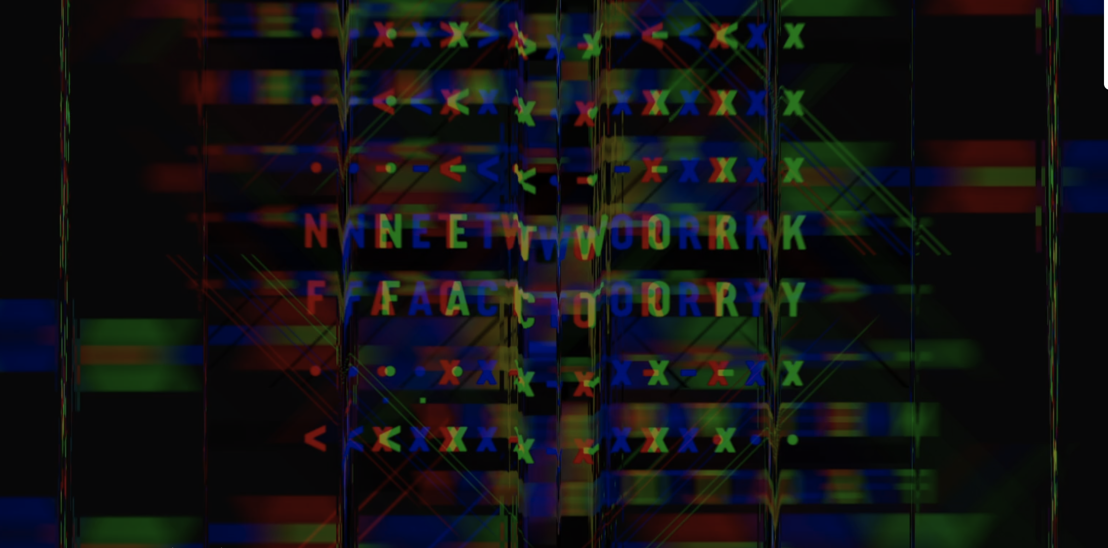
The Network Factory
Connections are everything
Networks are built on relationships. The Network factory spent decades on the ground, growing strong relationships with manufacturers, nurturing our network of high-quality factories and suppliers and collaborating with clients around the world.
They have a unique understanding of Southeast Asia and an unmatched network for you to connect with. Our solution was an expression of the dynamic global networks they work in.
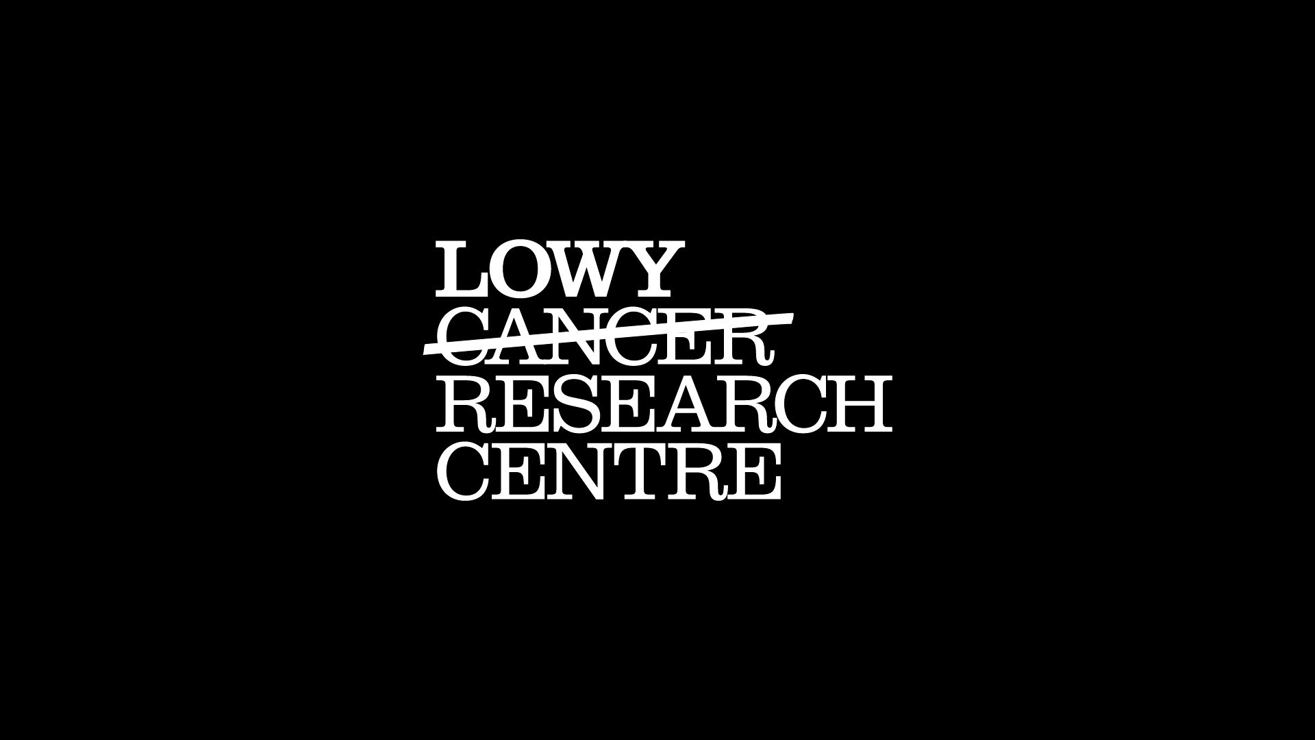
The Lowy Cancer Research Centre
Make your mark on cancer.
The Lowy Cancer Research Centre is one of the largest adult and children’s cancer research centers in Australia. The Centre is a joint facility hosted by the University of NSW and Children’s Cancer Institute Australia. Diffusion Sydney developed a comprehensive brand strategy designed to position the Centre as one of the most respected and pre-eminent research facilities in the world. Lucas Melbourne was asked to reinforce the concept of hope and collaboration.
The new brand is not traditional – there is no fixed logo. Like cancer research, the logo evolves and changes. Everyone involved with the centre is invited to contribute to the brand and ‘make their mark’ by crossing out the word ‘cancer’ in the logo. The brand was launched in 2008, by then Prime Minister, Kevin Rudd.


Top Row
-
World of Wool - Quality certifier
An aspirational wool symbol designed to help the brand lift itself up to a new kind of ‘eco-premium’ positioning. As a likeable and engaging graphical device, the symbol acts as a brand certifier, or a symbol of quality to help us build out the broader wool and natural materials story. -
Ecopelago is a perfect collaboration between science and nature. The first premium fibre remade from 100% recycled PET. With all the qualities of new polyester but without environmentally harmful dark side.
Our solution highlighted the manufacturers symbiotic relationship with nature.
-
Exclusive outdoor cushion value chain.
Aerobu is a large, enterprise-scale solution for large, international clients. It has been developed to solve multiple problems with the existing cushion supply chain and make things easier for manufacturers and brand.Our symbol acts as quality certifier, with each wing representing a product or service attribute.
-
Westpac “For Australians it is this unique spirit of helping one another that makes us special. As the nation’s oldest company and first bank, Westpac has played a role in the lives of many Australians for more than 200 years.
Our solution highlighted Westpac’s quality heritage. -
From PET into Faux fur
Wunderfur Faux Fur is made from a polyester yarn created from 100% recycled plastic bottles.
Our solution highlighted certification through ticks. ECO. Big Tick. Wunderfur will meet all present and future industry and community standards for environmental sustainability. Their performance will be assessed and certified by independent third parties. -
The Priceline Sisterhood Foundation is dedicated to helping Australian women and their families. Since its inception in 2011, Priceline Sisterhood Foundation has raised more than 8.65 million dollars.
Our typographic solution is made by hand, its human and honest. The style reflects styles associated with community movements.
Middle
-
InaCash enables multi platform payments. It’s a transparent payment platform powered by blockchain technology. InaCash is the central payment gateway for blockchain payments across Indonesia.
-
Lucas Melbourne helped SoundBooth develop a creative solution that appealed to creative people. We developed an unexpected library of images to communicate .
-
Driven by the name, our emotive solution engages a mass market audience. Bold colour, pictorial graphics combined with a contemporary clean brand language, establish a clear hierarchy for brand and product definition.
-
Telstra created an integrated messaging and browser solution for simplified access to the most popular social networking services on mobile. Tribe makes it easy to manage social networks through one mobile application. The brand needed to have promotional attributes and work as a navigational icon. Tribe would be seen on millions of Telstra mobile phones.
Our solution highlights that Tribe creates a central stream of personal information. The new Tribe brand integrated seamlessly with Telstra’s existing digital brand assets.
-
Surrounding offers a tailored selection of carefully curated international designer brands aimed. Their customers are typically design aware consumers or trade professionals that know what they want.
Initially launched as lighting store, our unique typeface references lighting forms
-
PlasticPay is a recycling rewards programme that motivates and financially empowers people and businesses who participate. Bottles are collected.
This project and brand launch was a key part of a highly successful Jakarta Stock Exchange IPO.
Bottom
-
A global leader in reticulation and impregnation technologies. Based in Indonesia, the product is a truly international ingredient brand across designer outdoor furniture markets.
The brand identity reminded people to take a closer look, the Q was used as magnifying tool in communications.
-
Urecel is the parent company to a range of reticulated foam products. Our identity was influenced by the bulky appearance of their products.
-
‘The answer is yes’ now what’s the question? Compriband is the world’s most advanced sealant - providing the ultimate resistance to water, heat and aging.
Our solution communicated the key product attribute through typography. The new brand needed to extend beyond Indonesian markets. The product is now distributed across the EU and North America.
-
Micron21 operates in premium cloud hosting technology. Their new identity reflected the group’s secure and vast data solutions
-
Australia’s largest health and beauty loyalty program with 7 million members
-
It's Australia by Train. Our identity reflected the beauty of the harsh Australian outback