Naumi Group, International Brand Transformation.
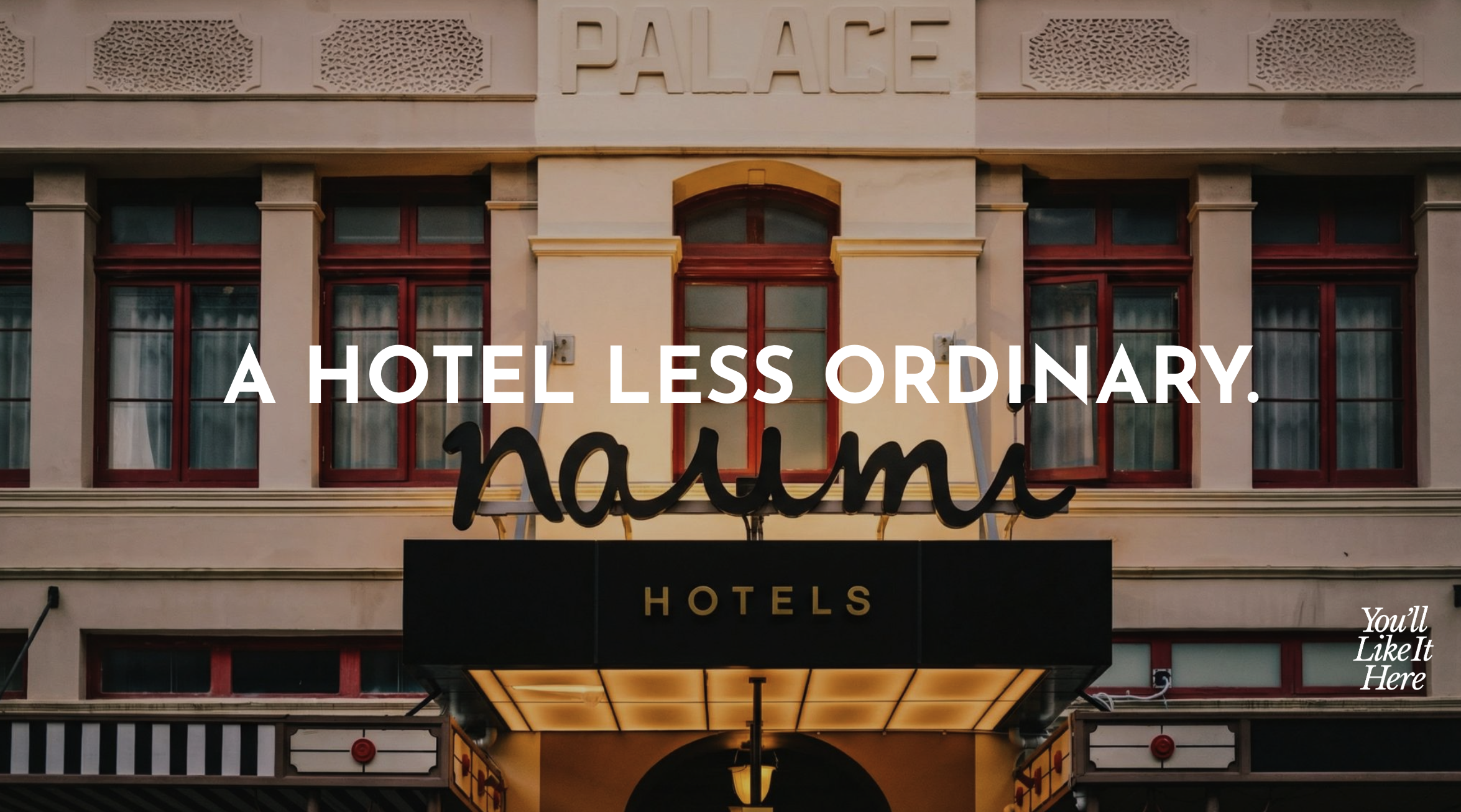
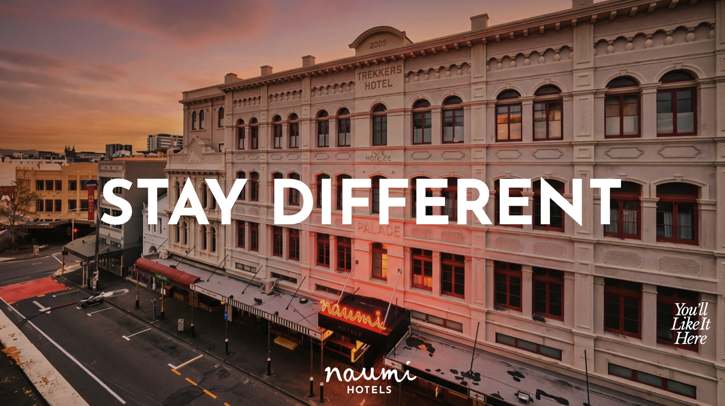
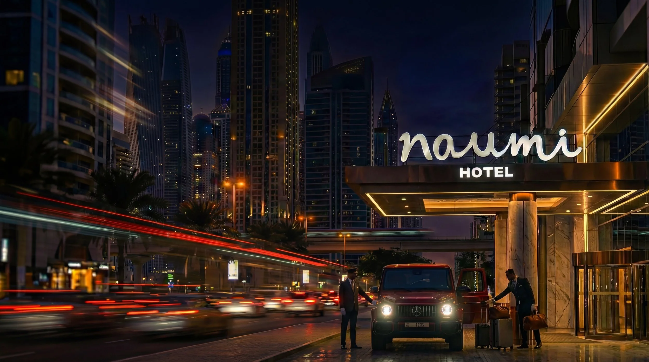
Founded in 2007, Naumi is an international; design-led boutique hotel company, operating across SNG, NZ, AUS and the UAE. Naumi Hotels maximalist spaces, deliver immersive diverse experiences. Every Naumi hotel is different. Lucas was approached by Naumi to deliver a major brand transformation, using AI to scale the brand.
-
The discovery phase found the sector saturated with ineffective, generic messaging and clichés
Systems Investment: Global competitors invest heavily in comprehensive logo systems and brand assets. To compete and scale, Naumi was advised that robust brand systems was essential, not optional.Key market gaps and internal needs for Naumi's brand transformation were identified:Target Audience: The strategy can position Naumi as the "thinking person’s hotel experience"—a smarter, more curious choice Visual Strategy: To overcome static, generic brand, extending Naumi’s "Neu Maximalist" aesthetic was recommended Efficiency: Traditional content production was too costly and slow. Adopting an AI-driven workflow could reduce costs while enabling hyper-personalized, localized content for different markets. -
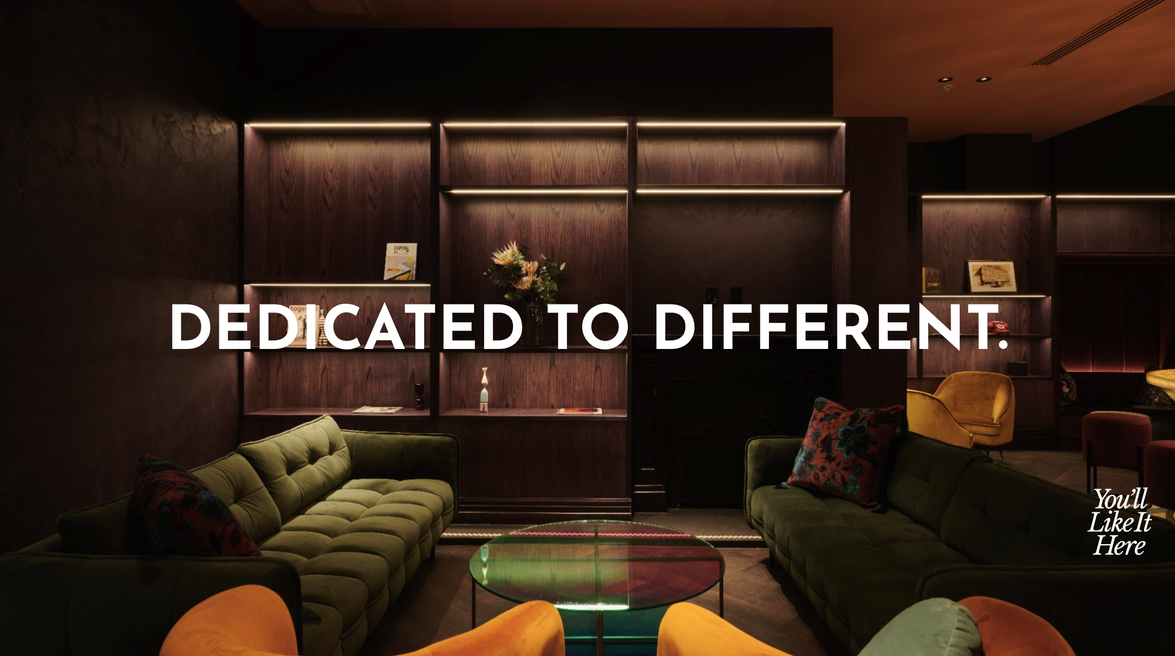
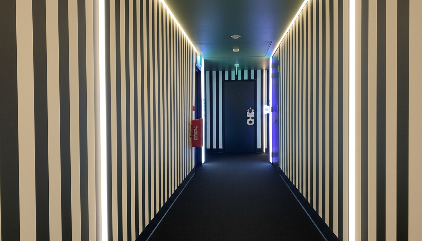
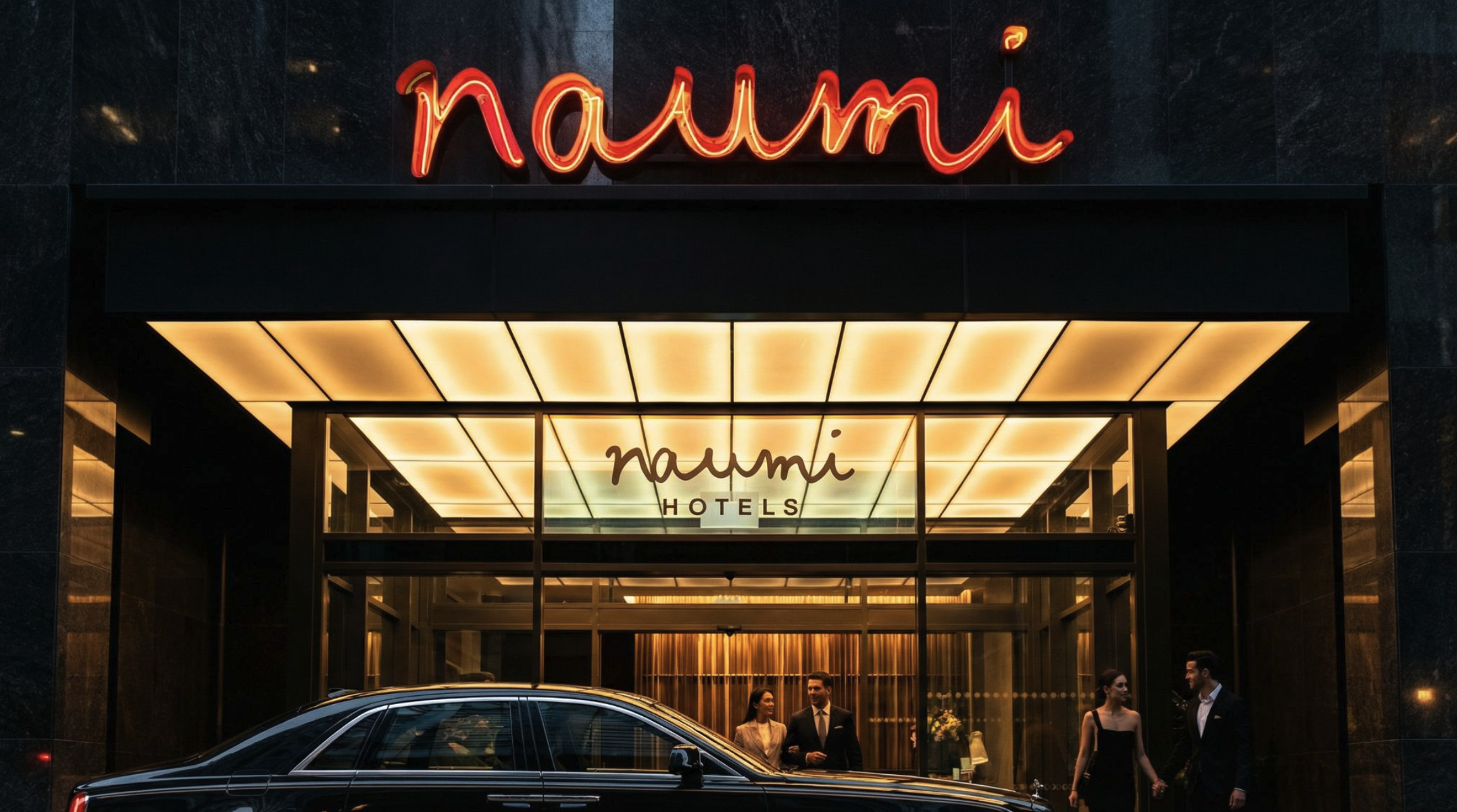
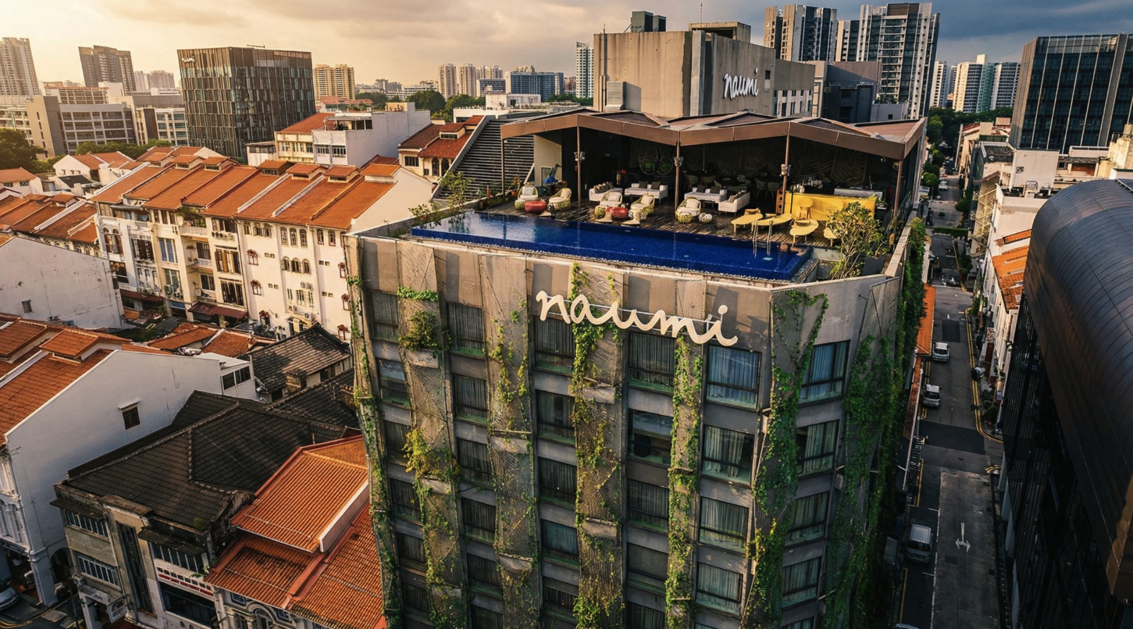
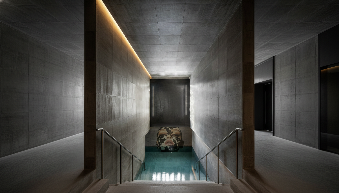
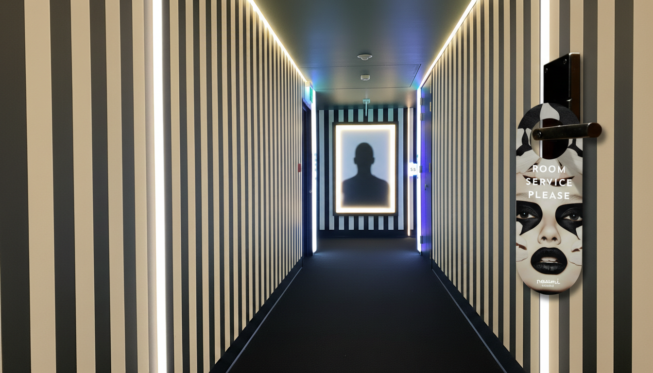
Naumi underwent a comprehensive redesign, updating its brand identity, print, digital, environment applications, and messaging systems across all consumer, investor, and retail partner touch points. The new "Neu Maximalist" identity uses a "Culture Fusion" language with kaleidoscopic graphics and layered patterns, offering a flexible visual system to complement diverse hotel interiors. Operationally, an AI-first content production model was implemented for scalability.
-
Lucas' creative direction spearheaded the Naumi brand's "Neu Maximalist" transformation, developing a consistent international ecosystem across all touchpoints:
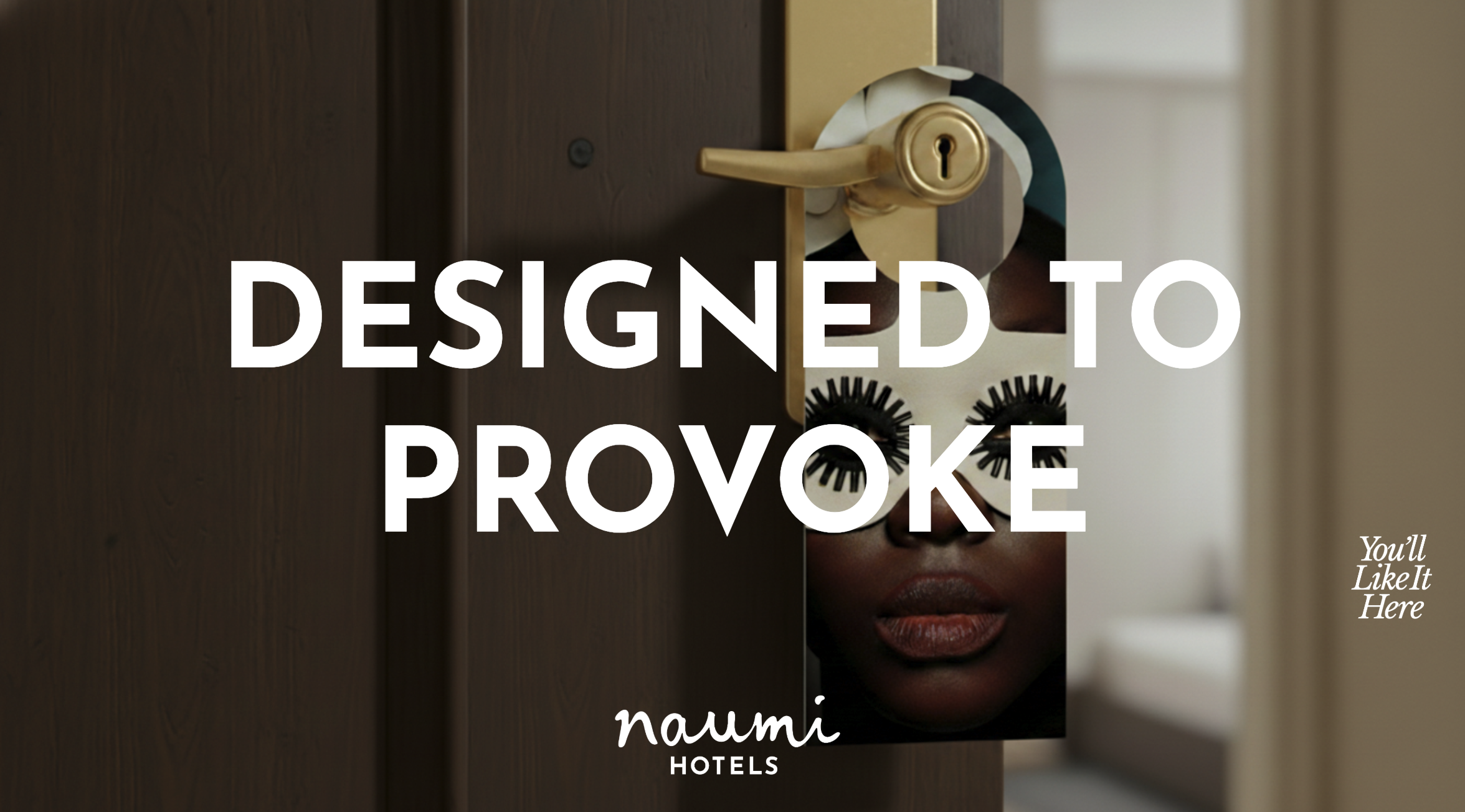
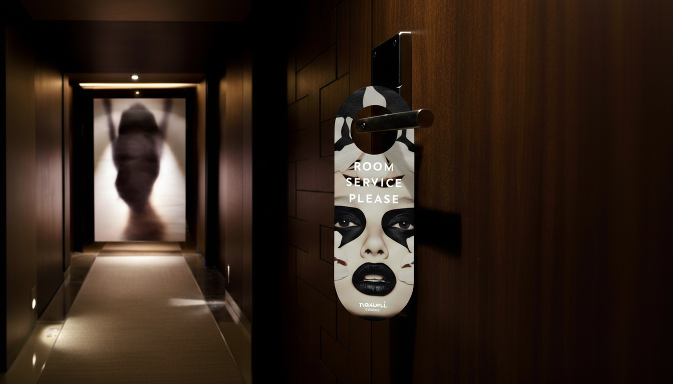
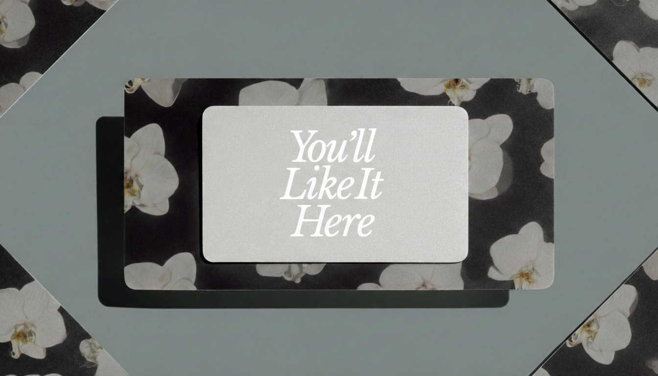
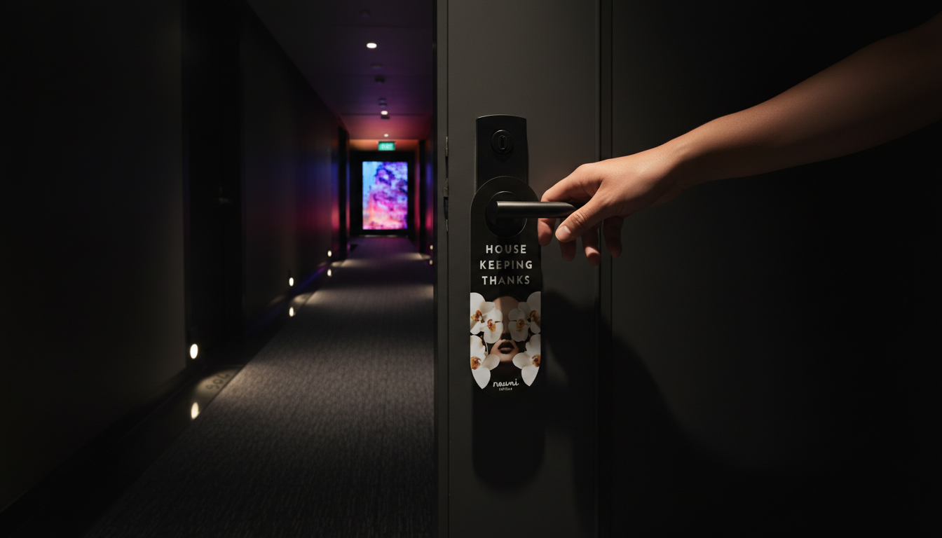
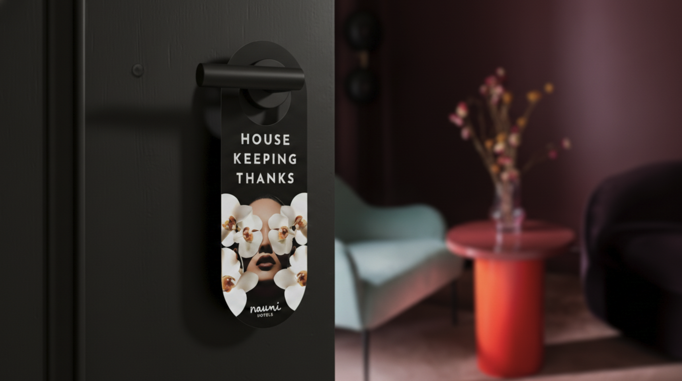
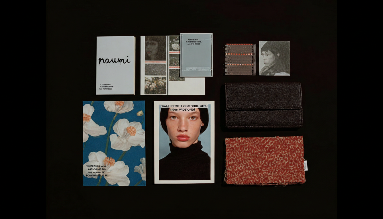
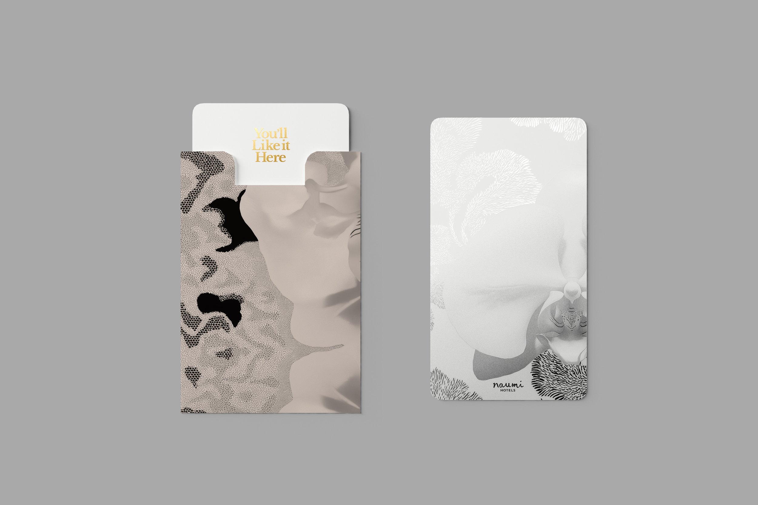
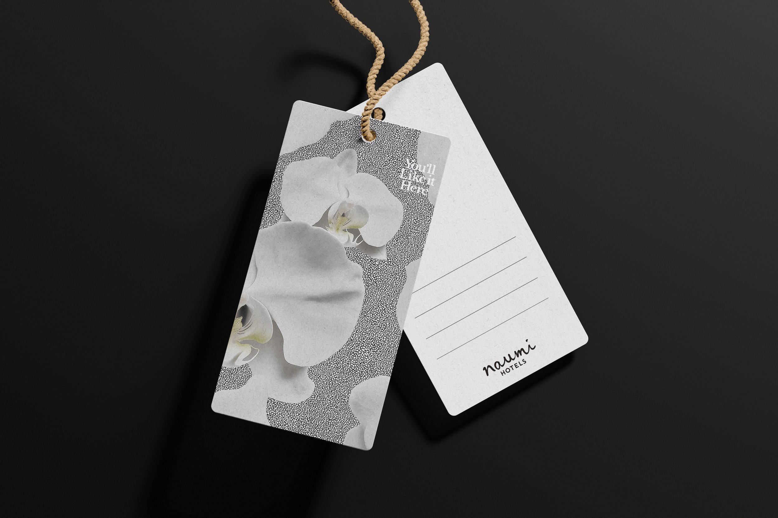
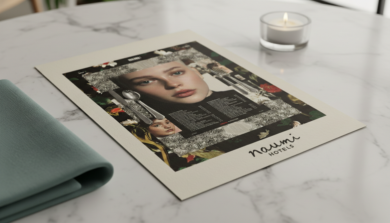
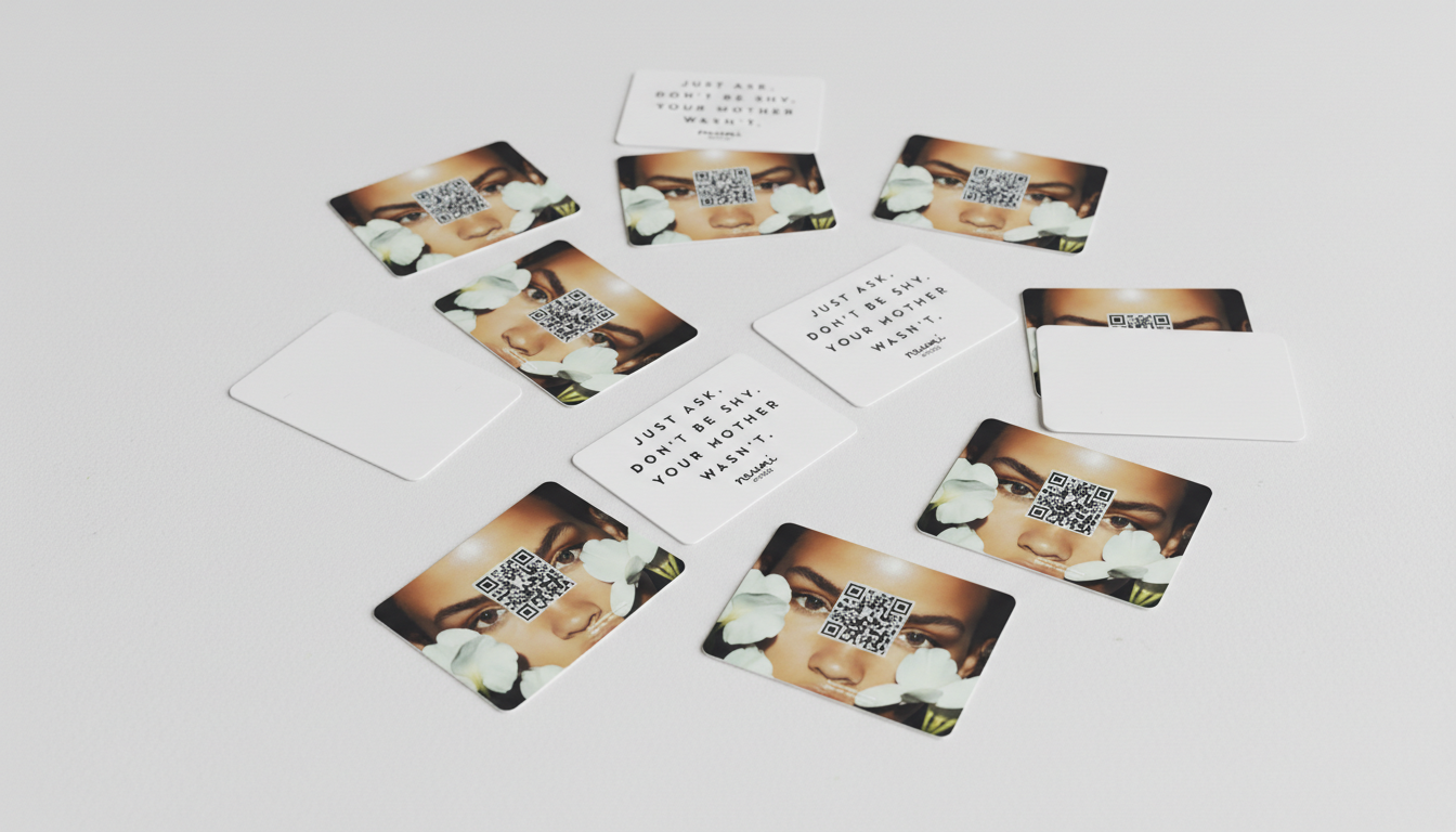
Digital & Online: Websites, booking, OTA listings, social media, email marketing, and digital advertising.Guest Experience & In-Room: Key cards, luggage tags, menus, sustainability cards, coffee instructions, toiletries, and service items. Physical & Environmental: Signage, wayfinding, stationery, staff uniforms, and merchandise.Operational & Strategic: Brand Guidelines, sales/marketing materials, brand videos, and animations.Sub-Brand Design Exploration: Distinct collateral for Naumi Studio and endorsement branding. -
This comprehensive handover provided Naumi with a dynamic, self-sufficient production capability, not just a static brand identity.The Naumi Hotel brand transformation delivered an AI-first workflow for independent visual management, building on previous successful models. The training strategy for Naumi’s internal team focused on four pillars: Dedicated AI Training (prompt engineering and creative AI workflows); Hyper-Personalization and Localization (cost-saving content generation for Singapore, NZ, and Australia); Long-Term Independence (an "AI Roadmap"); and Brand Compliance and Risk Mitigation (authentic, secure AI usage advice). This comprehensive handover gave Naumi a dynamic, self-sufficient production capability, rather than a static brand identity.


Naumi Hotels was inherently designed with an international perspective, weaving global influences into its very core.
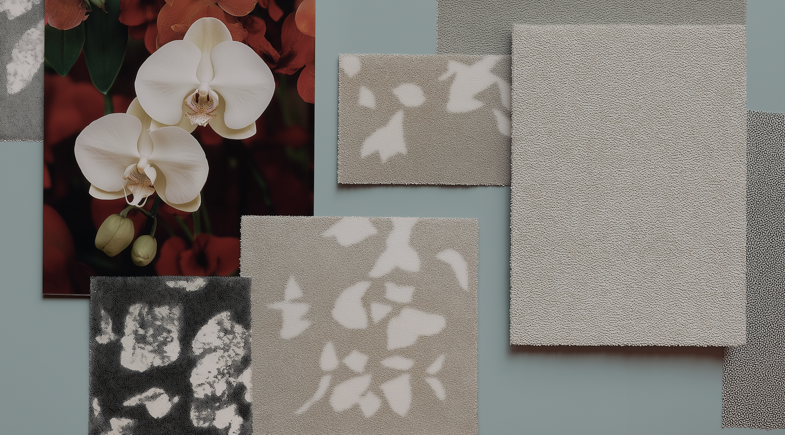
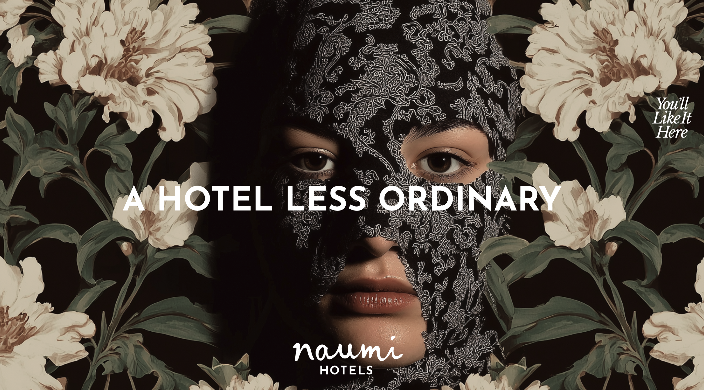
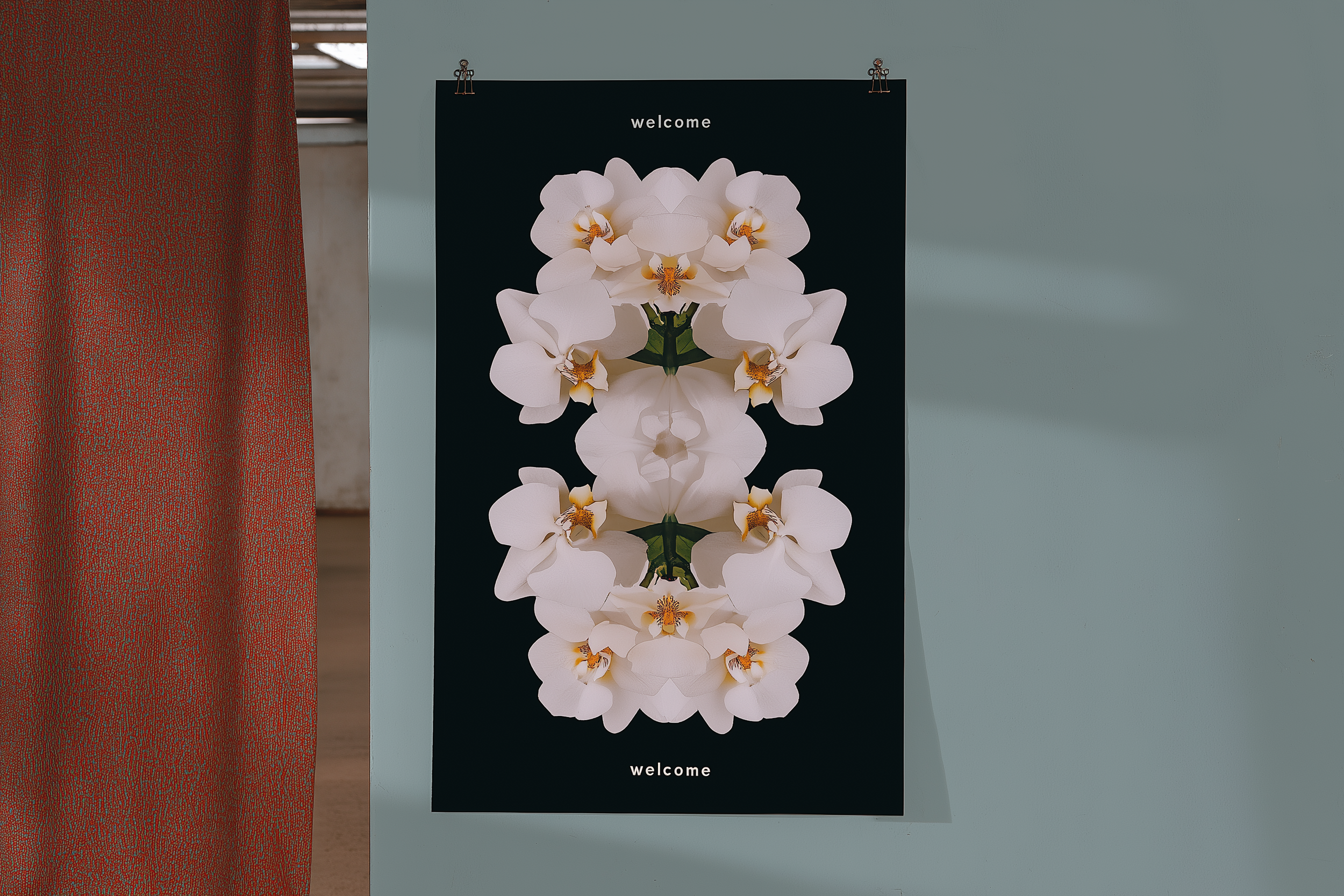
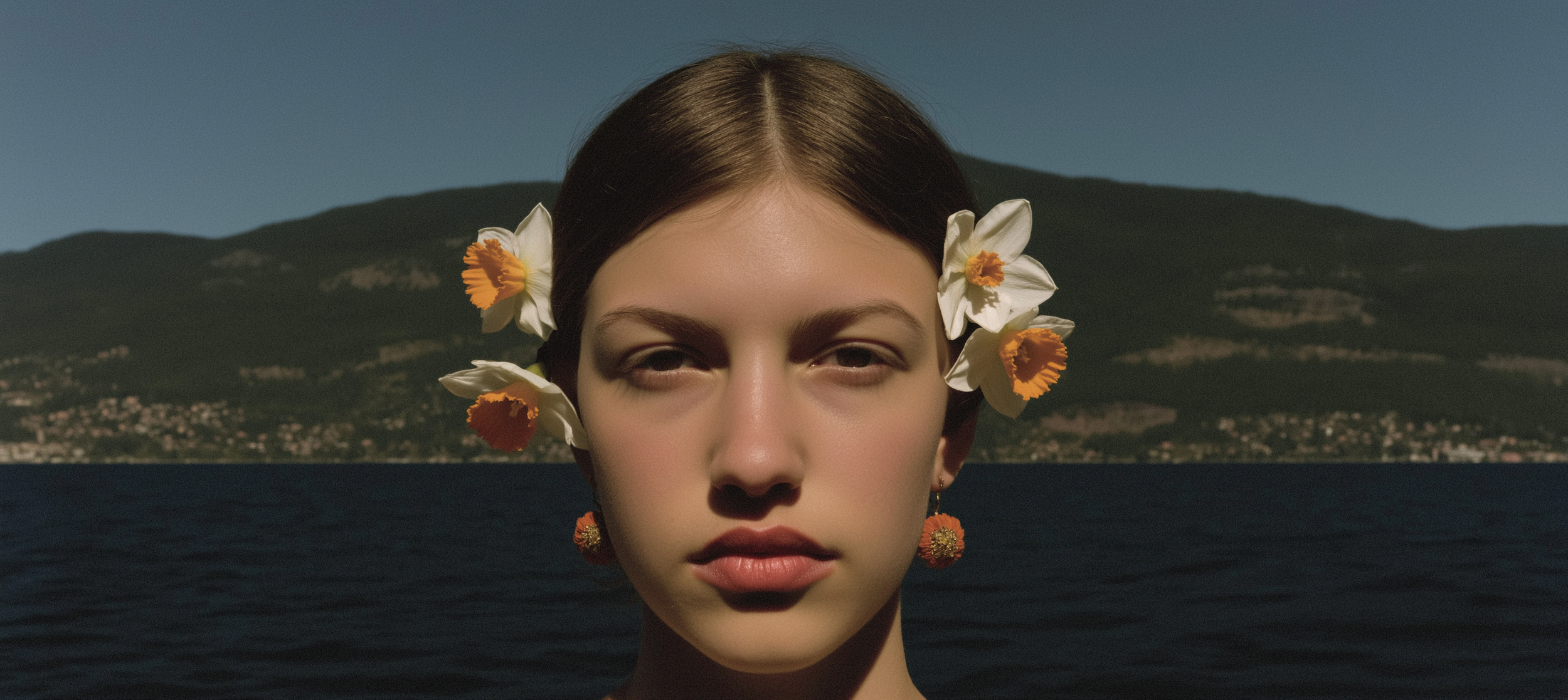
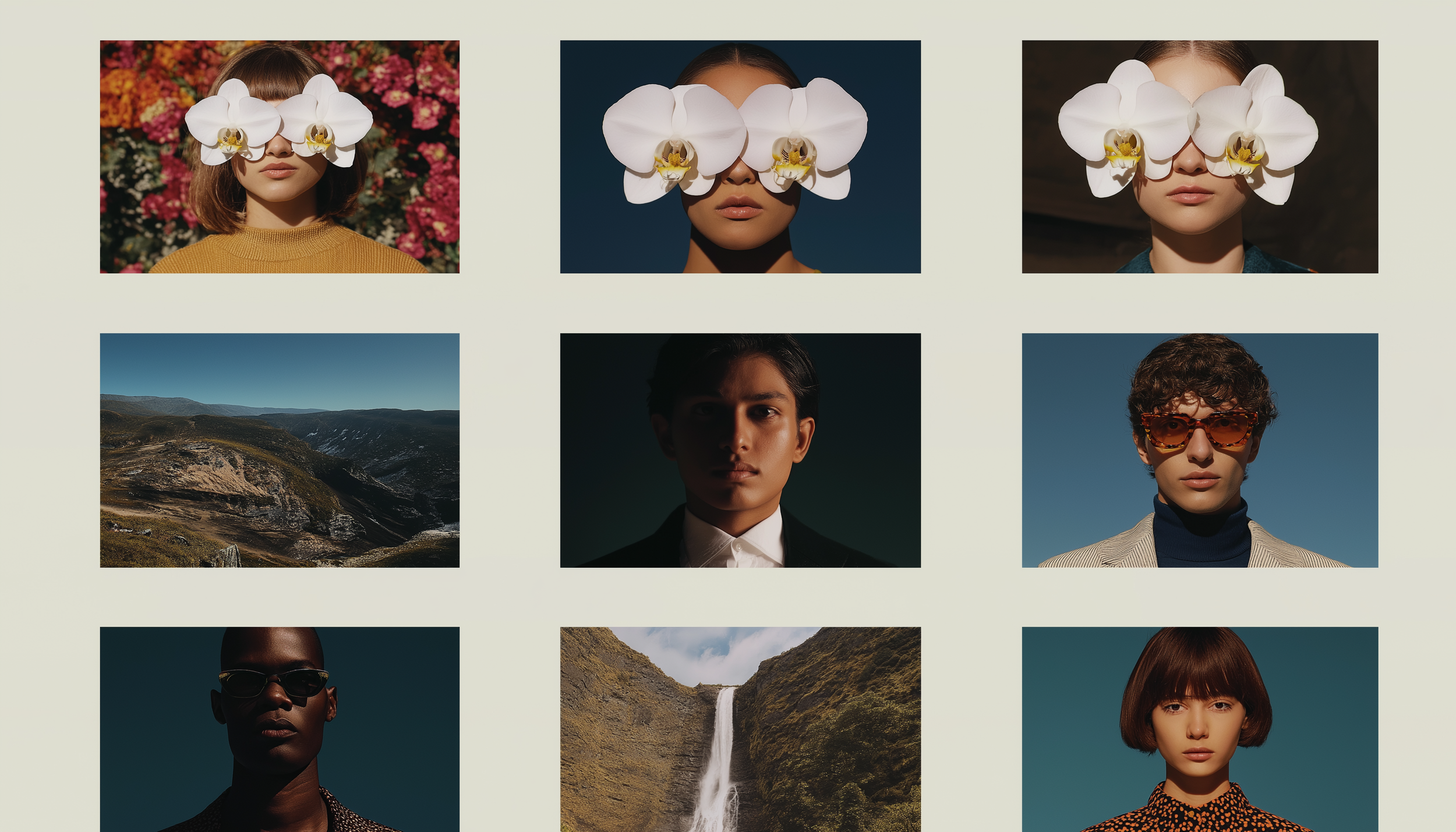
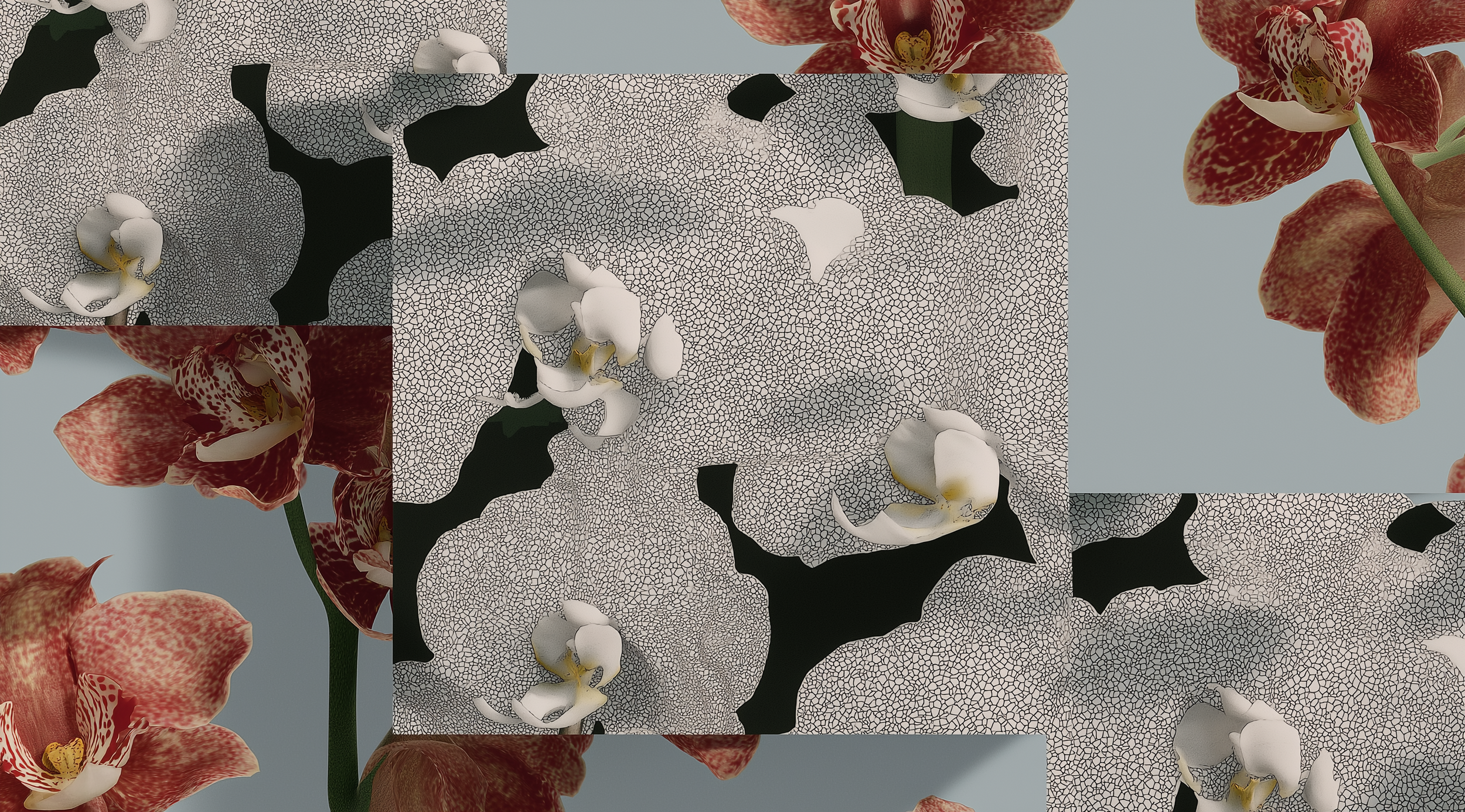
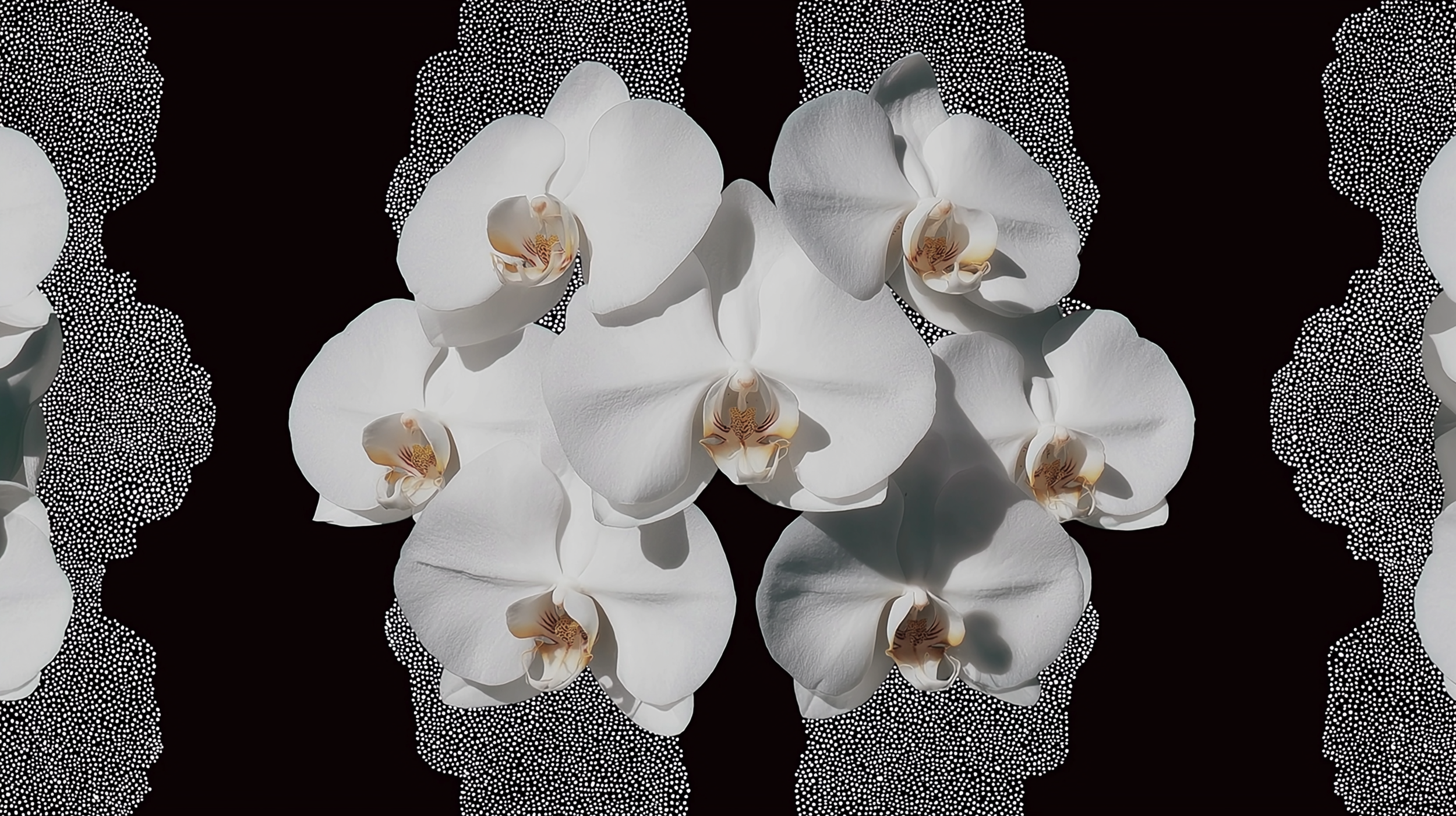
The central concept of 'Culture Fusion' is a direct reflection of this internationality. It introduces a unique graphic language that deliberately blends "diverse Eastern and Western styles, both old and new." This approach creates a visual narrative that transcends singular cultural boundaries, aiming for a broader, more global appeal that resonates with a diverse international clientele.
Furthermore, the design system built around the "Kaleidoscopic Story" emphasizes its adaptability and flexibility. By utilizing pattern and kaleidoscopic techniques, the system is designed to "complement a wide array of content styles" and ensures "future adaptability across various brand touchpoints." This inherent flexibility allows the brand to maintain a cohesive and recognizable identity while being able to nuance its presentation across different international markets and cultural contexts. The goal was to generate a "distinct, proprietary, and adaptable graphic language" that could be consistently applied regardless of geographical location, from print materials to digital applications and even experiential video content
Built for Possibility
Create something you're proud of.
Whether you're just starting out or taking things to the next level, we have everything you need to connect, engage, and make something truly yours.
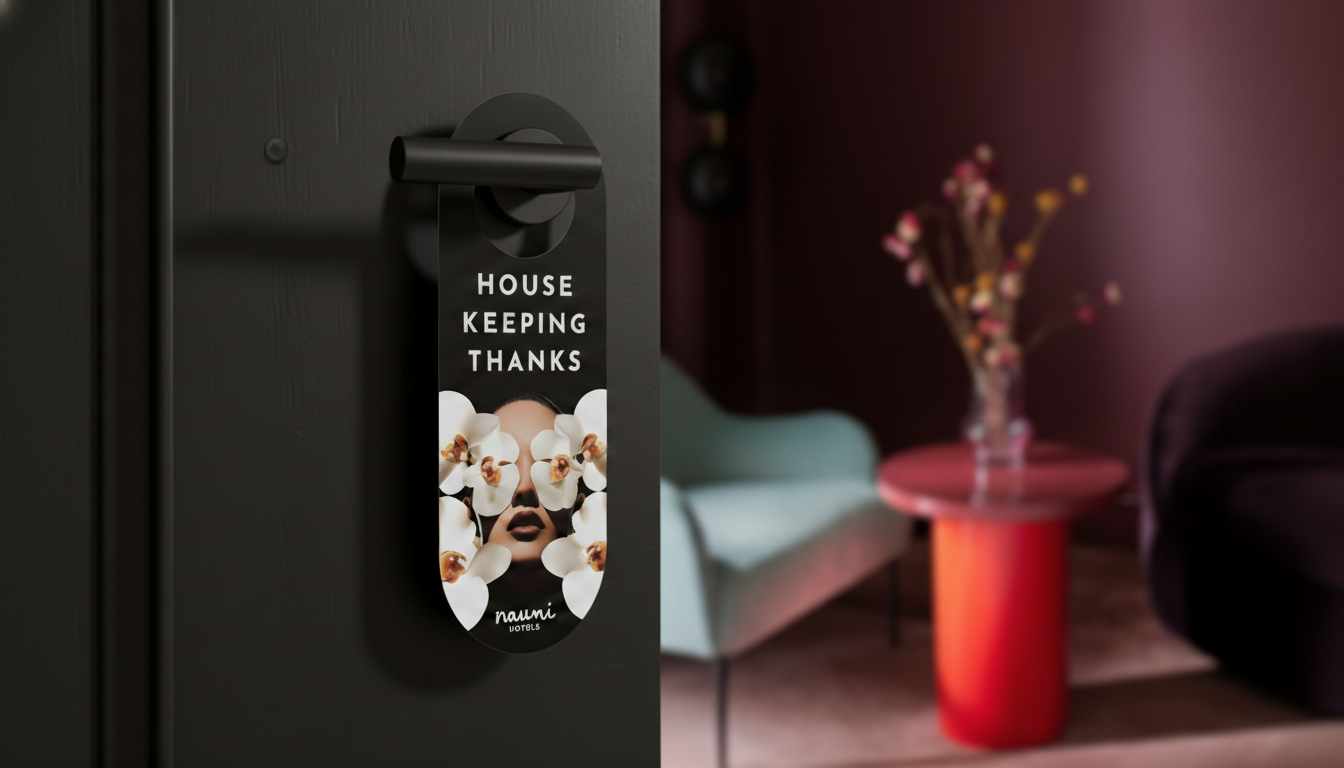
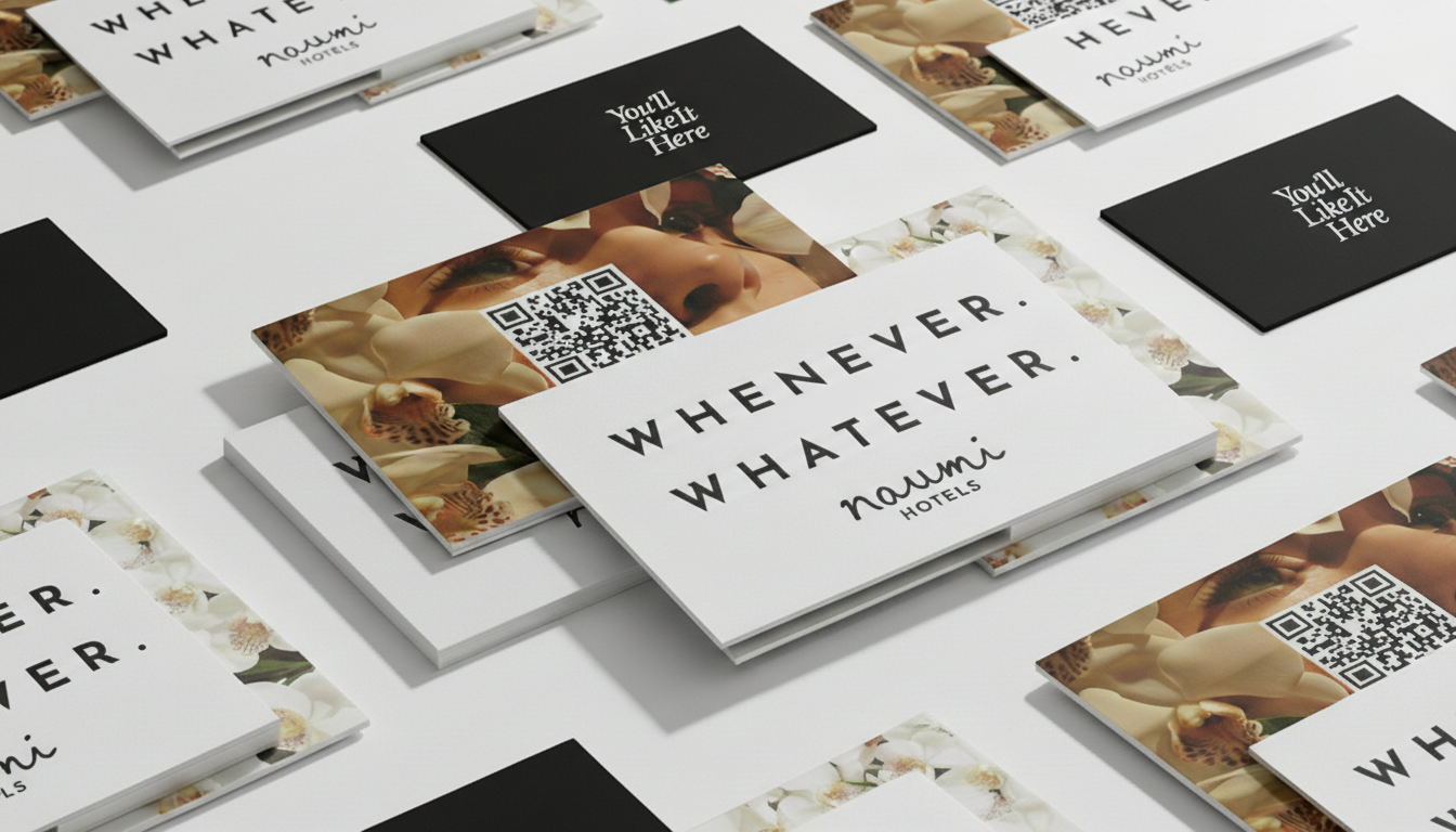
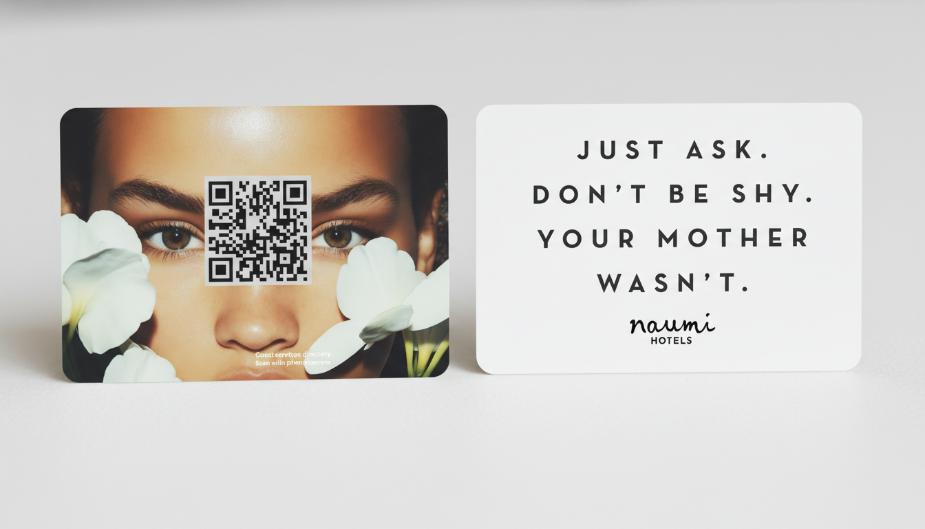
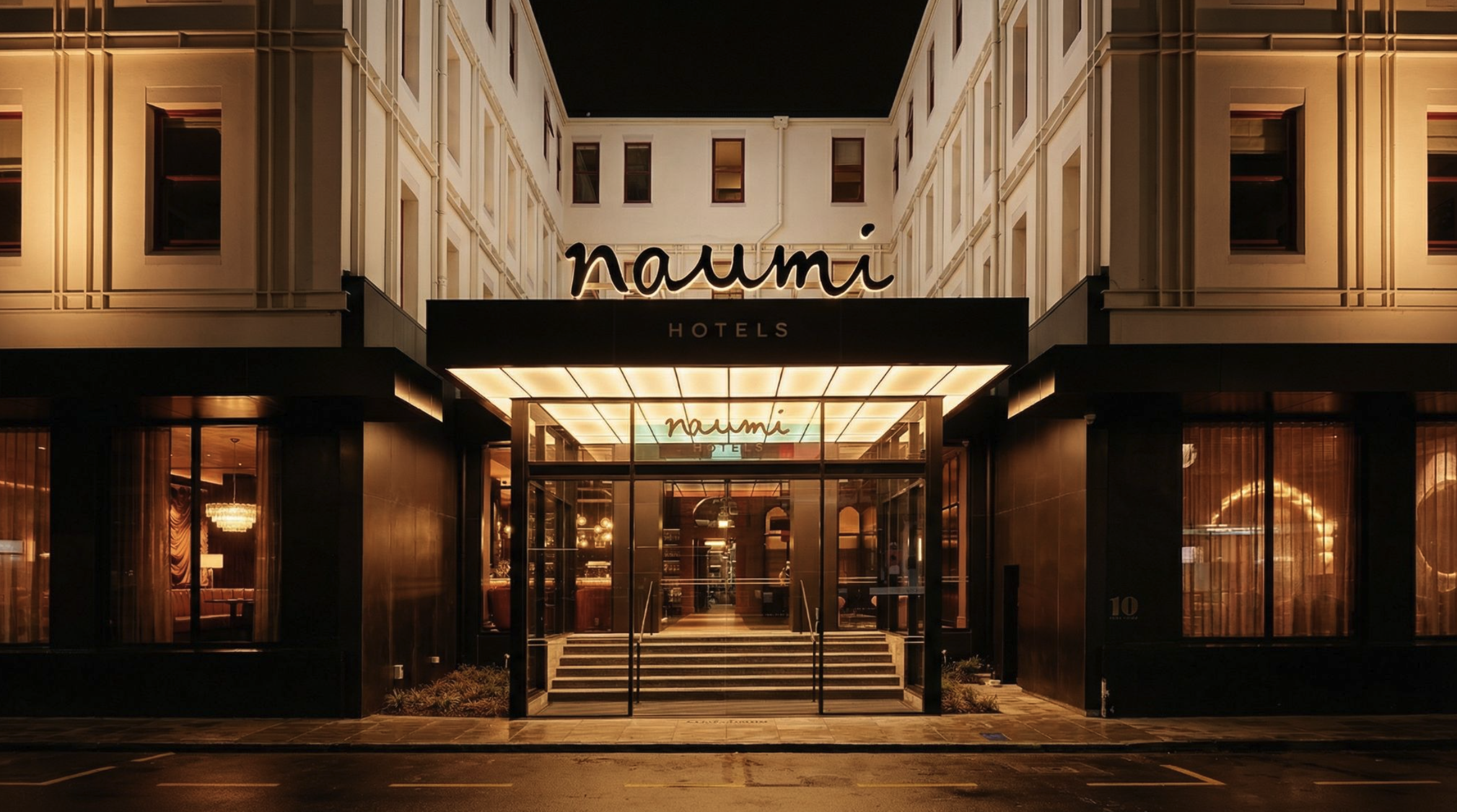
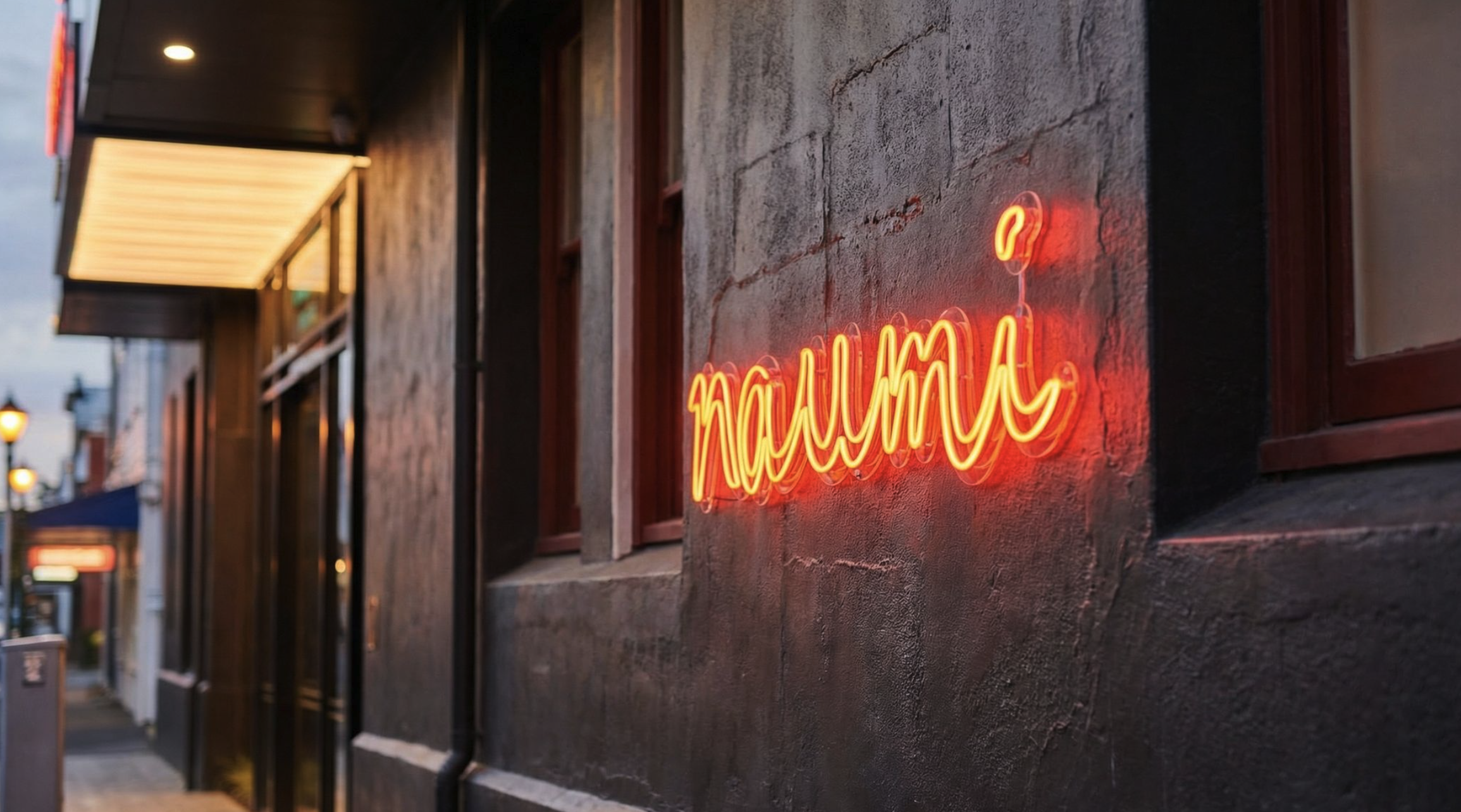
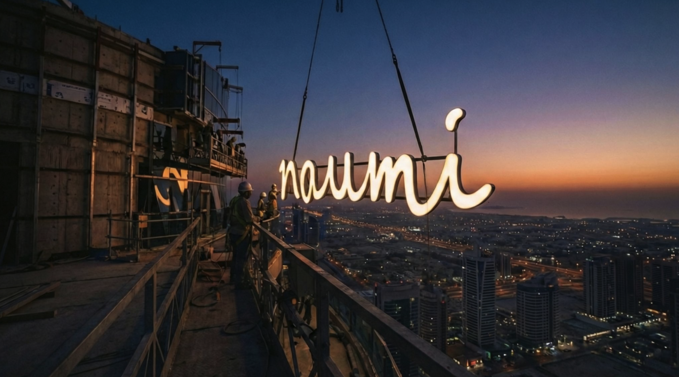
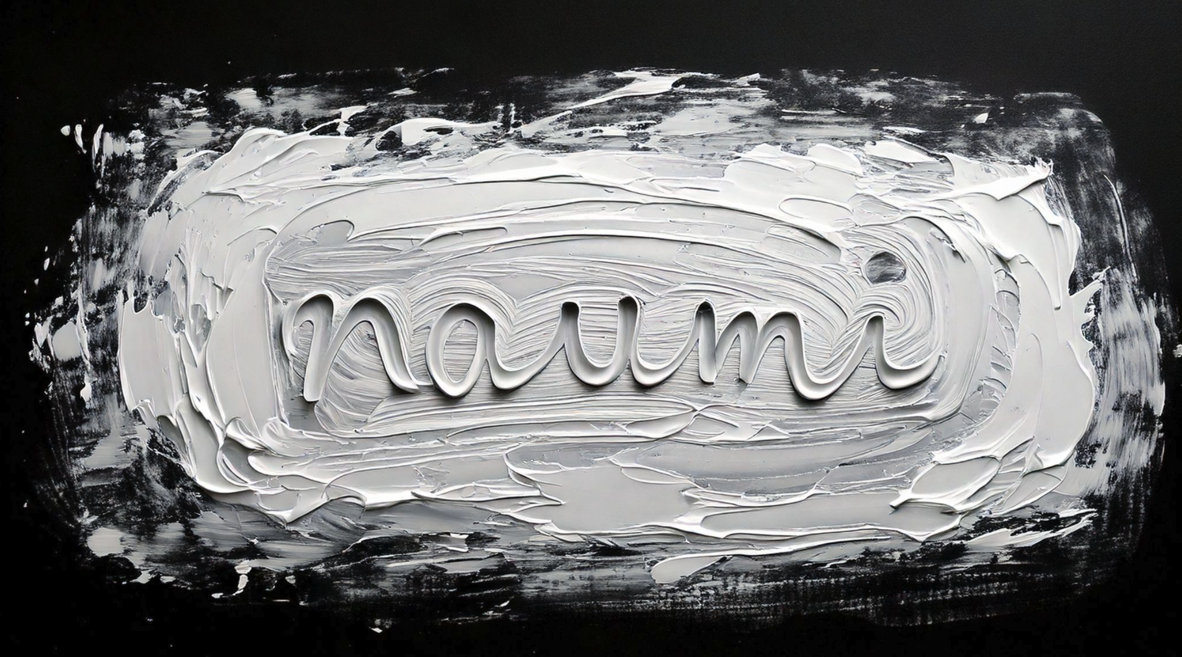
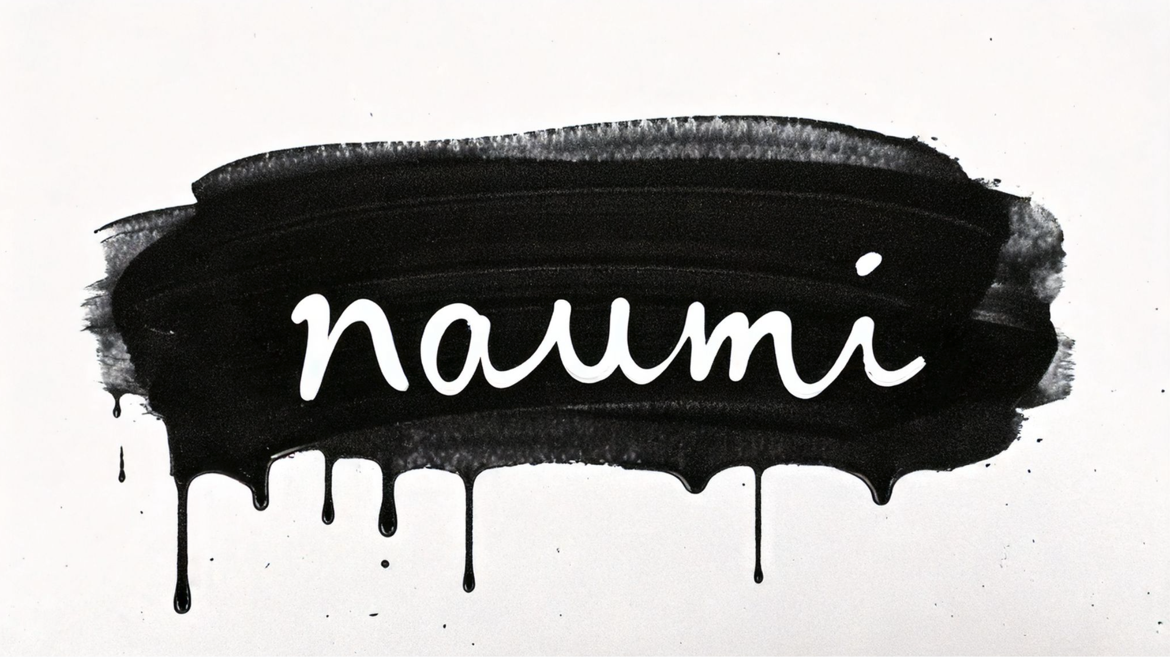
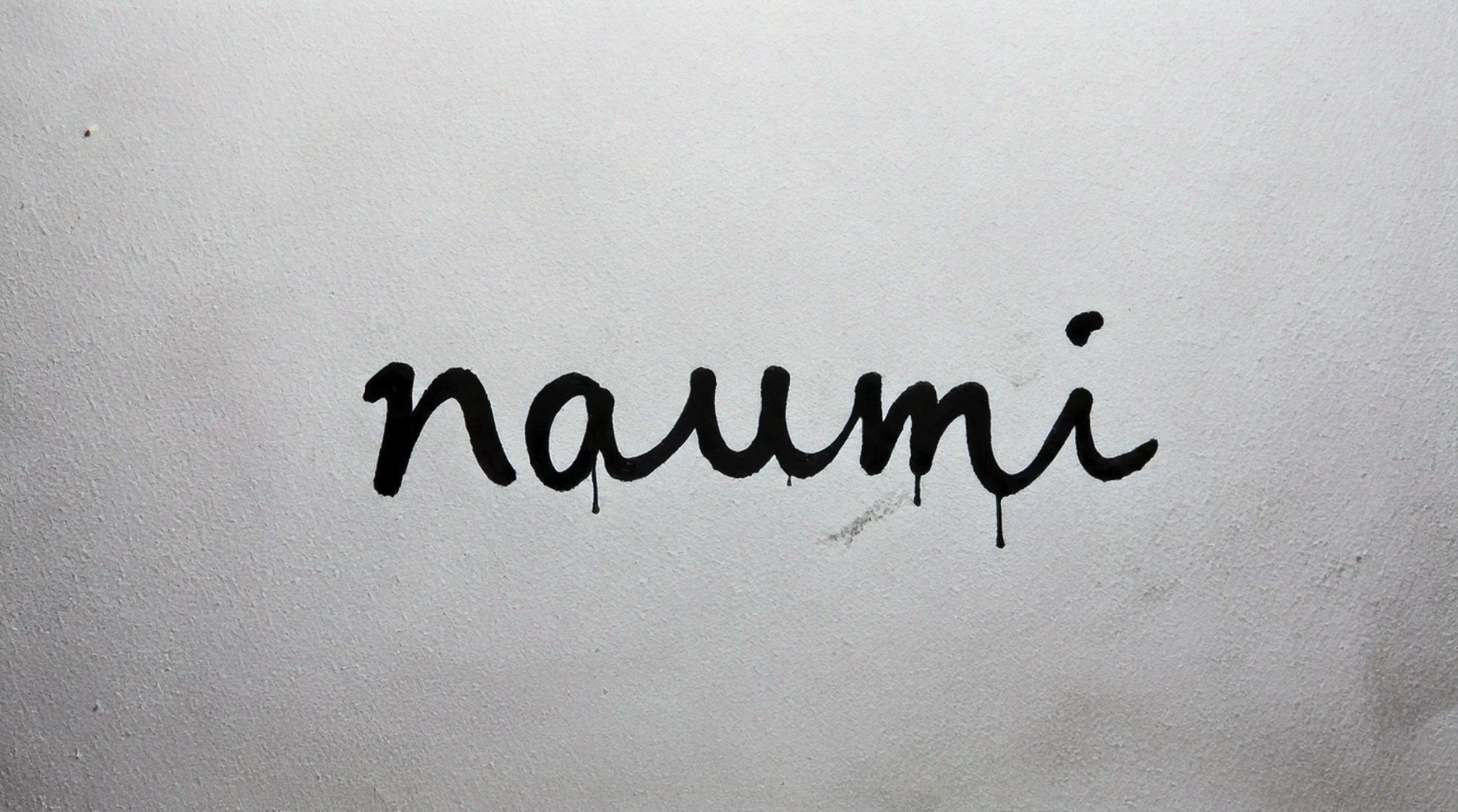
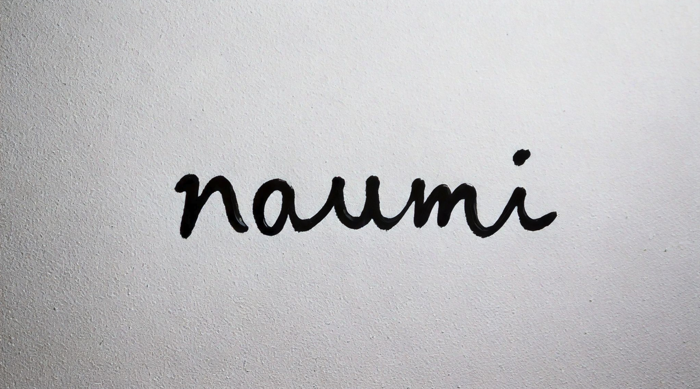
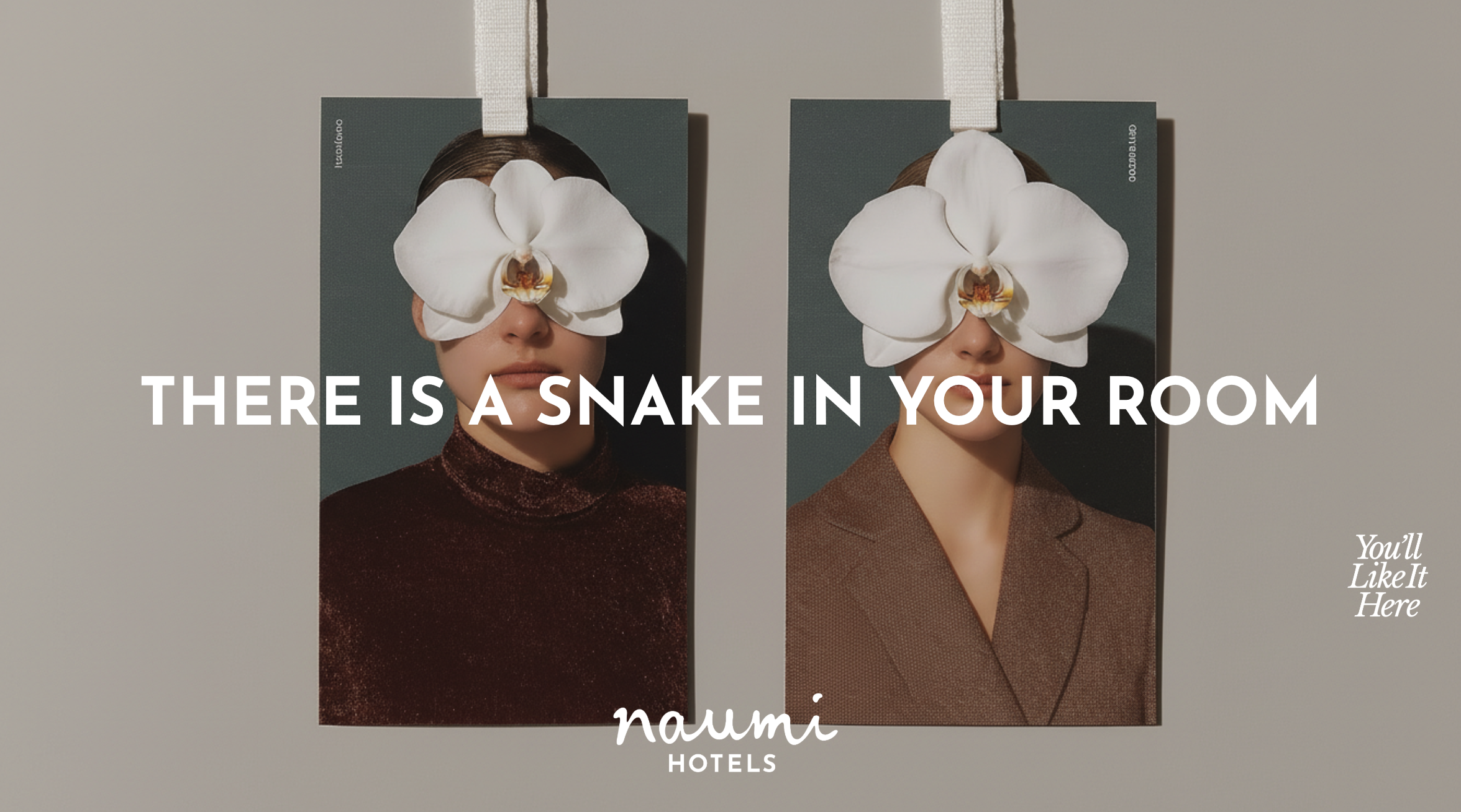
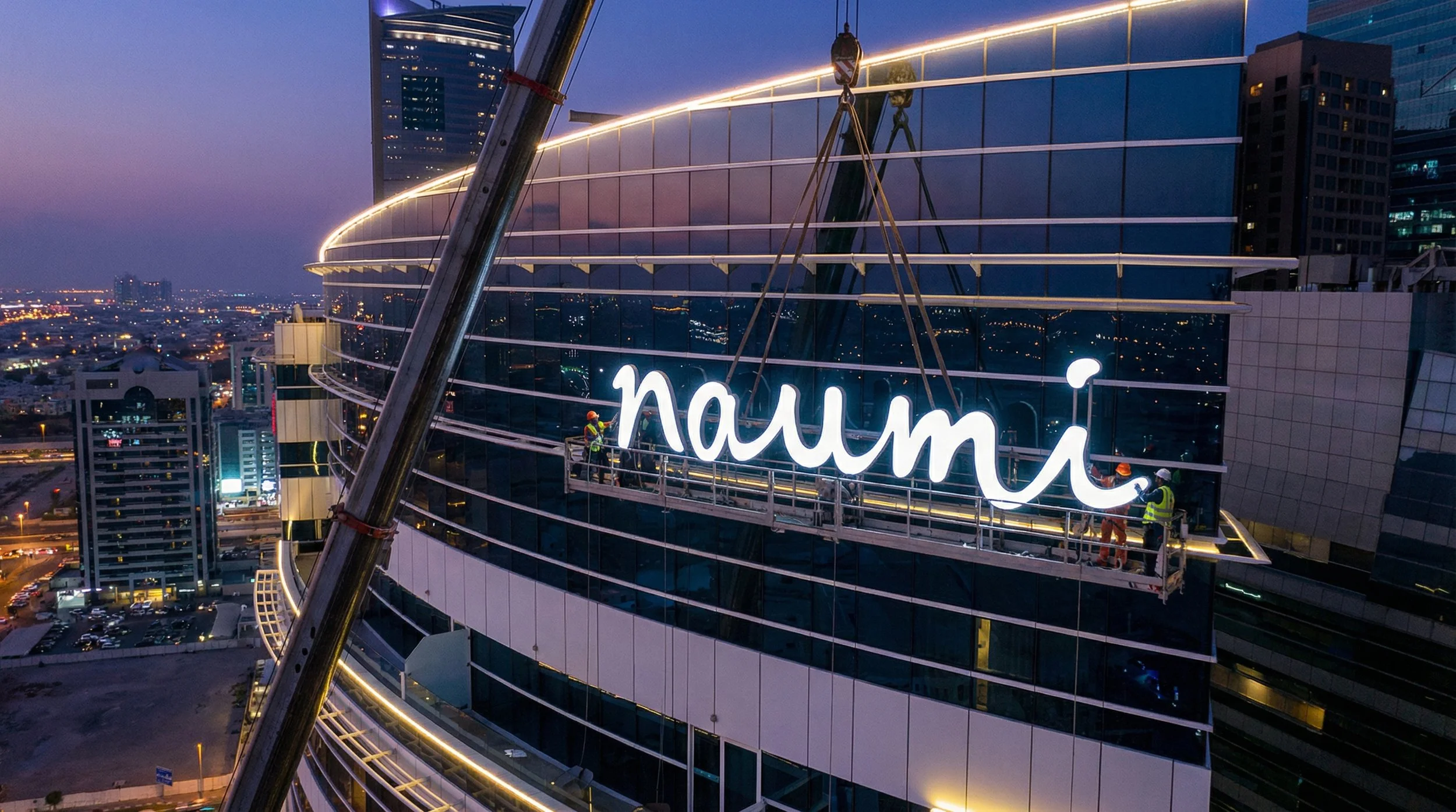
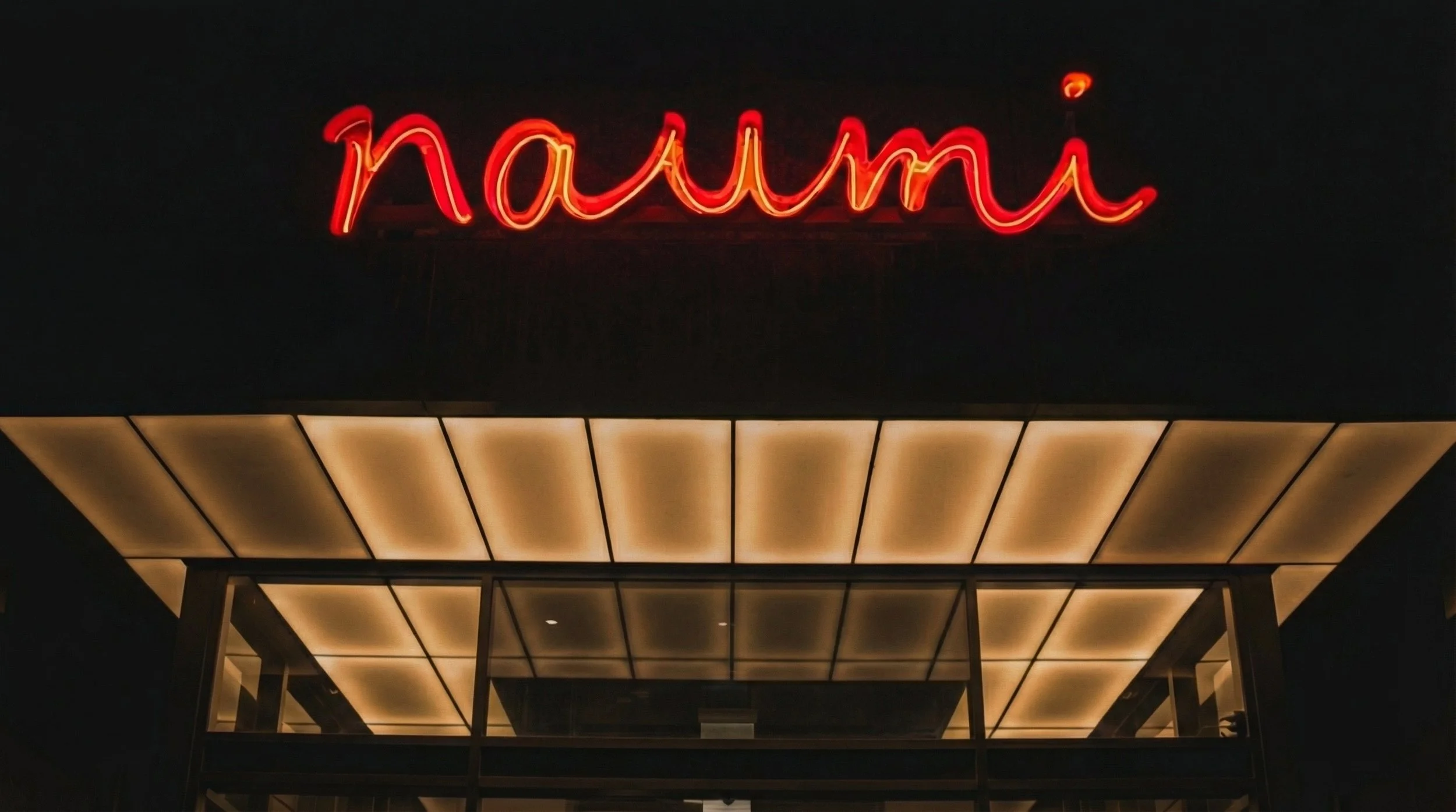
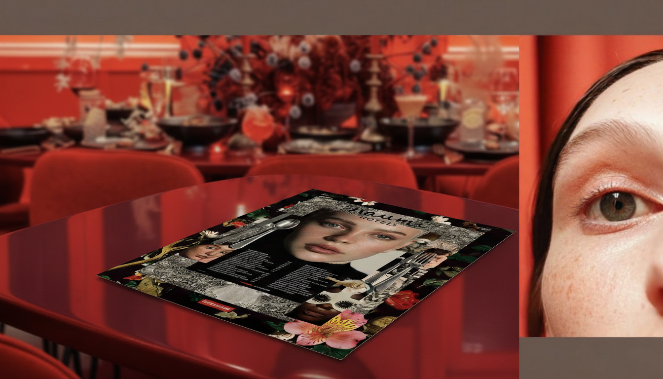
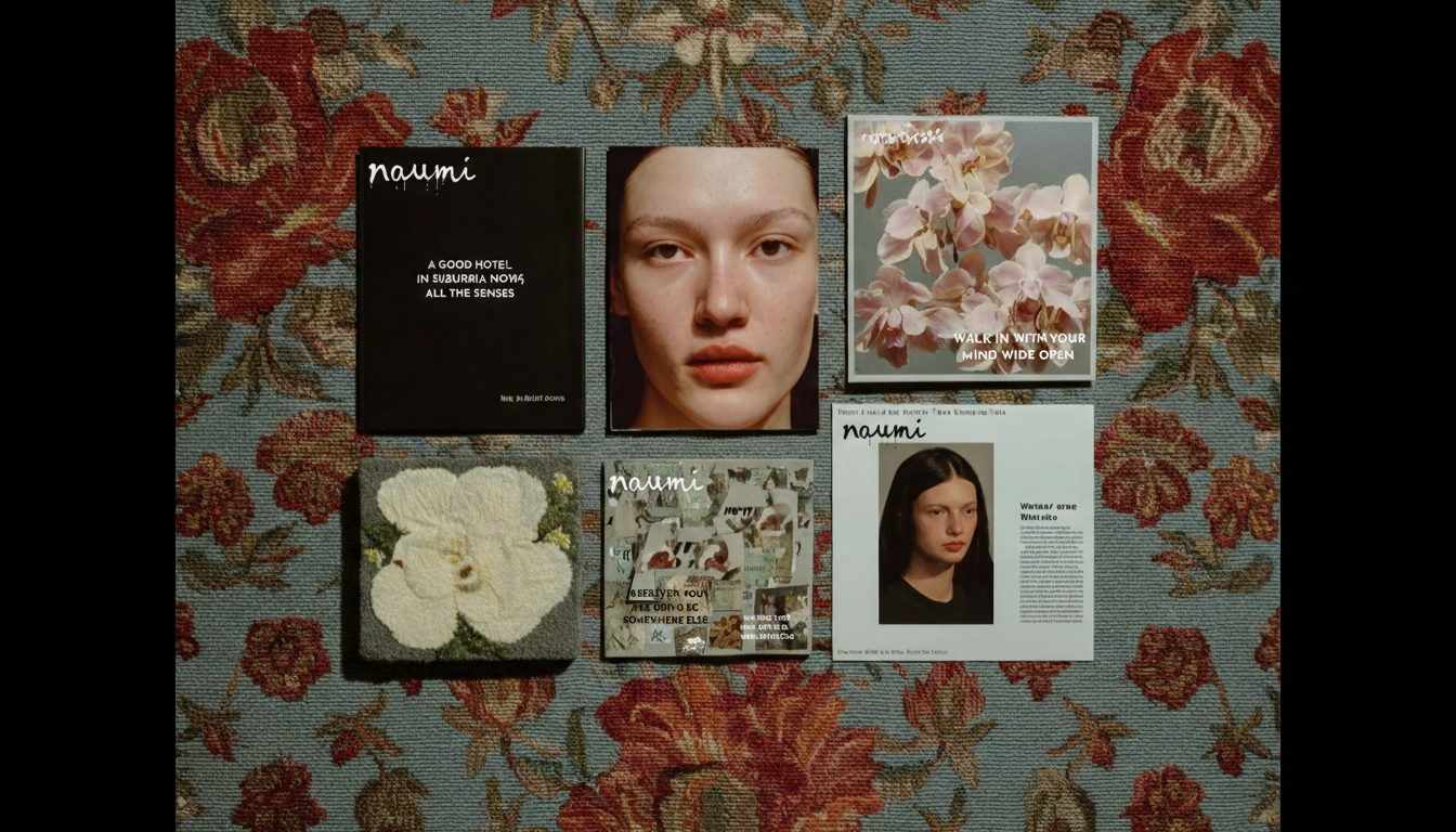
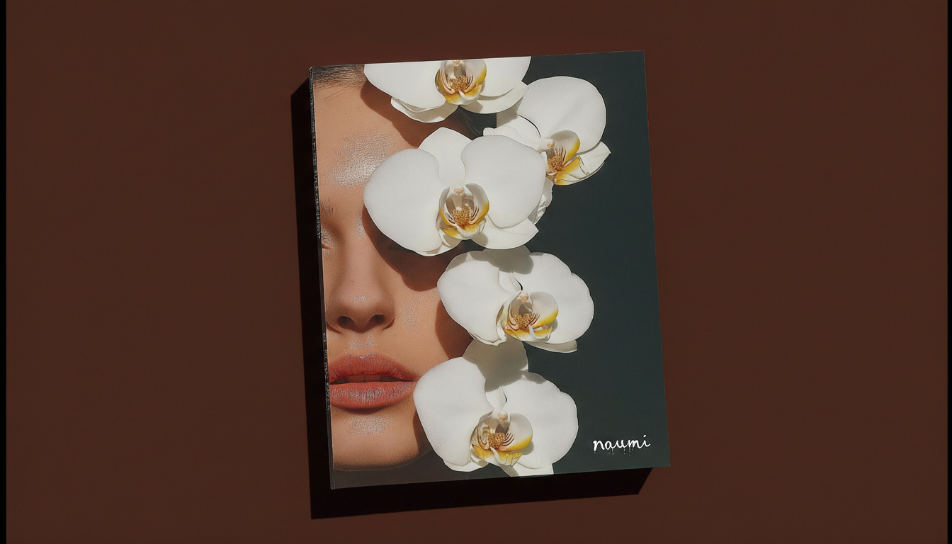
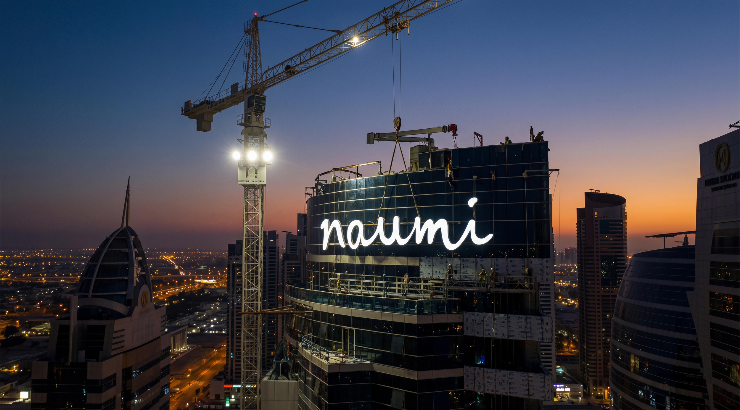
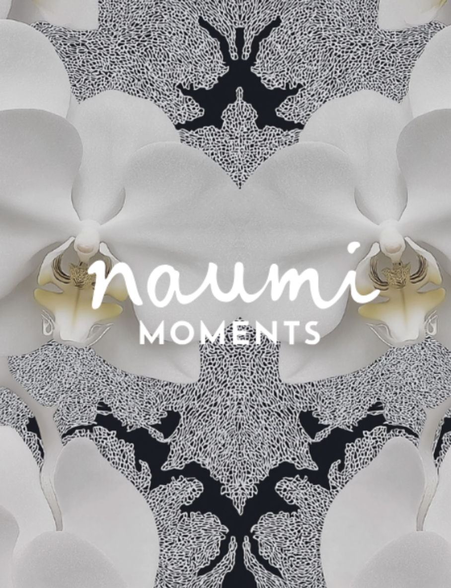
Wordmark Evolution: The redesigned "naumi" wordmark features fluid, natural lines, resembling a fresh sketch or ink settling into paper, conveying authenticity.
Wordmark: The redesigned "naumi" wordmark features fluid, natural lines, resembling a fresh sketch or ink settling into paper, conveying authenticity910. It embodies an interplay of artistic character and lived-in humanity, grounding Naumi's revitalized identity in bold, modern contrasts and confident warmth910.
•

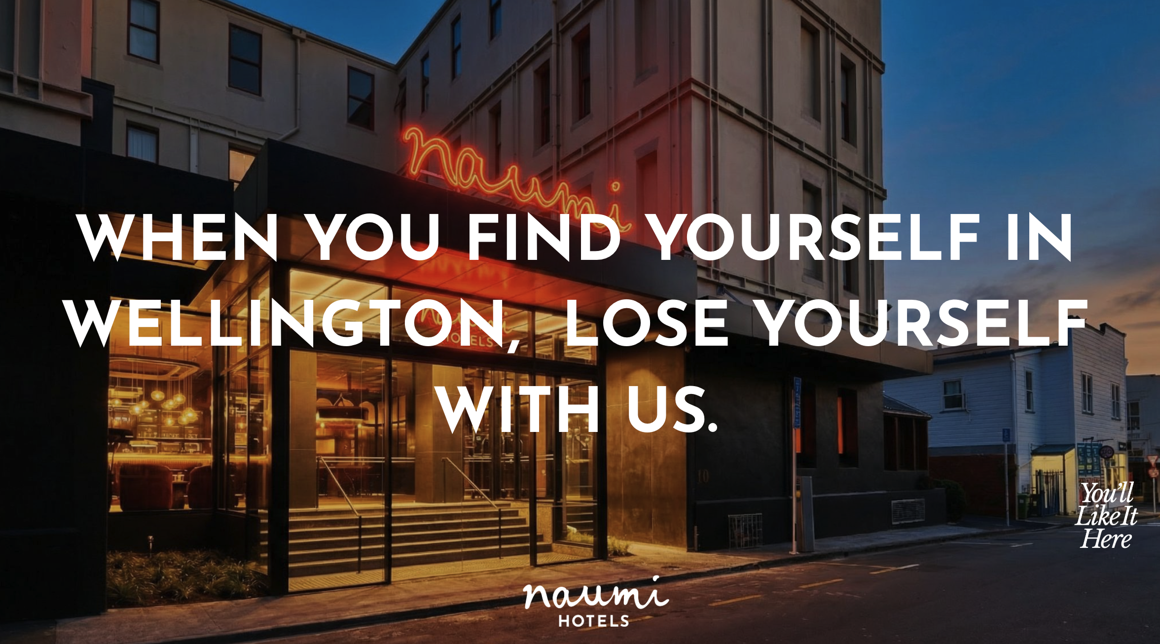
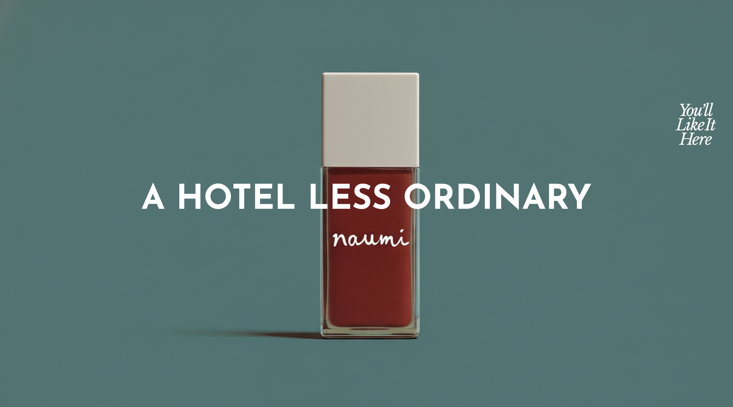
Where nothing is ever same-same.

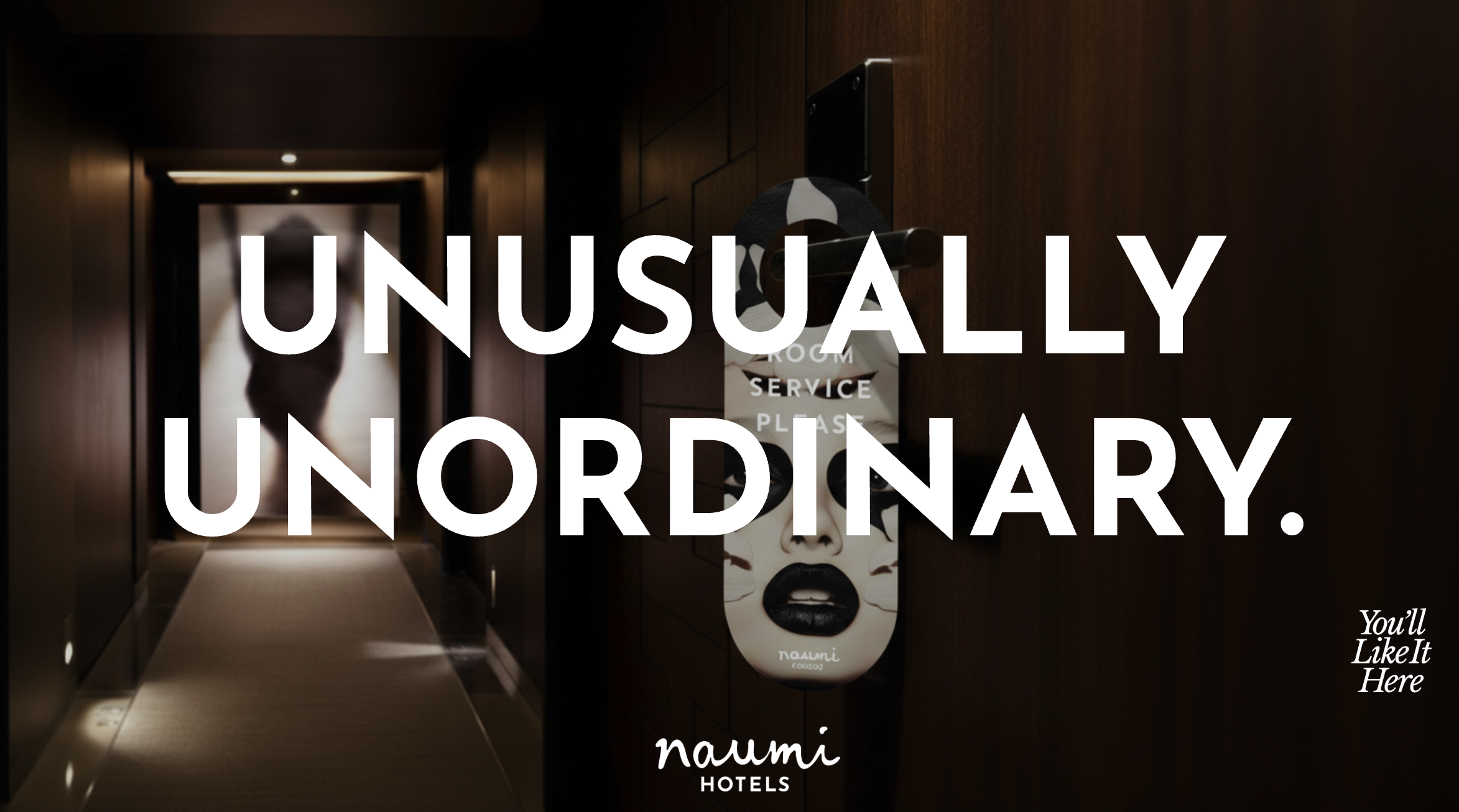
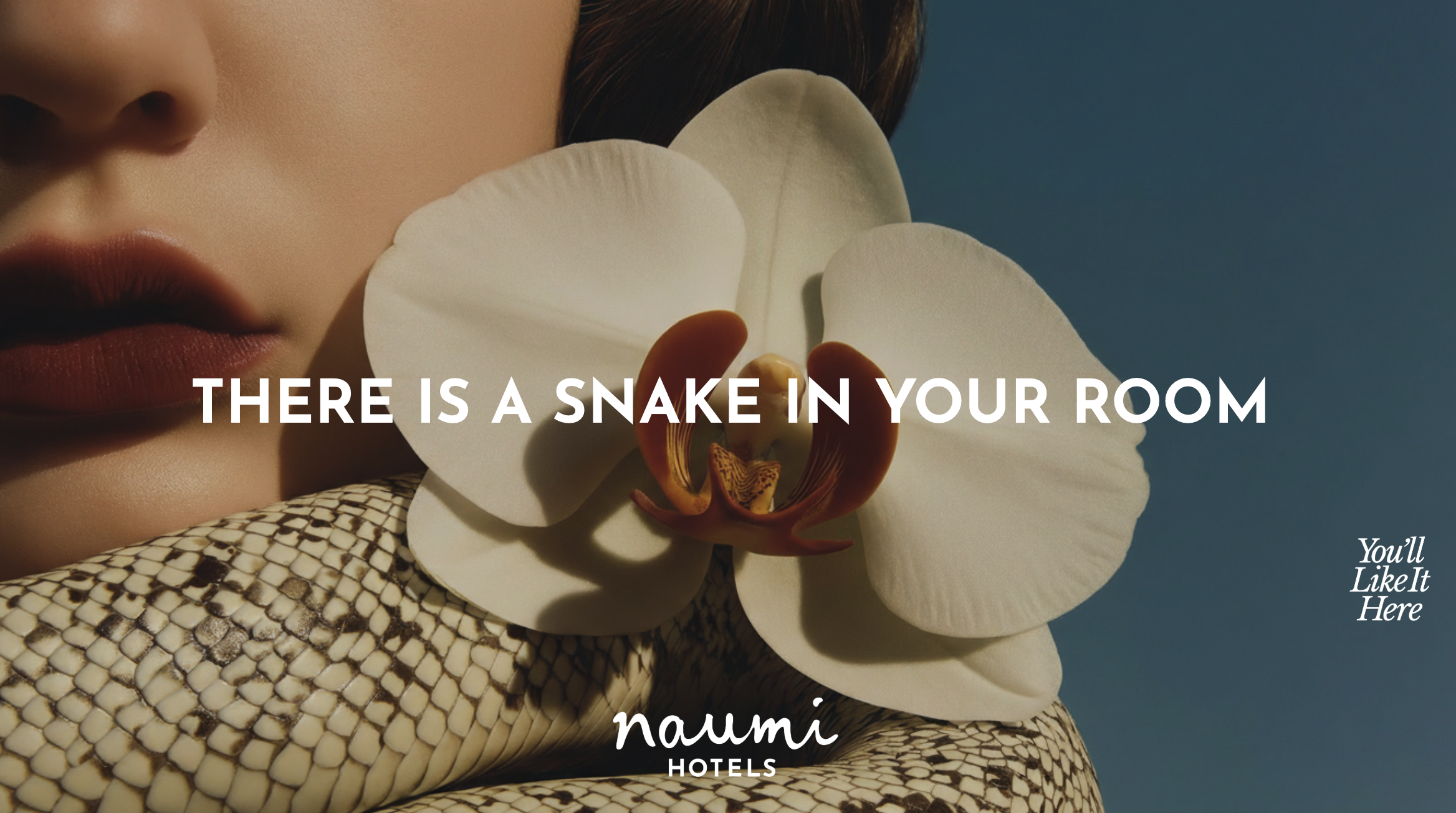
There's a snake inside your room

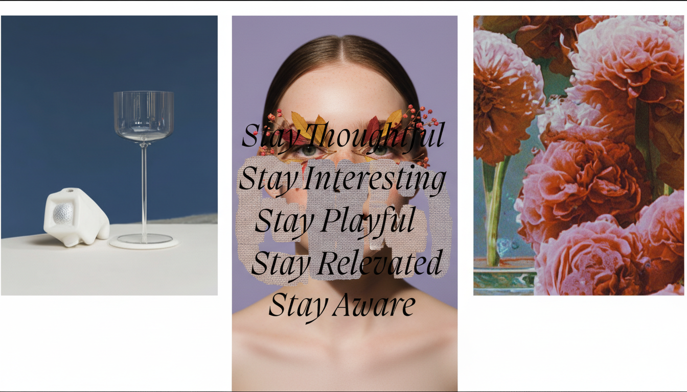
Stay curious
Whenever. Whatever.
We get bored easily, so you don’t have to.

Another chapter in your story

Lets Wellington until dawn

Walk away quietly


Become part of the story


The Kaleidoscope concept aimed to decisively differentiate the brand from conventional designer hotel sector.
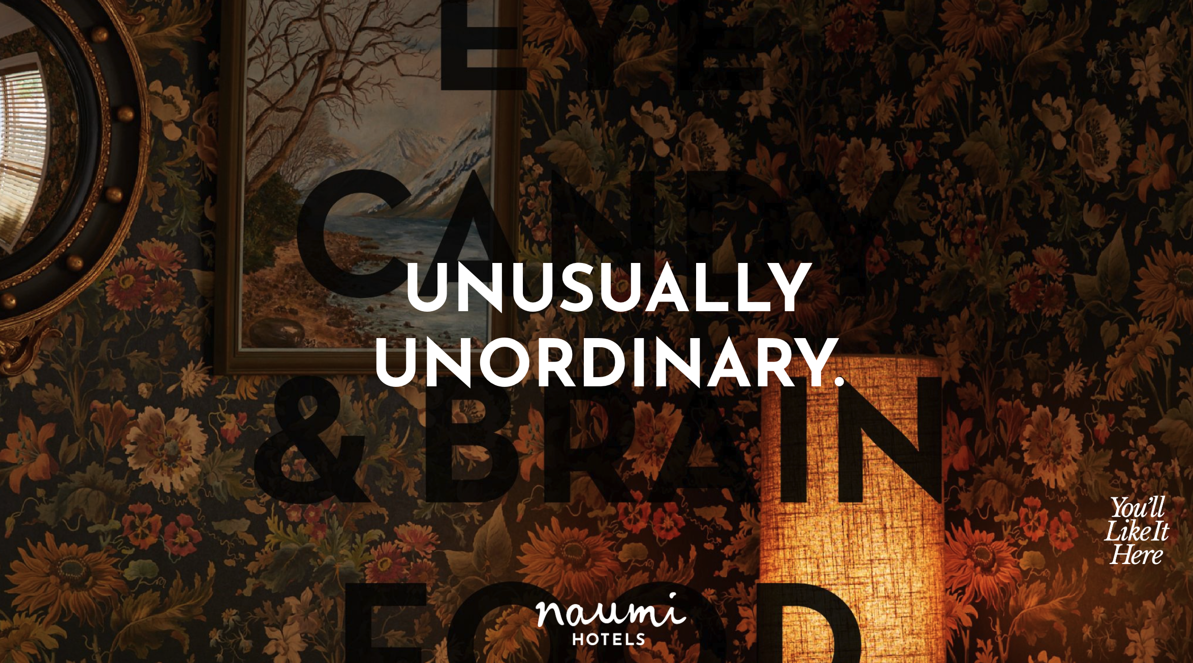
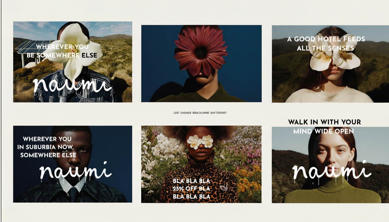
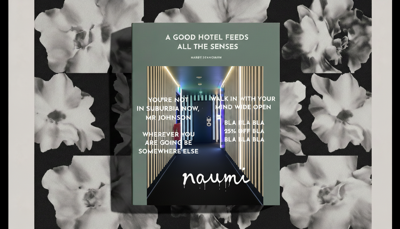
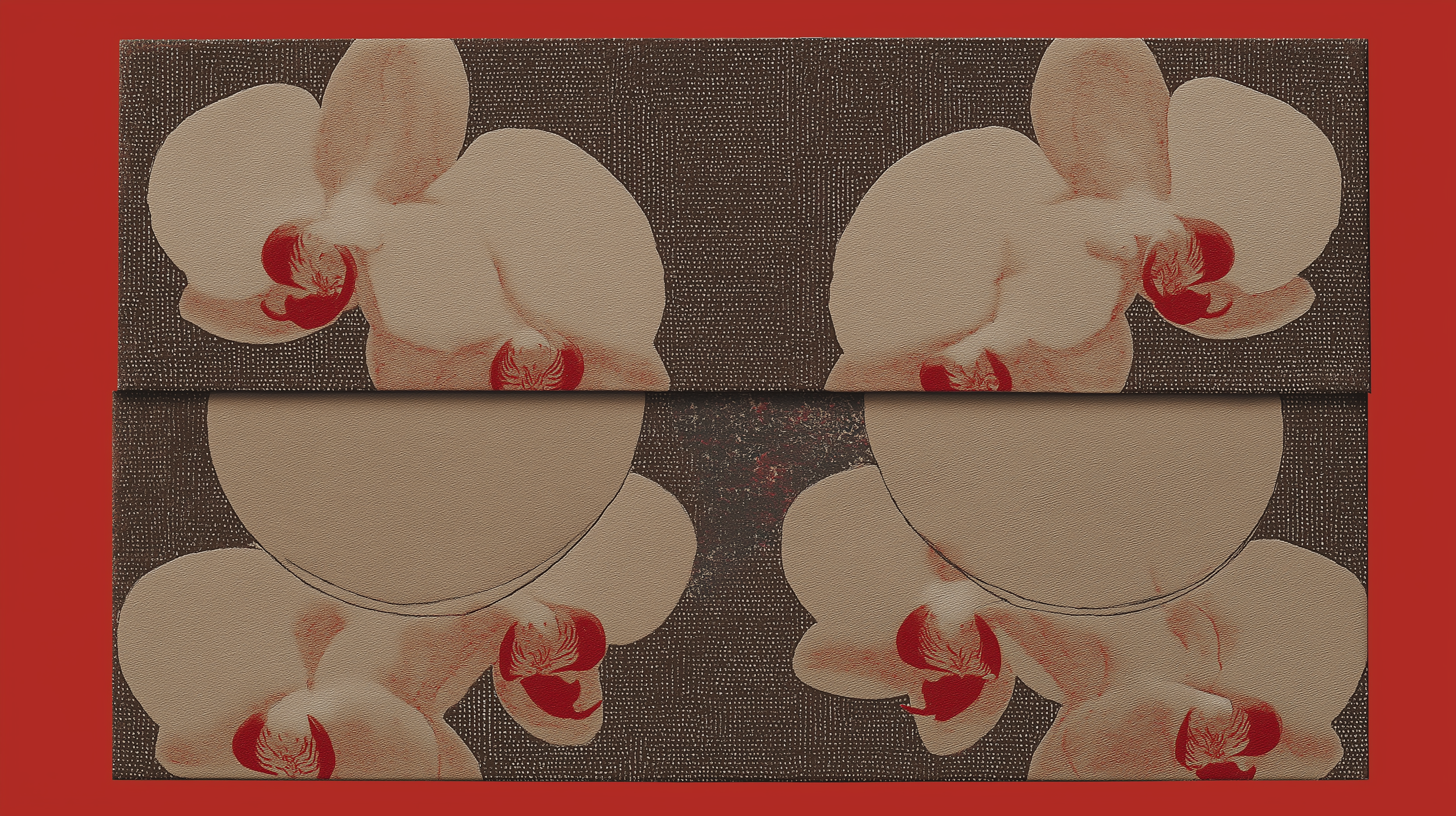
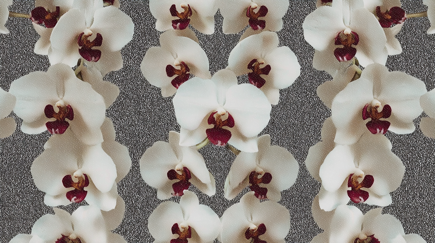
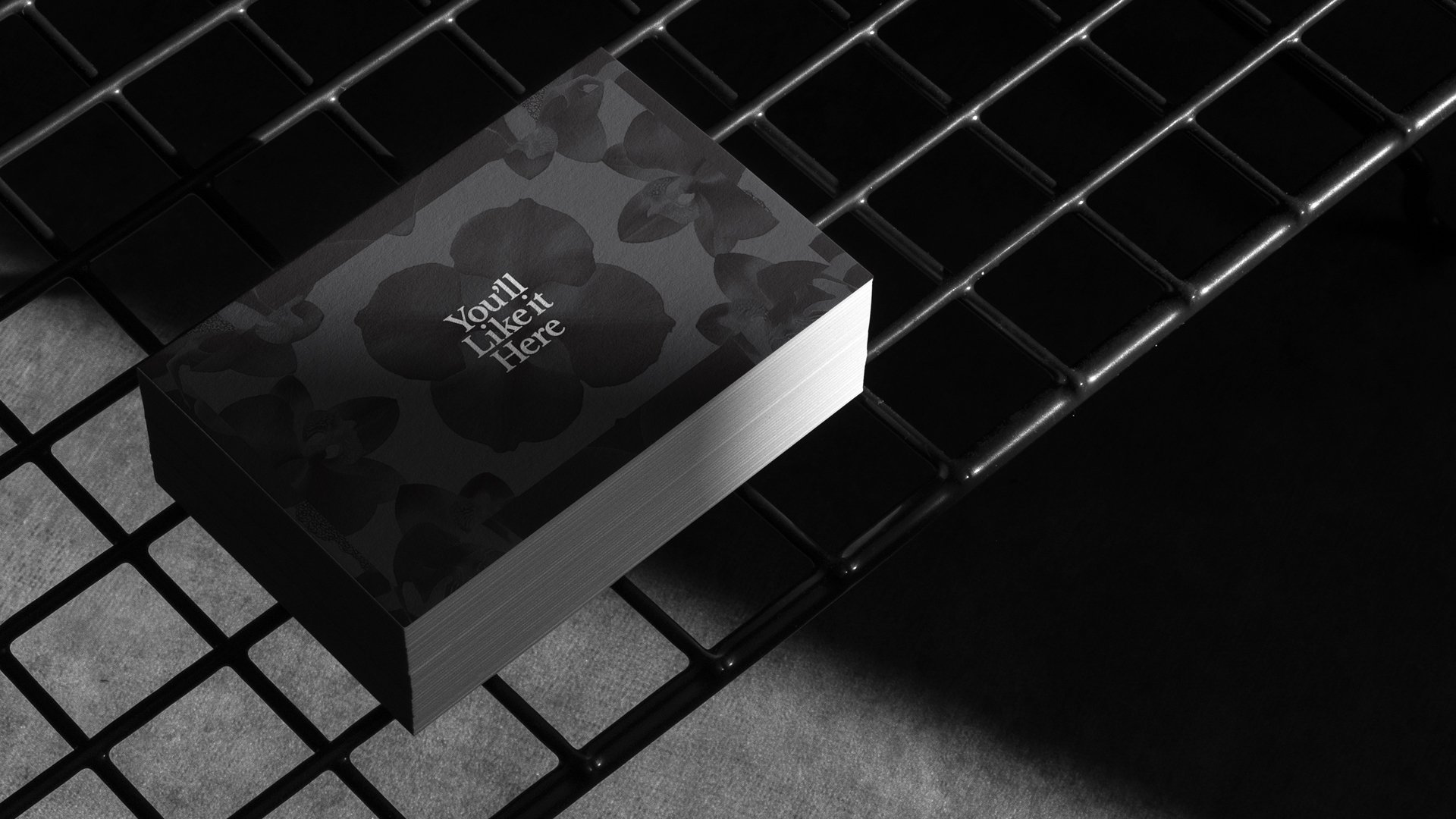
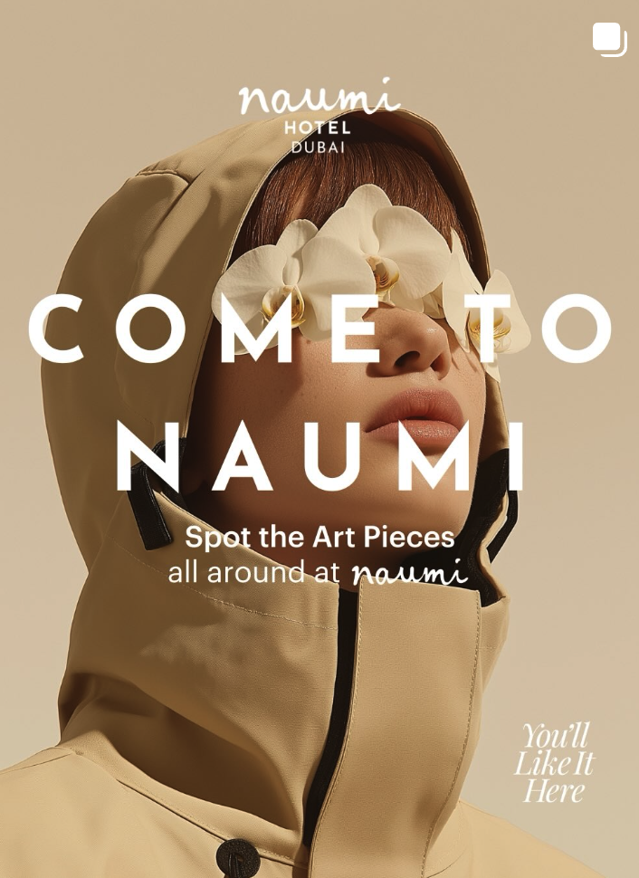
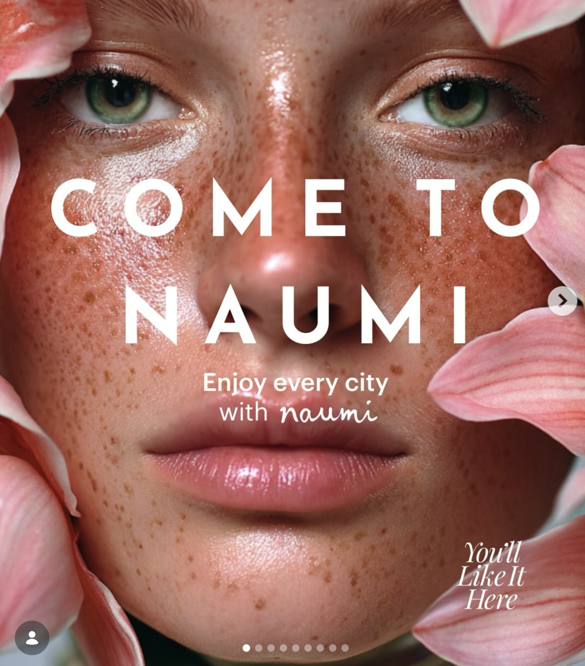
The core challenge was to cultivate a unique, flexible, and adaptable graphic language that would resonate with their nonconformist and independent-thinking target audience, all while leveraging the existing maximalist patterns already present in their distinctive hotel spaces. Our solution introduced 'Culture Fusion', a proprietary graphic language designed to blend diverse Eastern and Western styles, both ancient and modern. This flexible system uniquely harnesses pattern and kaleidoscopic techniques to generate Naumi’s central message: the "Kaleidoscopic Story." The transformation included redesigning the wordmark with fluid, natural lines that exude authenticity, balancing contemporary fluidity with organic imperfections to mirror a creator’s signature.
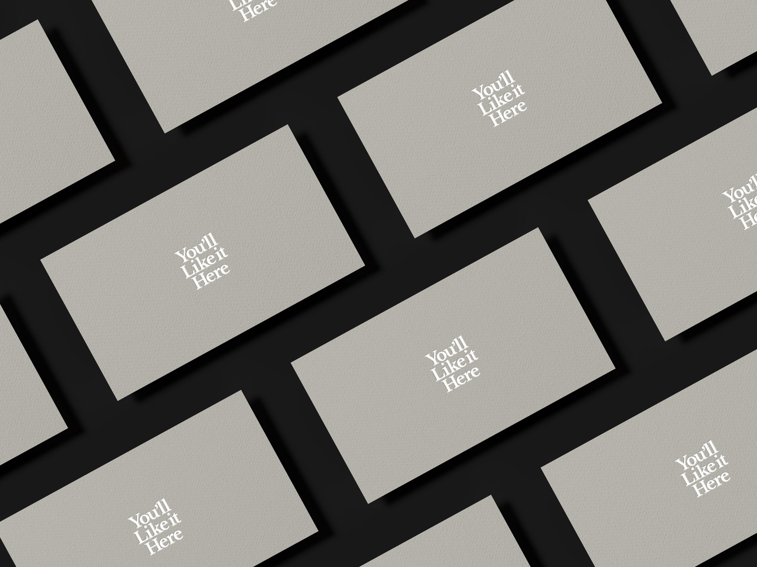
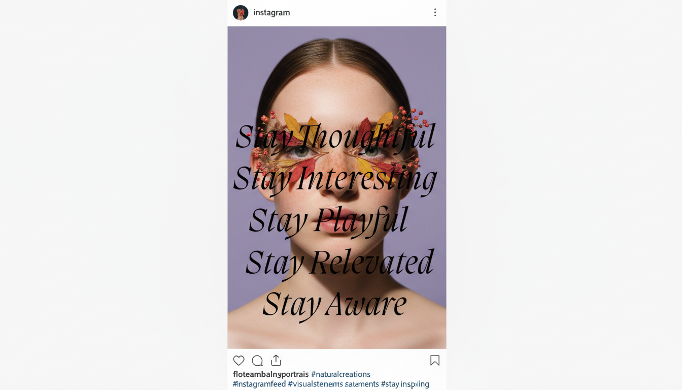
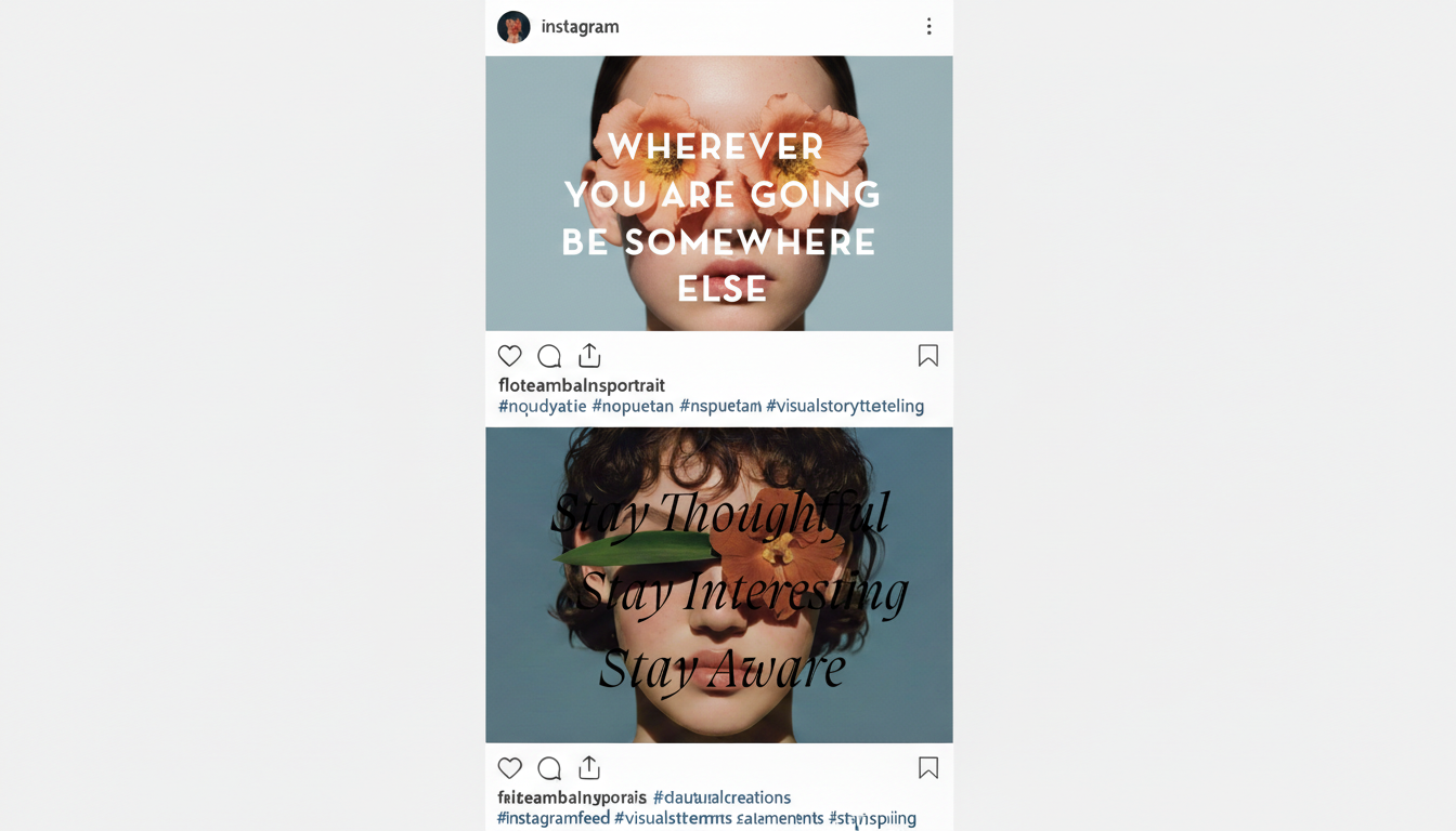
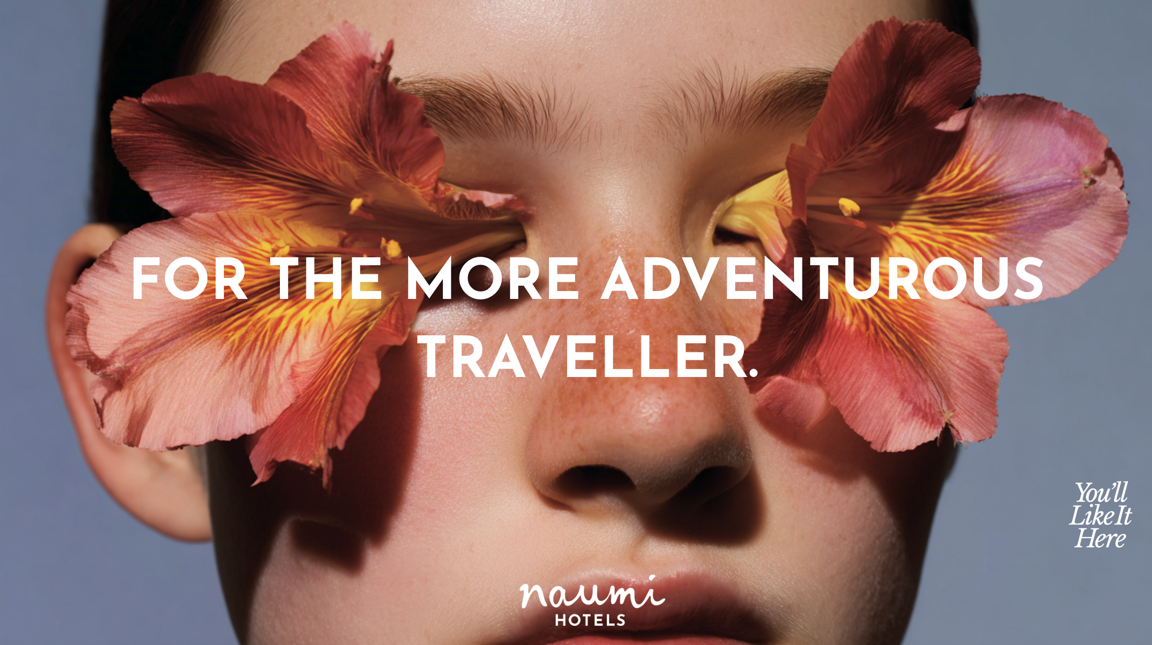
Naumi's brand language aims to be fresh, evocative, and engaging, moving away from common industry clichés. It prompts people to think about the hotel experience.
GLobal Brand
Each hotel is celebrated for its unique design, art, furnishings, food, and vibe, with every new hotel experience starting from a "blank sheet of paper"
Ultimately, the 'Culture Fusion' brand transformation successfully achieved its goal, differentiating Naumi Hotels from its conventional competitors by establishing a truly unique, proprietary, and highly adaptable graphic language
This new identity, deeply rooted in the "Kaleidoscopic Story," ensures future flexibility across diverse content and brand touchpoints. It has redefined Naumi's position as a "thinking" person’s hotel experience – a smarter choice for more open and curious individuals seeking memorable and unexpected journeys.

The Result:
Naumi Hotels maintains brand consistency across its international locations (Singapore, NZ, Australia, UAE) using a structured brand architecture, a scalable AI-driven content strategy, and rigorous visual/operational systems.
1. Brand Architecture: A "Neu Maximalist" Master Brand (Naumi Hotels) sets the core tone and "Stay Different" philosophy. Sub-brands like Naumi Studio and By Naumi Hotels allow segment targeting without diluting the core identity, while individual properties add local storytelling.
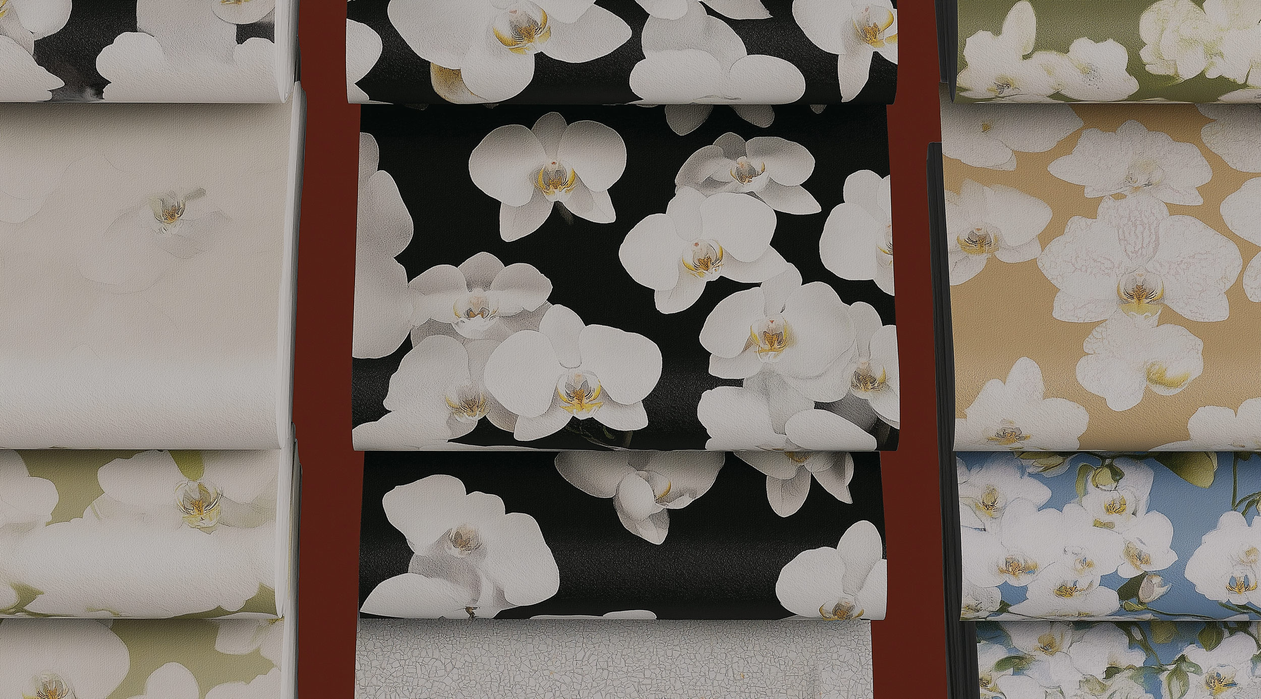
2. AI-Driven Strategy: Generative AI (MidJourney, Runway) is used for hyper-personalization and scalable content creation. This creates region-specific campaigns (e.g., Māori motifs in NZ) that adhere to the master brand's visual style, managed by centralized prompt engineering controls.
3. Visual & Operational Systems: Consistency is ensured through a comprehensive logo system with variants, adaptive template systems (digital ads, menus), and post-launch "AI & Brand Audits" (July 2025) to prevent mixed messaging.
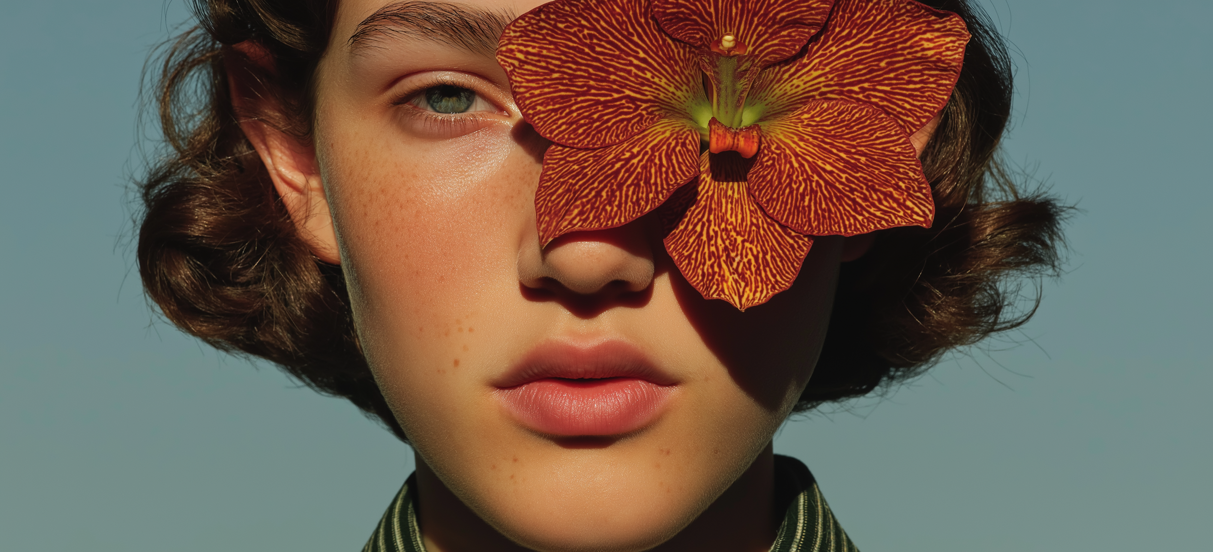
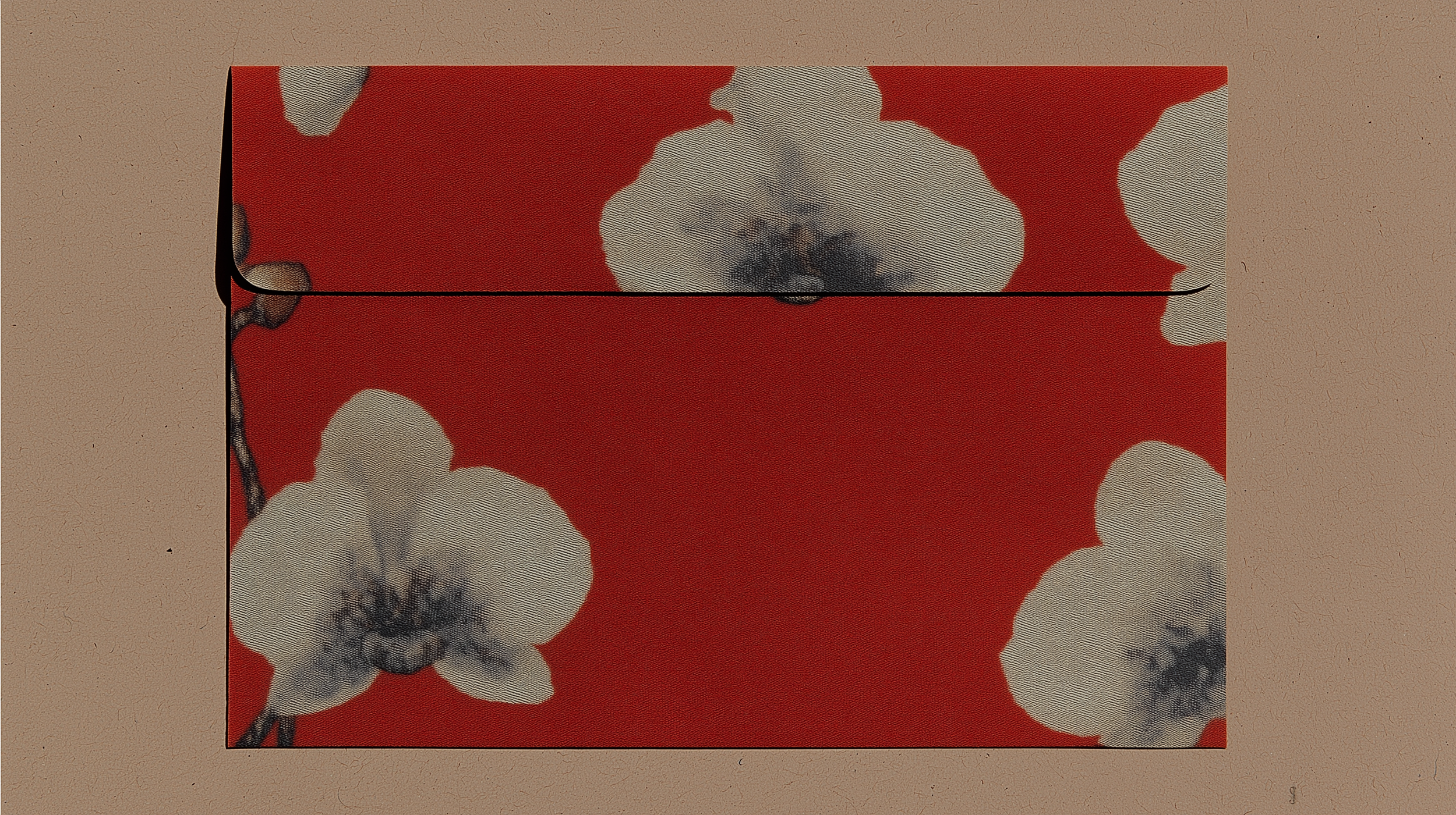
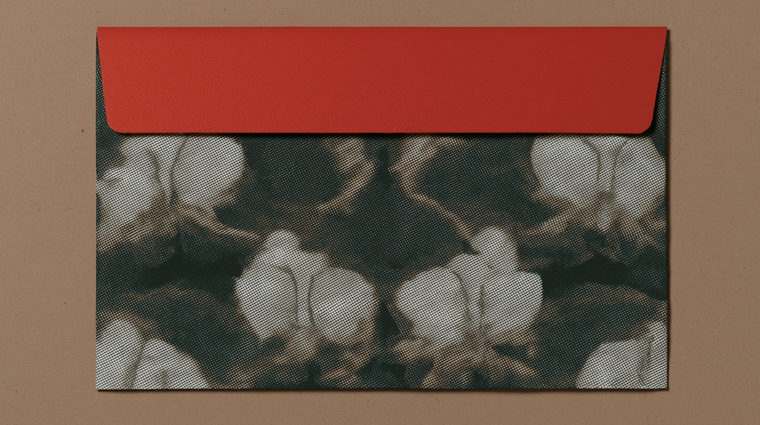
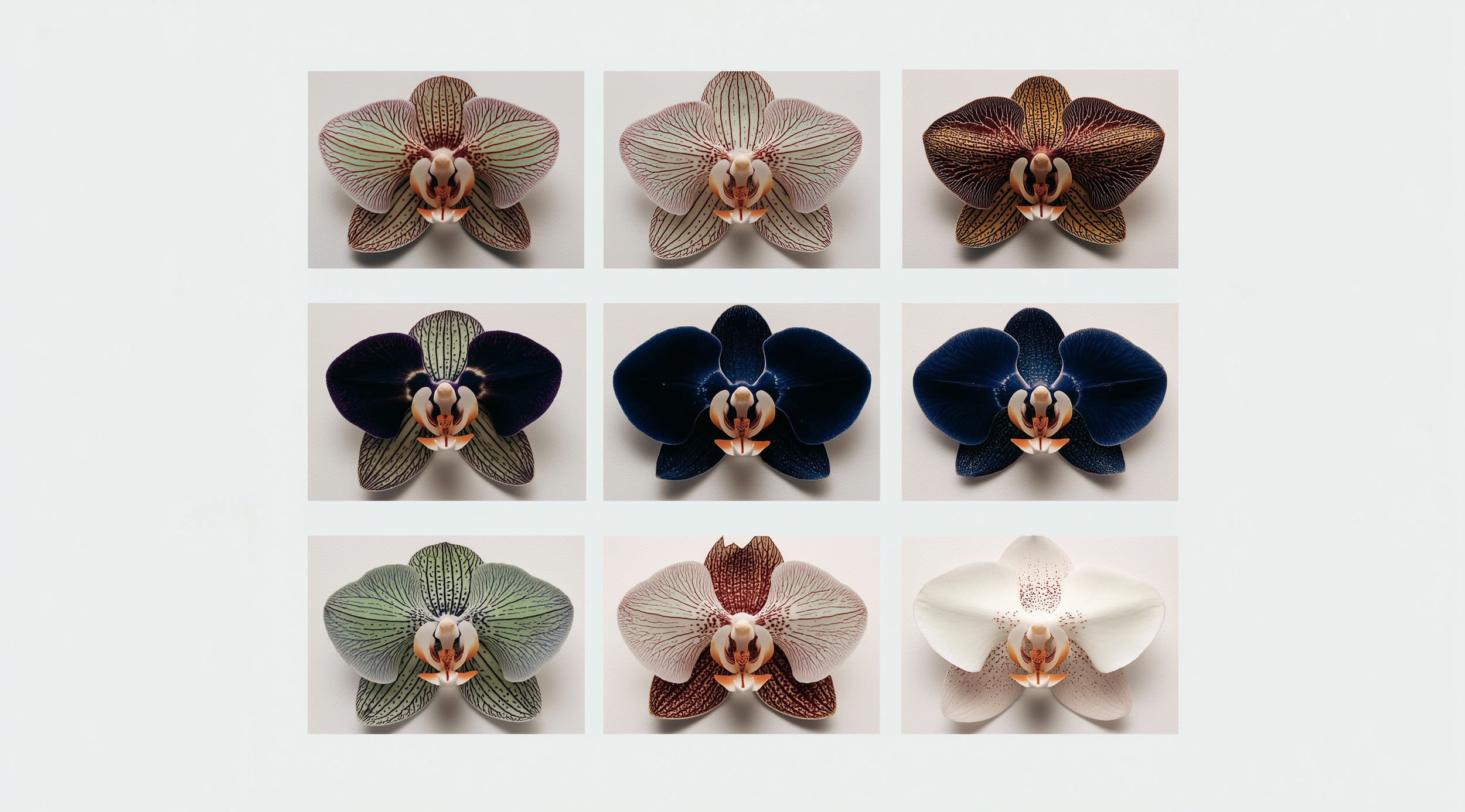
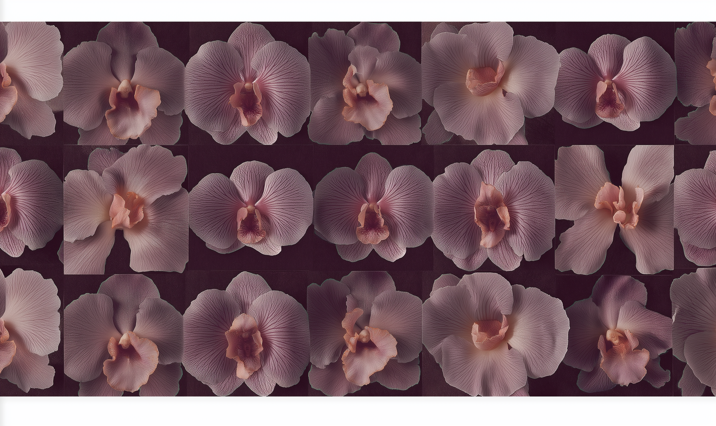
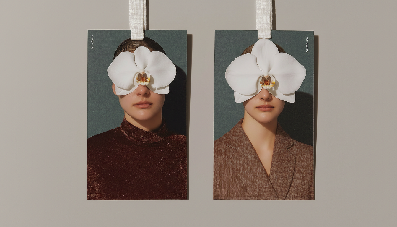
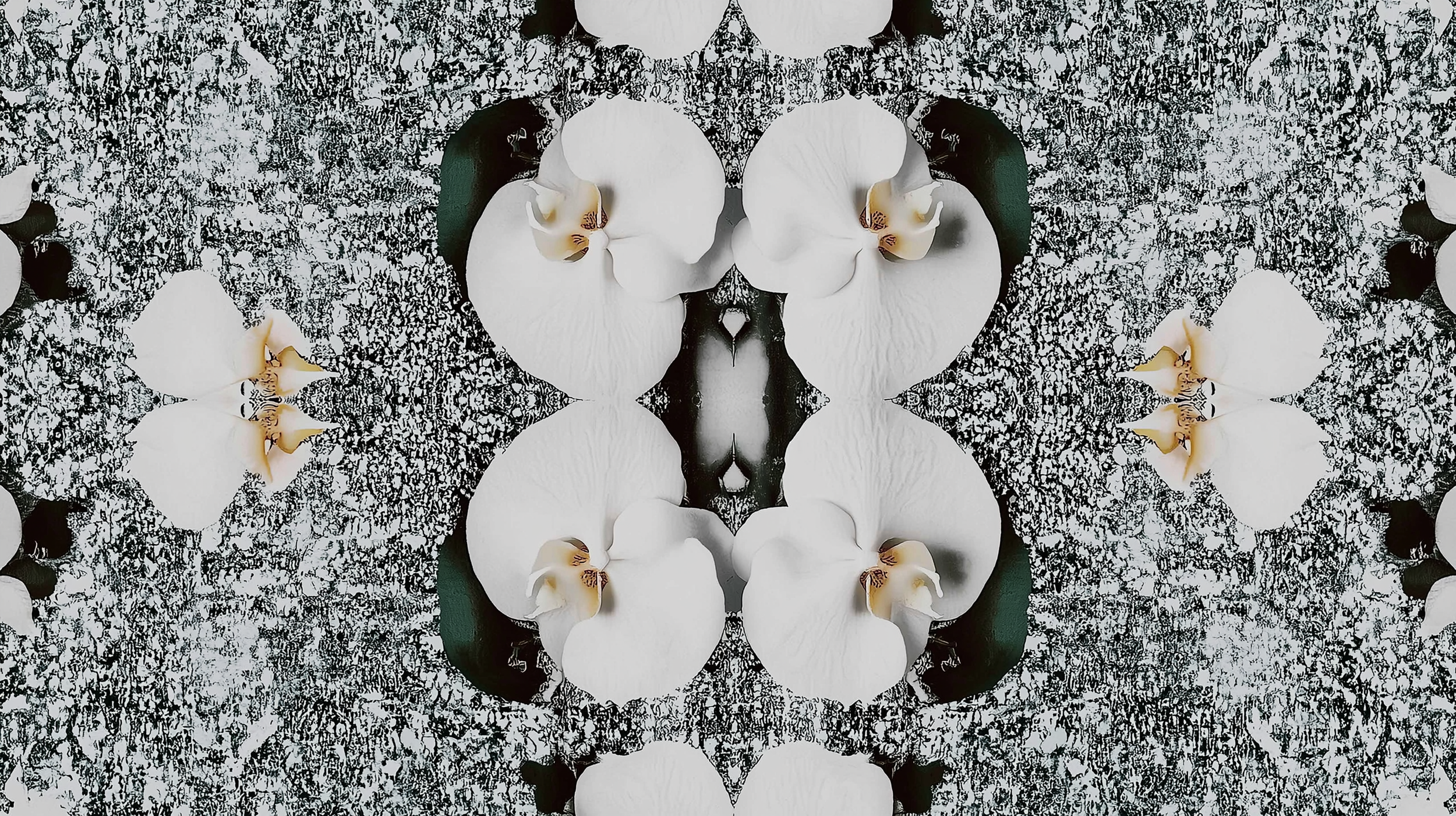
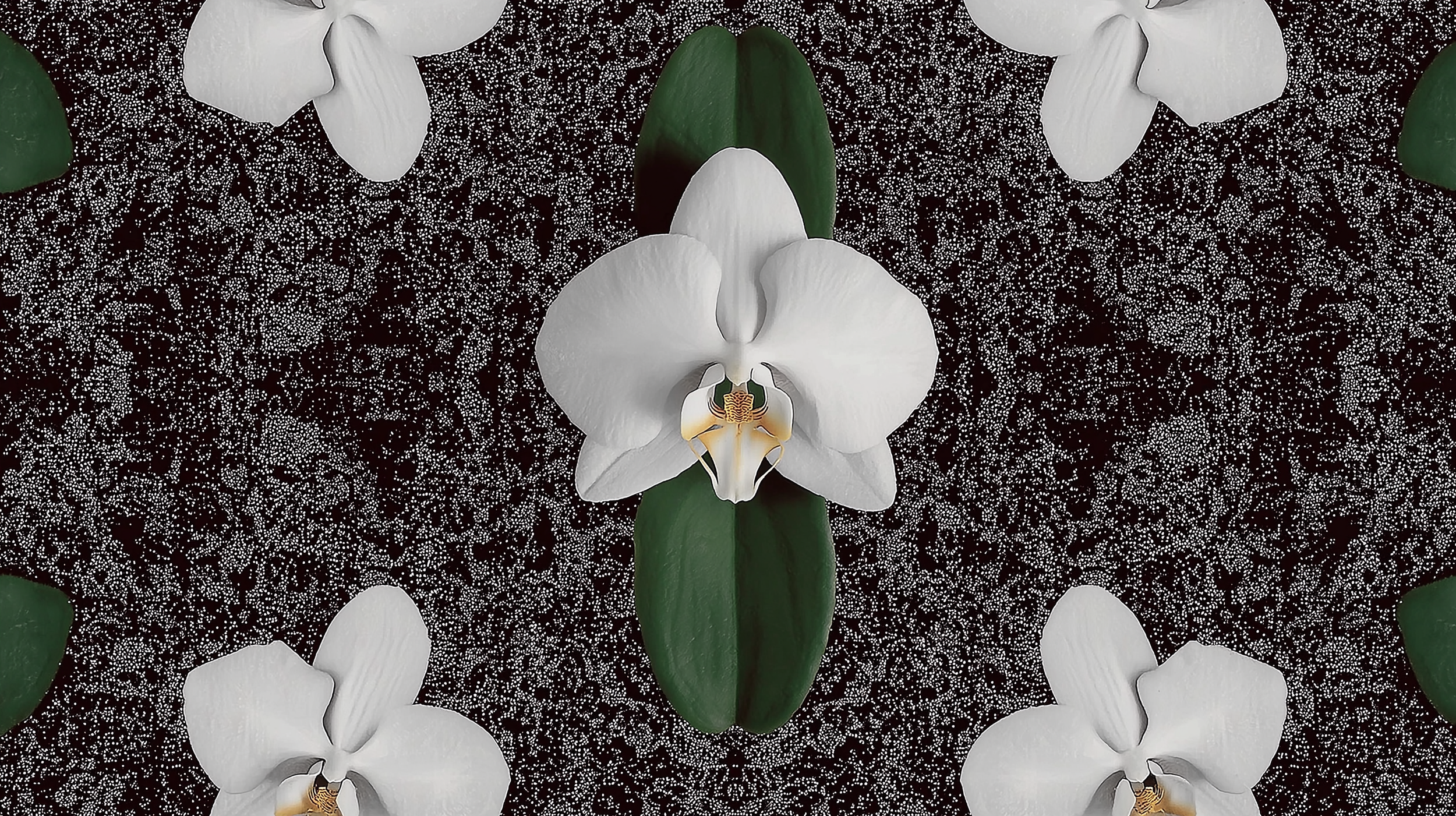
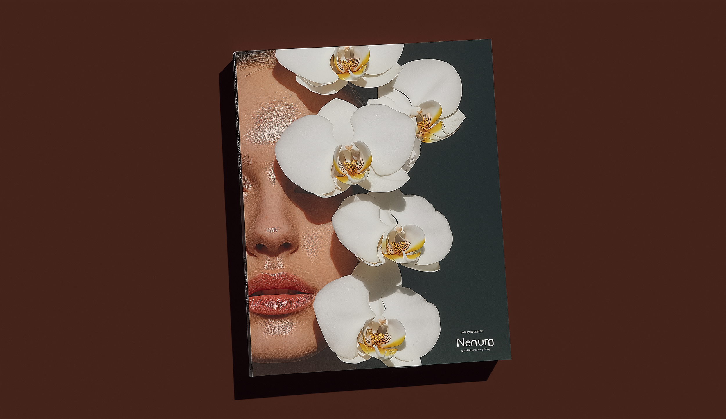
4. Visual Language: The distinctive "Neu Maximalist" aesthetic, featuring "Orchid" motifs and a custom "fluid" script wordmark, provides a recognizable visual thread across all properties.


Key Takeouts: The international brand transformation of Naumi Hotels was a comprehensive strategy to scale a boutique operation into a unified global luxury brand across Singapore, New Zealand, Australia, and the UAE. It moved the brand from variable space without defined assets to a cohesive, scalable strategic entity.
The solution centered on "Culture Fusion," blending Eastern and Western, old and new styles for broad international appeal. The visual identity adopted a "Neu Maximalist," "Kaleidoscopic Story" aesthetic with a flexible, layered system and fluid wordmark to unite diverse hotel interiors.
Operational scaling was achieved via an "AI-first content production model," generating cost-effective, "hyper-personalized" imagery and an "AI Roadmap" for team self-management. Messaging targeted the "thinking" traveler with "crisp copy," provocative headlines, and localized descriptors.
This transformation created a consistent "Neu Maximalist" experience across all consumer and investor touchpoints, ensuring global brand cohesion.

The project created tangible assets, a branded system that is scalable.
The Naumi Group is now actively seeking opportunities to acquire existing properties, with the intention of repurposing and renovating to align them with the new Naumi Brand.
Geographic Endeavours;
Urban Hotels;
AUSTRALIA | NZ Perth Melbourne Sydney Brisbane Gold Coast Christchurch Auckland
APAC Singapore Bangkok Jakarta Manila Ho Chi Minh City
EUROPE UK Italy Netherlands Switzerland Belgium Spain Germany
MIDDLE EAST UAE Saudi Arabia
Resorts
WORLDWIDE
Phuket
Koh Samui
Bali Maldives