
Tsuru Coffee, Tokyo: Crafting a Community-Focused Brand Identity.
Note
This project is still in developement, case study images will be updated over the next few months
Masterbrand Variants
IPlace making brand ppplication
Brand creation
Brand Launch
AI image sets
Ai video colletion
Background
Established as a new venture, Tsuru Coffee sought to create a brand identity that would resonate with busy city dwellers, offering a sense of anchor and community through coffee. The vision was to establish a local coffee shop where diverse individuals could connect and find solace, transforming it into a vital "third place" – a space beyond home and work. This approach aims for a business model that champions quality, ethical practices, and a strong presence in the community, setting a benchmark for the industry in terms of quality, transparency, and education.
x
x
The Challenge
To define and visually communicate Tsuru's unique proposition as a sanctuary and hub for meaningful in-person connections in a fast-paced, digital world. The brand needed to embody warmth, authenticity, and a progressive spirit, similar to how leading brands modernize their identity with a focus on core values and unique offerings.
Above
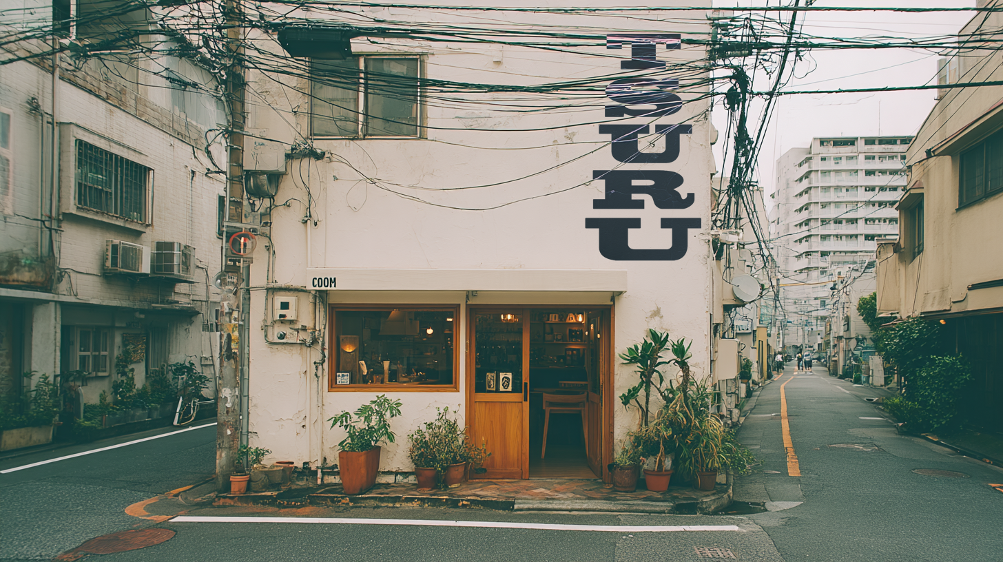
New brand identity
Below
Flexible symbol system


Discovery Stage: Conceptualizing Identity
Our initial discovery phase explored various conceptual directions to capture Tsuru's essence, drawing inspiration from different cultural and artistic styles. Three primary concepts were developed:
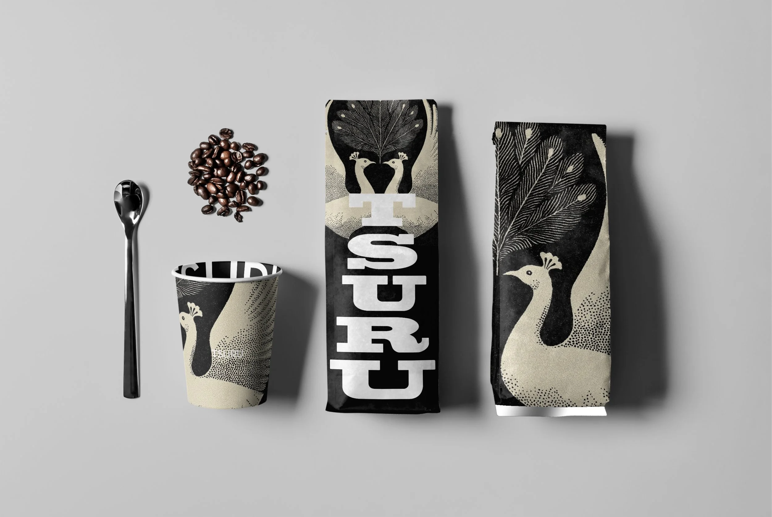
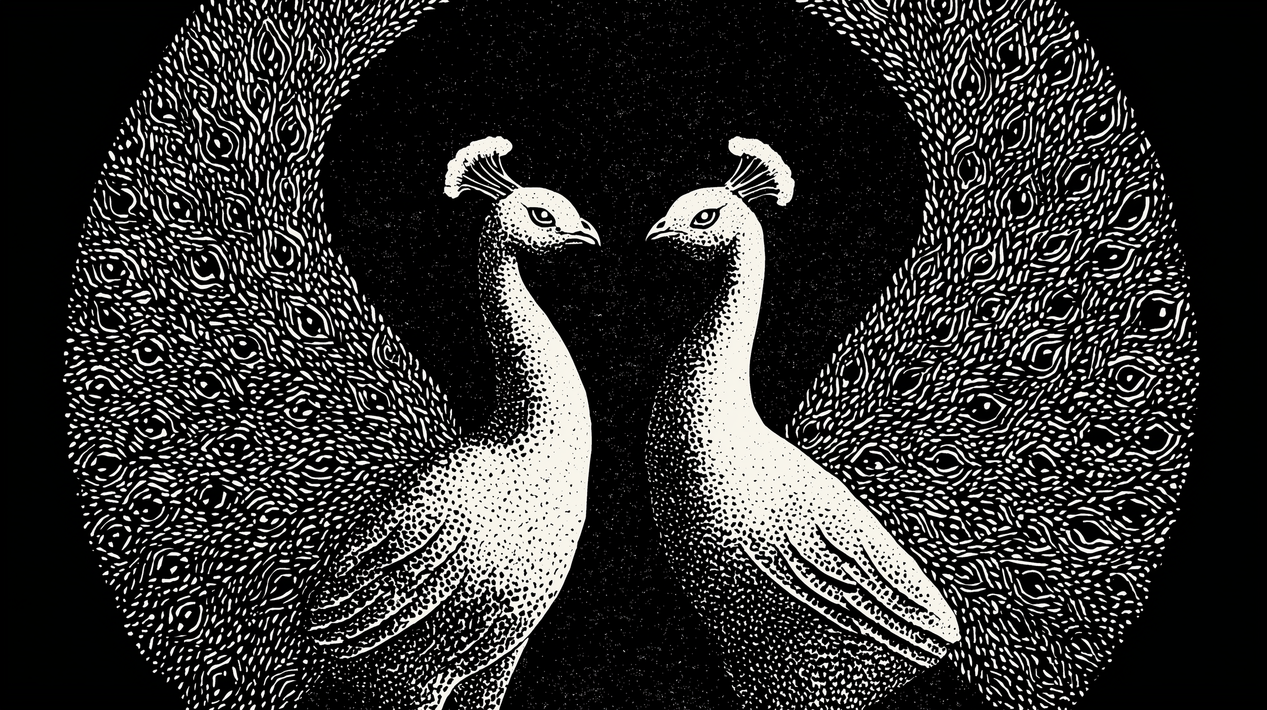
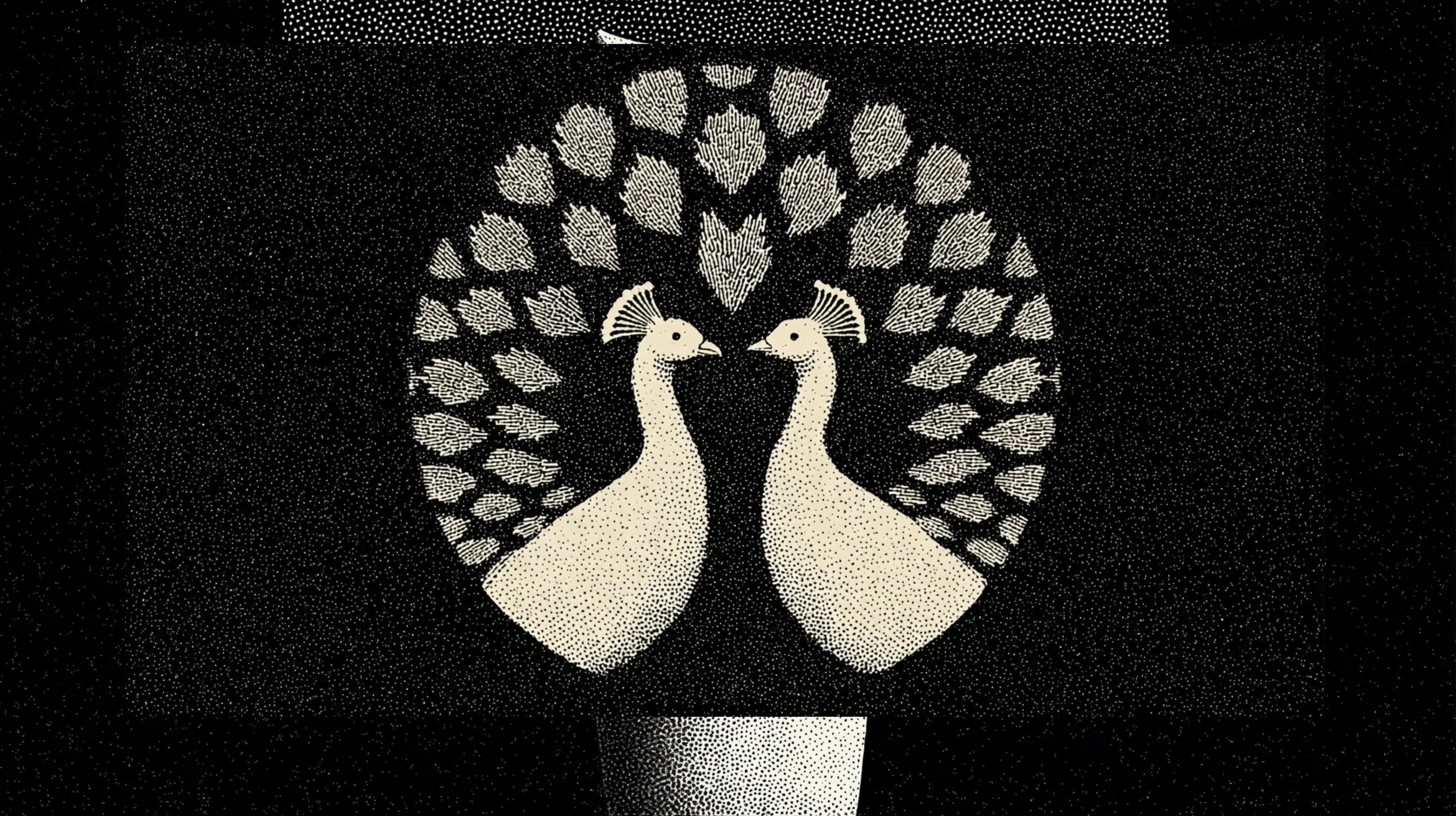
"Stamp": This concept drew inspiration from traditional Japanese "stamp" aesthetics, featuring a vertical logotype for "TSURU COFFEE" and intricate, circular illustrations of cranes or peacocks. This approach aimed for a sense of heritage and precision.
Origami": This concept explored geometric, folded bird shapes, reflecting the art of origami. It featured bold, colorful abstract patterns on packaging, with the "TSURU" name presented horizontally. This concept emphasized modernity and artistic expression.
"Minimal": A clean, minimalist approach that highlighted simplicity and sophistication. This concept featured a square logo with the letters "TSURU" arranged vertically within it, complemented by subtle geometric bird motifs.
Design Stage: Forging the Future
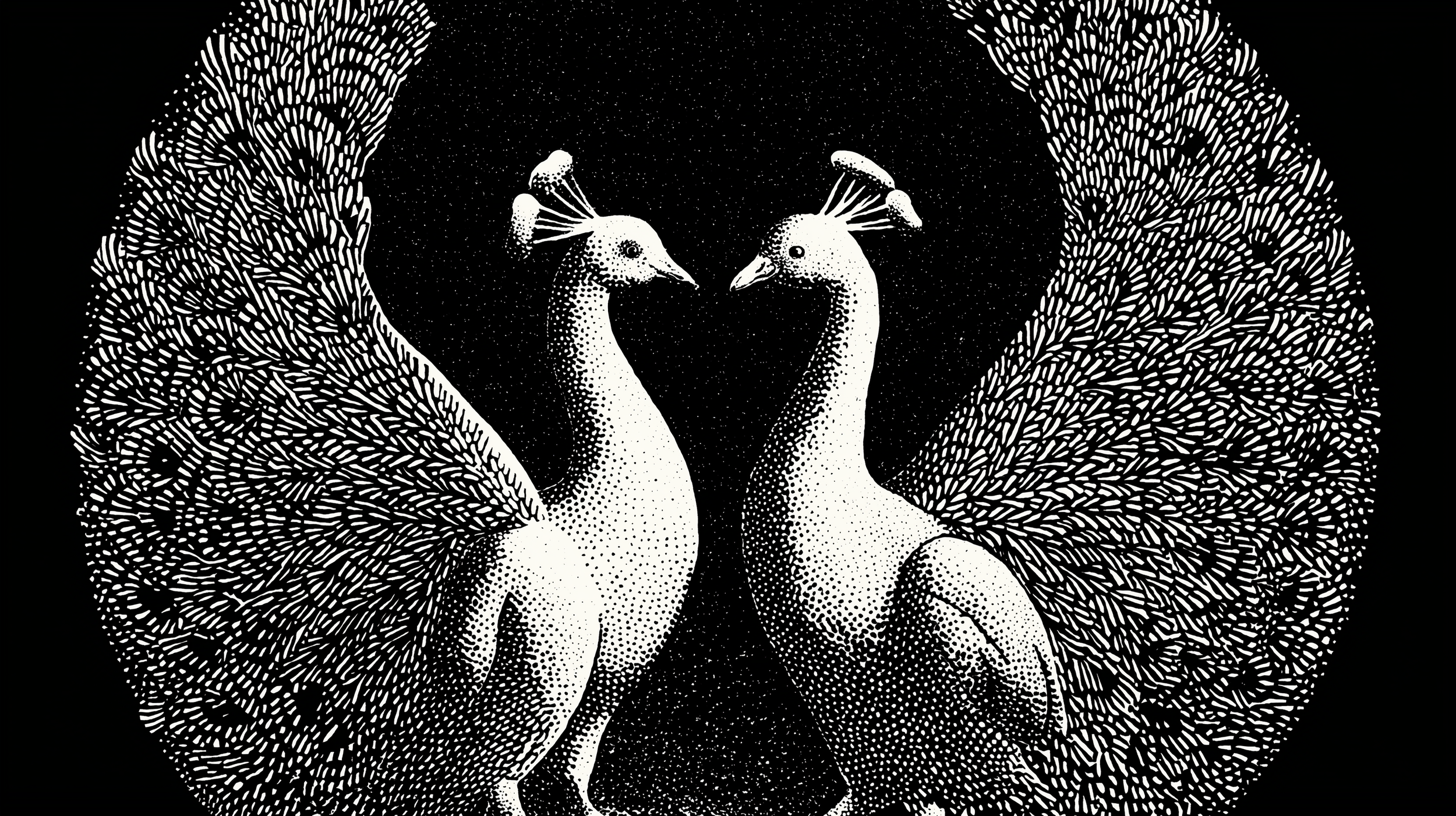
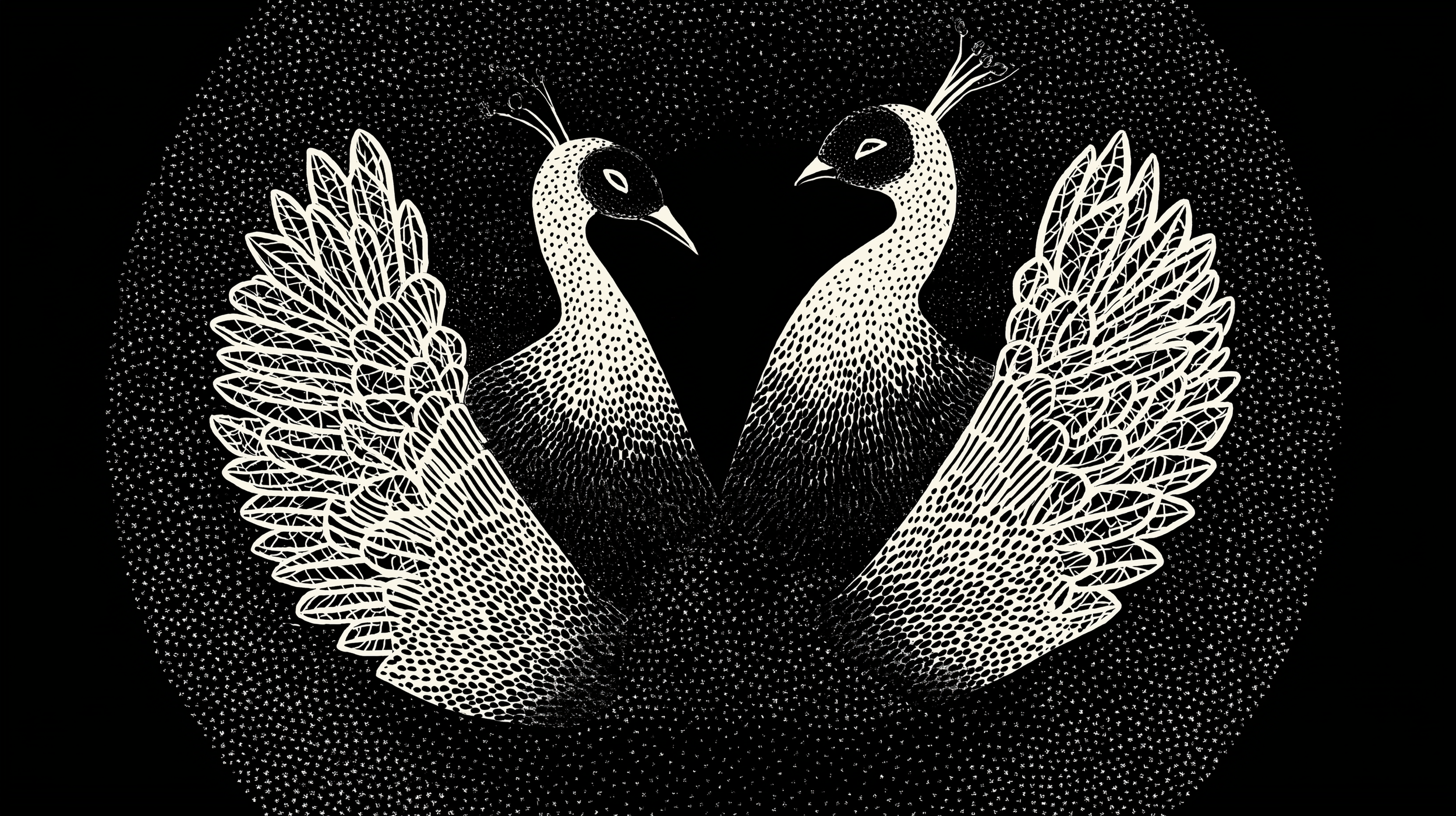
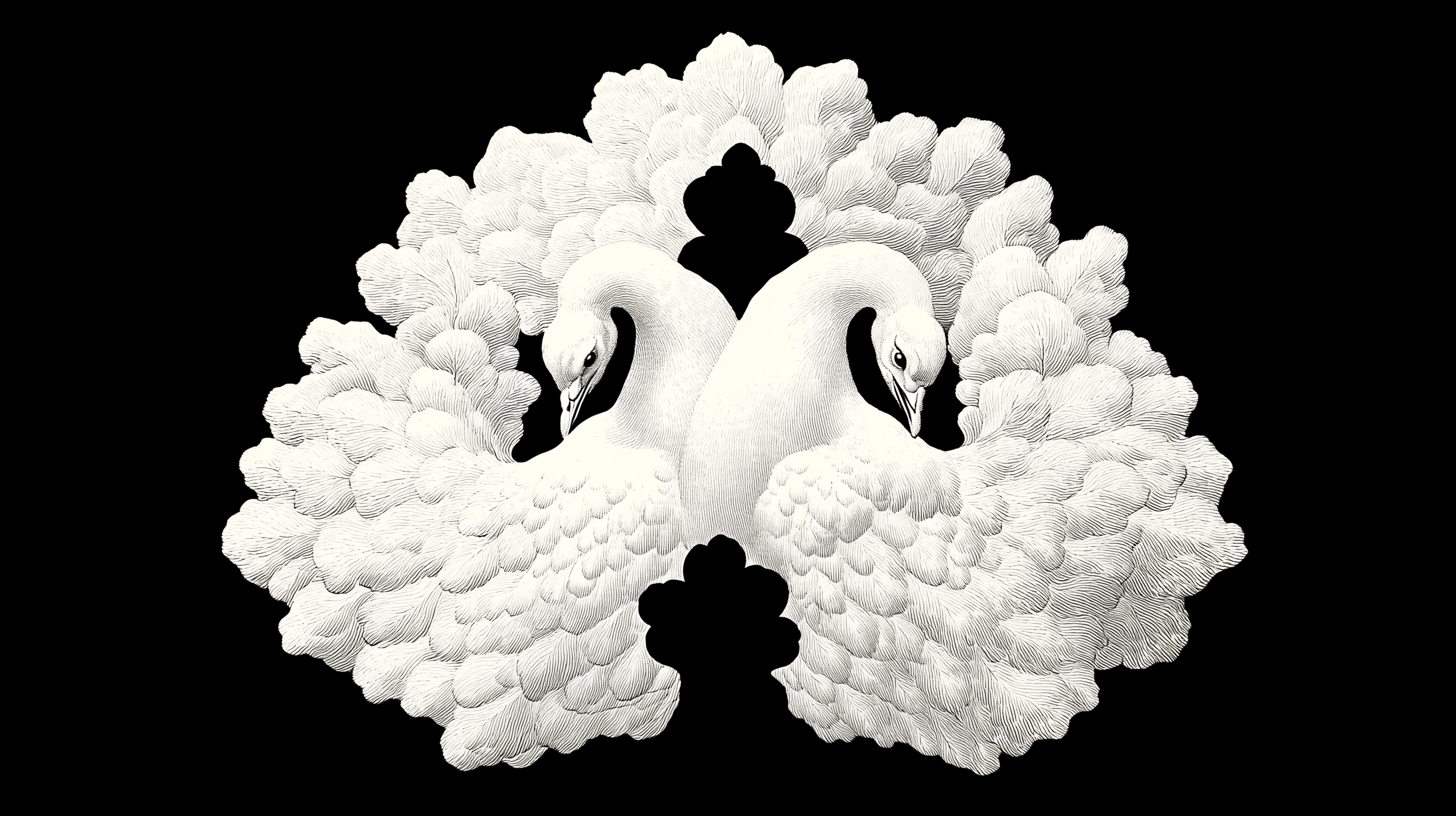
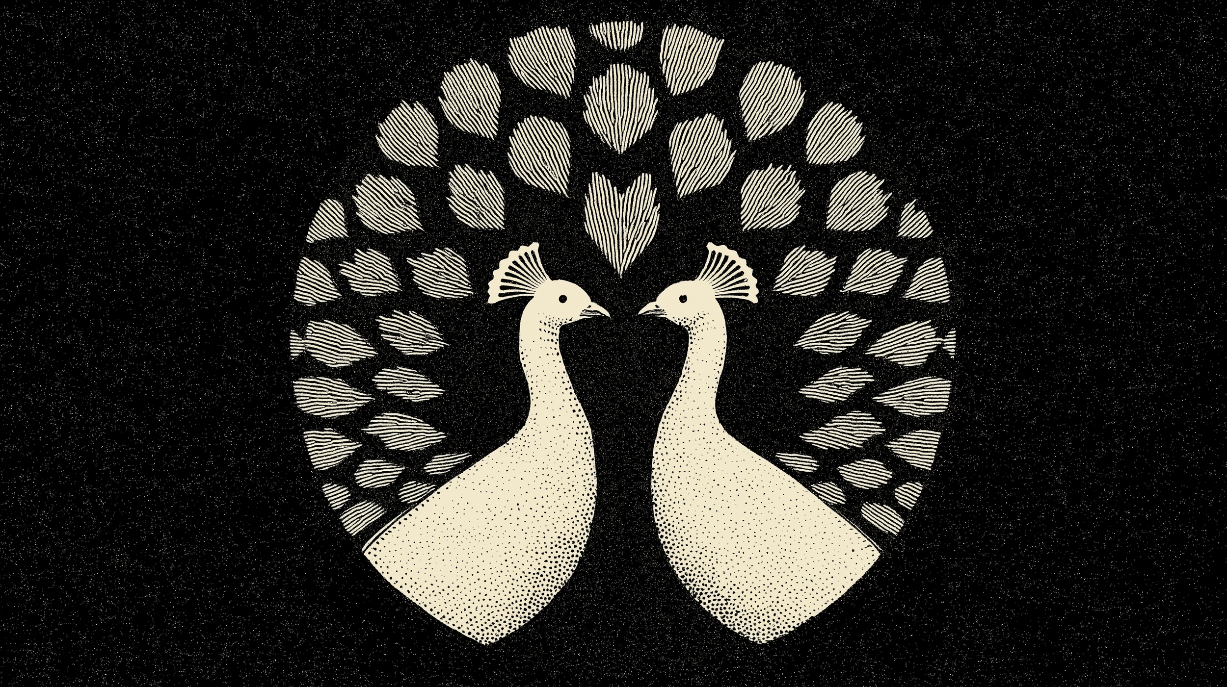
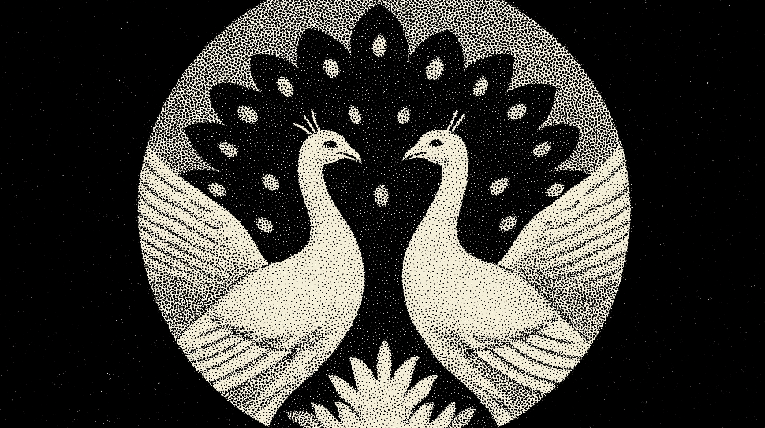
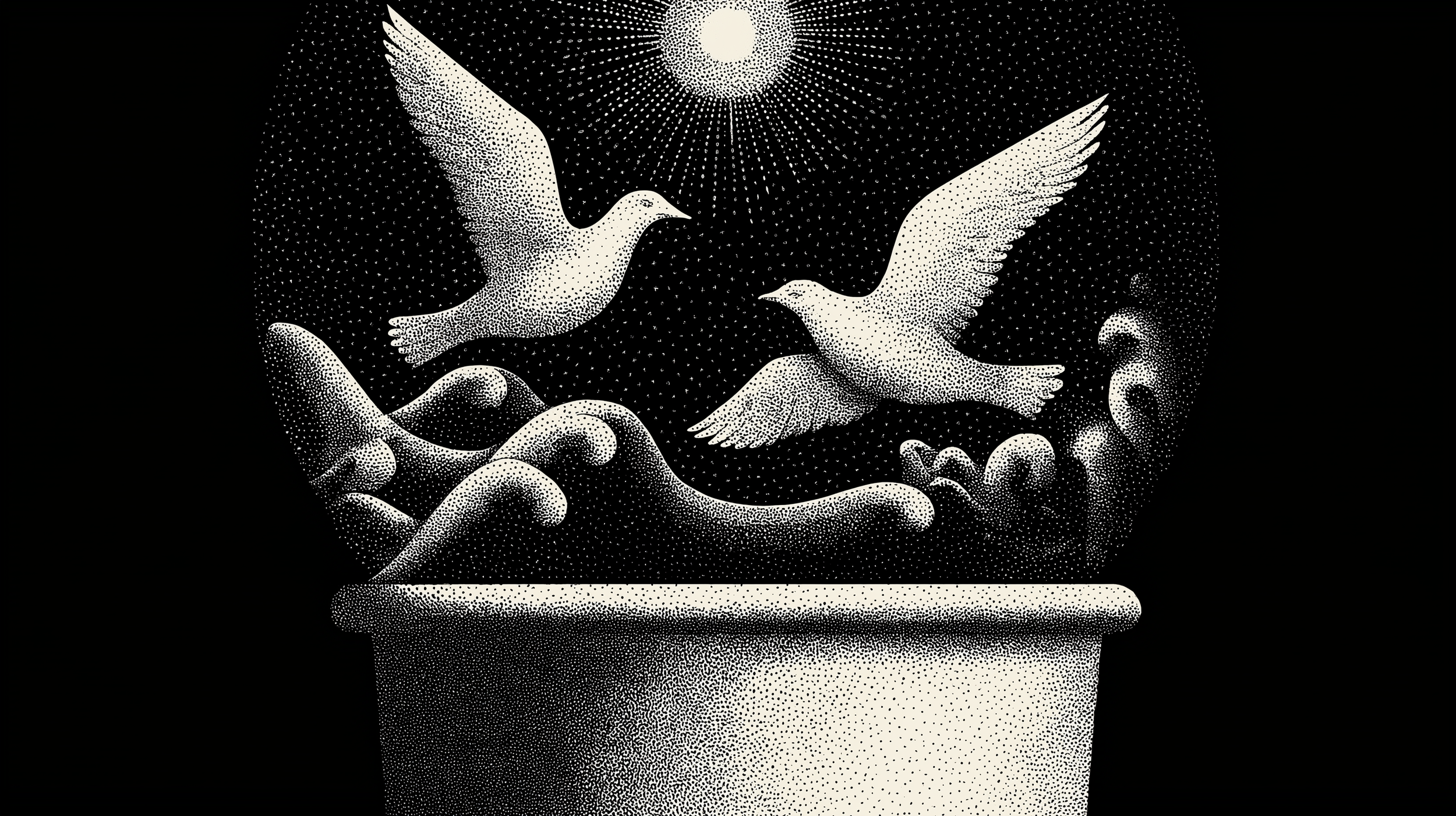
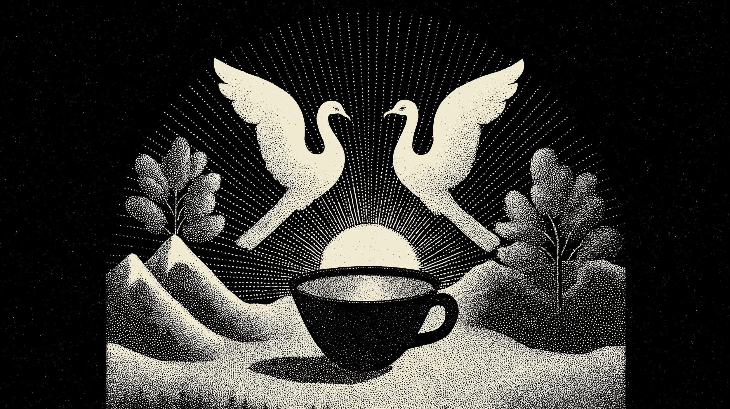
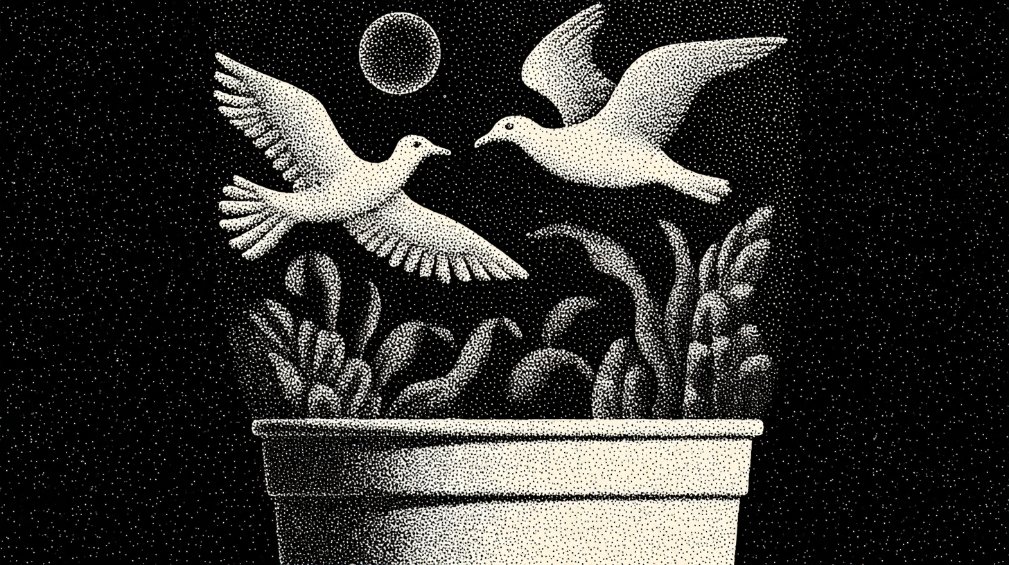
The chosen design direction for Tsuru Coffee masterfully blends classic elegance with a modern aesthetic, focusing on the powerful symbolism of two peacocks or birds facing each other, often within a circular or organic frame.
This imagery visually represents the core "birds of a feather" idea – that a diverse group of people can find common ground and support through shared ritual, even if they don't always look alike.

Key elements of the Tsuru brand identity include: brand identity, brand language and critical rollout applications. The new brand established a system for all print, digital and environmental touch points. The project scope included
Logotype: A distinctive vertical logotype spelling "TSURU" in bold, stylized capital letters, designed to be impactful and memorable across various applications.
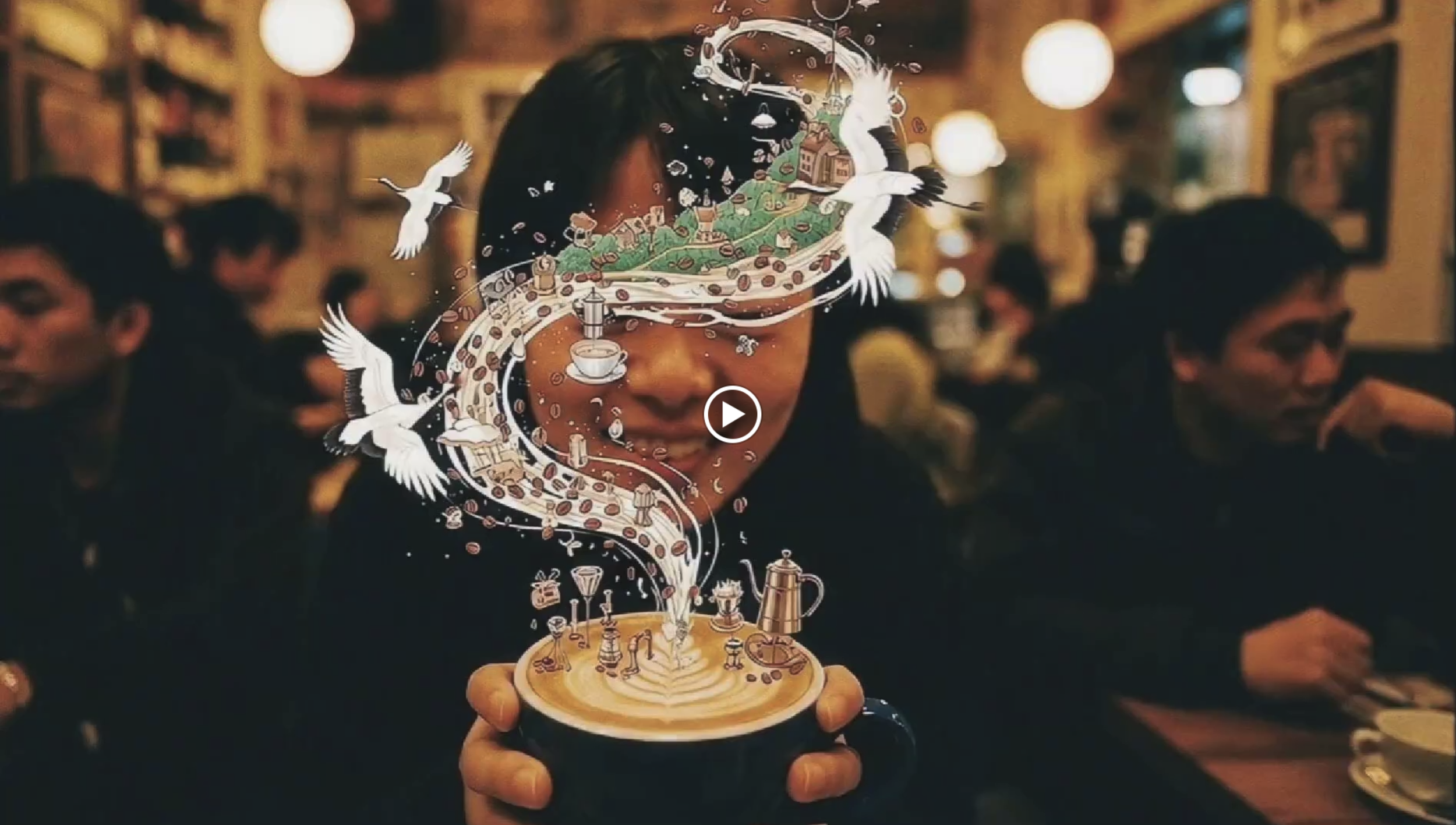
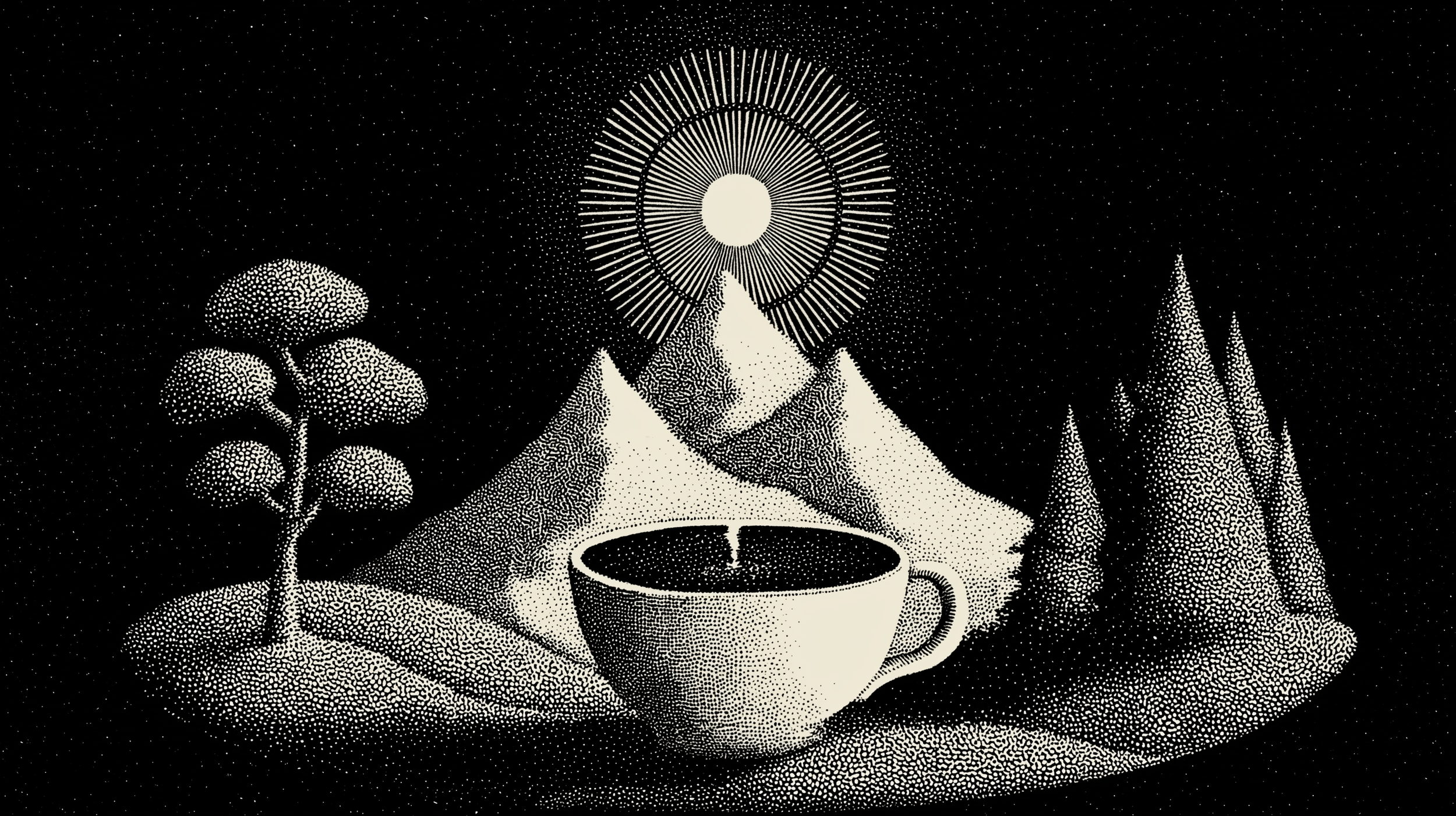
Symbolism & Imagery: The repeated motif of two peacocks or birds symbolizes connection, community, and the idea that "birds of a feather don't always look alike". Other symbolic elements include coffee cups, landscapes, and rising suns, integrating the coffee experience with a sense of place and new beginnings.
Color Palette: Primarily monochromatic with subtle, warm tones, reflecting the cozy and inviting atmosphere of a coffee shop. The use of dark backgrounds with light, detailed illustrations creates a sophisticated and timeless look.
Packaging Design: The brand identity extends seamlessly to packaging, with elegant coffee bags and cups featuring the prominent peacock/bird motif and the vertical Tsuru logotype. Coasters also feature the bird imagery, enhancing the in-cafe experience.
Environmental Applications: The brand's aesthetic is designed to translate into the physical space of the coffee shop, creating a distinct and welcoming environment.
The Third Place" Narrative: The brand concept is underpinned by the idea of Tsuru as "The Third Place," a short film concept illustrating how the coffee shop acts as a haven from the outside world, fostering genuine connections among diverse individuals. The visual style for this narrative mixes vibrant city scenes with warm, stable coffee shop interiors.


Impact & Future Positioning
Brand Strategy & Concept Development: Development of "Stamp," "Origami," and "Minimal" concepts, leading to the final "Birds of a Feather" concept.
Logotype and Brand Symbol: Development of the vertical Tsuru logotype and the iconic peacock/bird illustrations.
Packaging Design: Coffee bags, cups, and coasters showcasing the new brand identity.
Environmental Graphics: Concepts for the physical coffee shop space and signage.
Video Content Concept: "The Third Place" short film concept, defining the brand's narrative and visual storytelling, including visual style, sound design, and themes.
Brand Elements & Guidelines: Establishing typographic, photographic, and illustrative styles.
Projects and Deliverables
Tsuru Coffee's new brand identity is bold and transformative, positioned to cultivate a strong sense of community and connection. By focusing on human connection and shared experiences, Tsuru aims to be more than just a coffee shop; it aims to be a vital gathering place. This new brand, defined by its purpose and innovative design, is set to create a distinctive presence in the coffee market, inviting everyone to find their anchor in the daily ritual of coffee.
‘Project Icon’ extended across across the entire organisation. We created digital screen assets for all Telstra products/and services.
Working directly with senior management, Lucas helped Telstra realize the potential of high resolution new screen technologys.
‘Project Icon’ was extended into Telstra owned companies including BigPond, Foxtel, Yellow, White Pages, Trading Post, Sensis, Whereis, and Citysearch .