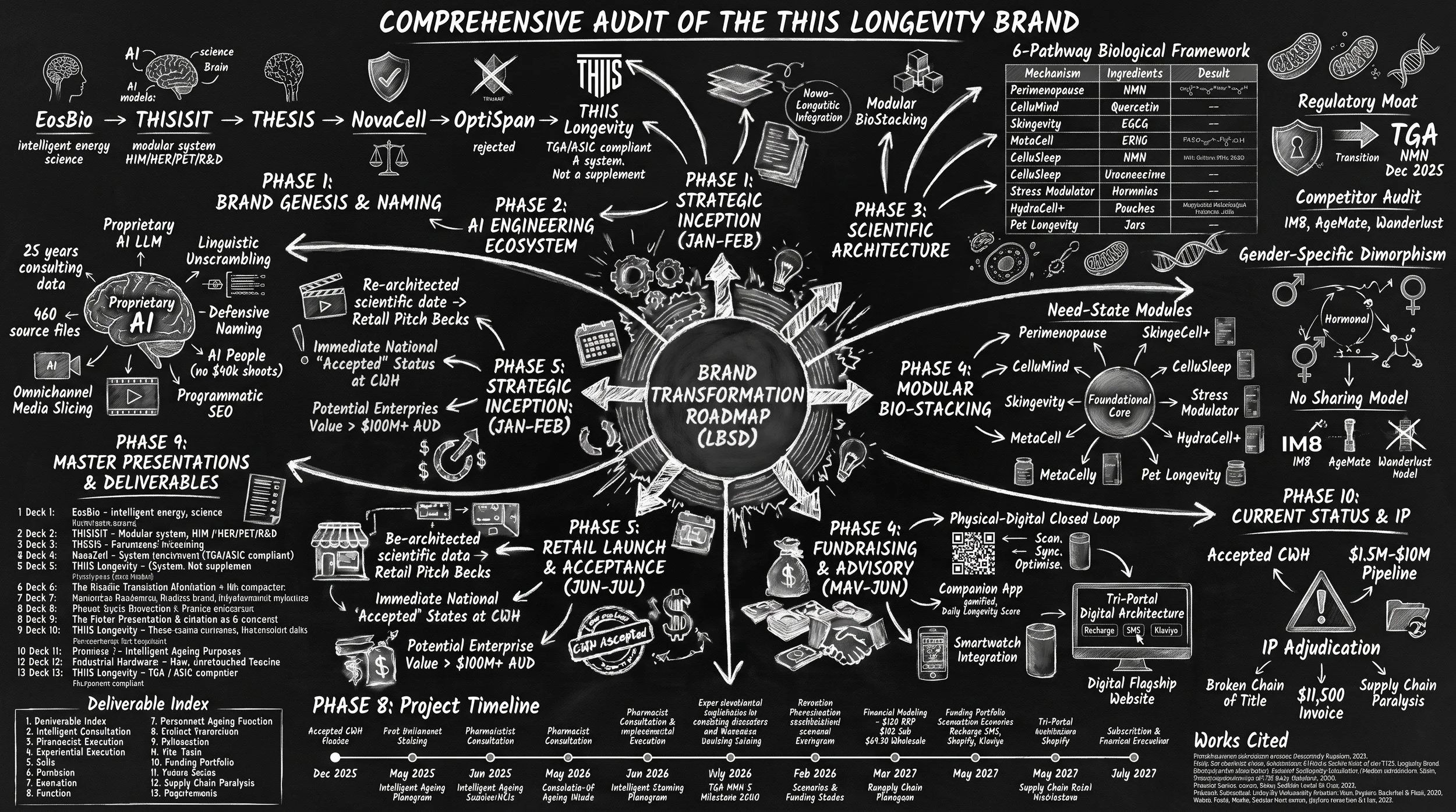
Executive OverviewThe development and commercialization of a new brand within the fast-moving consumer goods and nutraceutical sectors require rigorous alignment between the founder's scientific vision, the creative execution of the brand architecture, and the commercial realities of the retail market. The THIIS Longevity project represents a highly ambitious endeavor to shift the consumer paradigm from reactive symptom management to proactive, system-wide healthspan optimization. Transitioning a complex neurocognitive framework into a consumable, premium retail brand is fraught with communication challenges, requiring a precise visual and linguistic identity. The contemporary consumer landscape demands absolute transparency, clinical efficacy, and a highly sophisticated aesthetic that separates true scientific interventions from commoditized wellness trends.
Solving the Zero State:
Engineering a $100M Brand with a start up budget.
A Case Study in Brand Strategy, Design & Commercial De-risking
-
Stakeholder diagnostics, brand workshops, core narrative synthesis, and creation of the Strategic Brand Positioning Blueprint.
Architecture & IPConceptualization of 80+ names, trademark audits, and structural brand architecture development.
-
Design Systems
Translating biological science into visual identity, multiple brands createted before client proceeded with this , icon libraries, GTM copy playbook, and premium packaging concepts.
Narrative-focused CWH pitch deck, updated from rounds of client feedback.
Critical presentations to investors, major Australian retail groups, partners and suppliers included
Strategic Inception & Brand Identity (January - February 2026)Establishing the Category Disruption Thesis.Product Architecture & Structural Engineering (March - April 2026). Engineering the Modular Ecosystem and Packaging Innovation.
Chemist Warehouse (CWH) GTM & Planogram Merchandising (April - May 2026)
Fundraising, Strategic Advisory & Networking (May - June 2026)
CWH Acceptance (June - July 2026)
-
Final Chemist Warehouse Prep
Re-architecting strategy deck, final retail planograms, on-counter script mat mockups, and "Cheat Sheets" for the CWH team.

Background
+Zero brand identity.
+Zero GTM Strategy.
+Zero Consumer Awareness.
+Zero brand strategy.
+Zero retail-ready assets.
=Zero investor capital.
The Endpoint: Un-fundable Without Brand.
A clinical formulation, an academic and scientific description had reached a critical commercial endpoint. Investors and retail partners required a brand and understanding of the consumer market.
Strategic requirements for the projects
-
Establish and define a new catgeory for the brand. The Narrative Shift: Pivot immediately from reactive symptom management (legacy supplement market) to the macro-consumer trend of proactive healthspan optimization.1
The Problem: "Pill fatigue" and the clutter of generic wellness brands that lack clinical authority.1
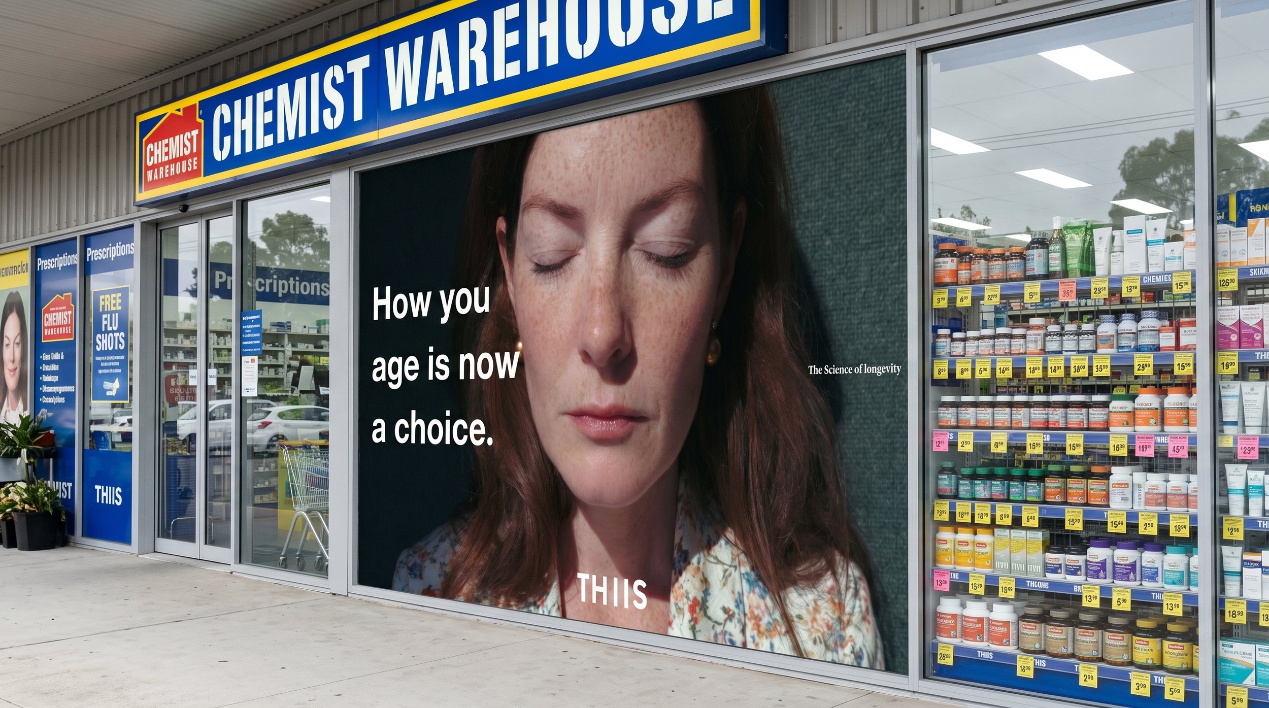
The Opportunity: Capitalize on the shift where "how you age is now a choice"
-
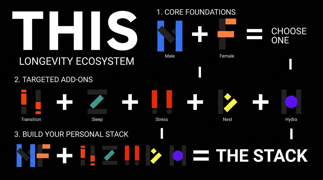
The Concept: Introduce the modular "Bio-Stacking" framework.1
The System: Explain the "Foundational Core" and "Need-State Modules" (e.g., CelluSleep, HydraCell+).1
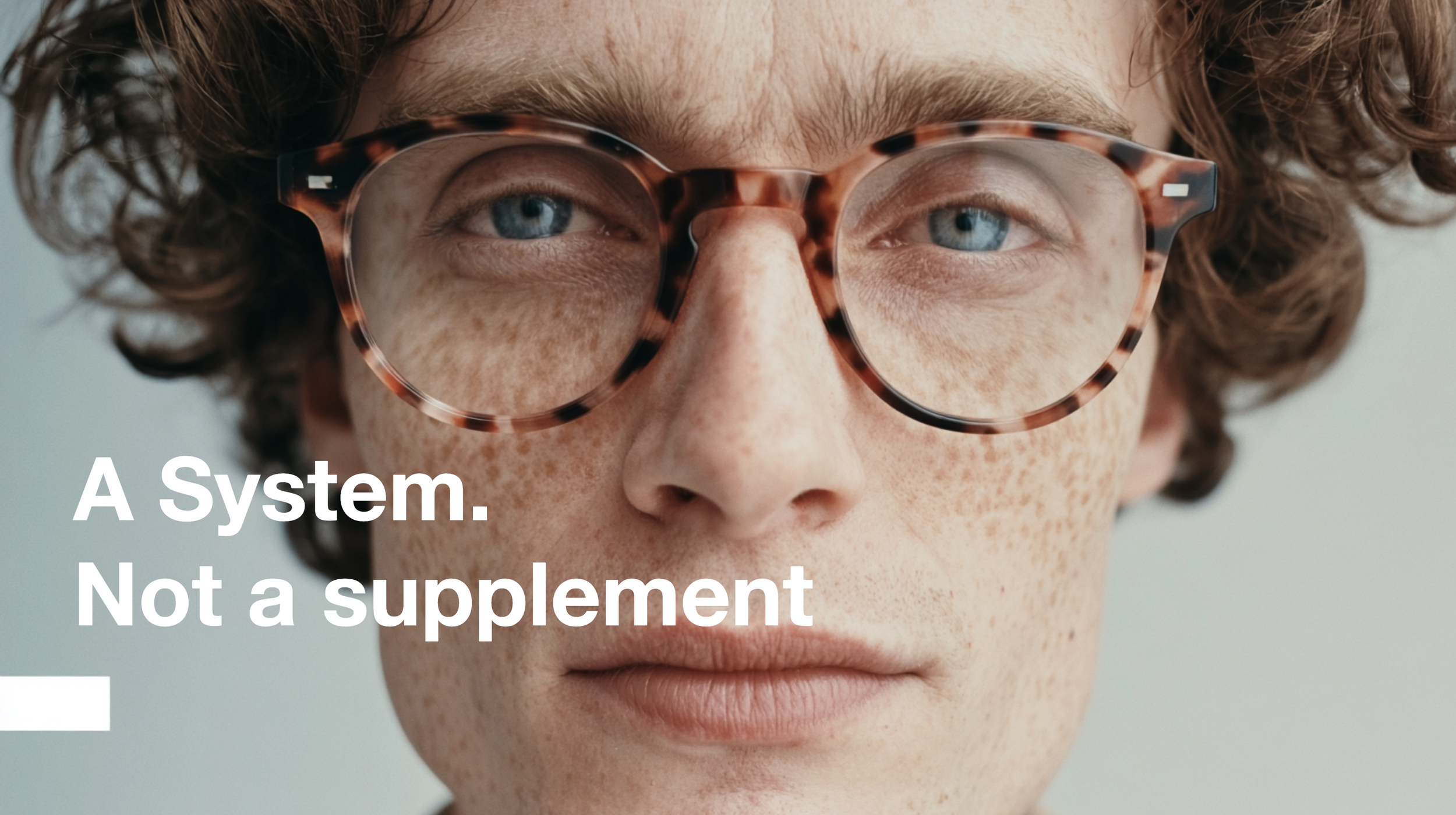
The Mechanic: Emphasize "Precision, not guesswork." This is asystem, not a supplement.1
The Retail Execution: Explicitly visualize the "Step 1 / Step2" merchandising directive to reduce cognitive friction at the shelf.1
-
Visual Strategy: Present the brand in designer, minimalist—stark, clean, and considered wway
The Packaging "Beauty / Cosmetic Brand Play": Showcase the metallic hardware and premium finish. Position it alongside prestige beauty, not as a commodity pharmacy product.
Typographical Identity: Highlight the "Pause" concept. It is not just a logo; it is a cultural statement about intentionality and taking control of one's biological timeline.
-
The Scientific Anchor: Lean into the founder's twenty-five years of neurocognitive expertise
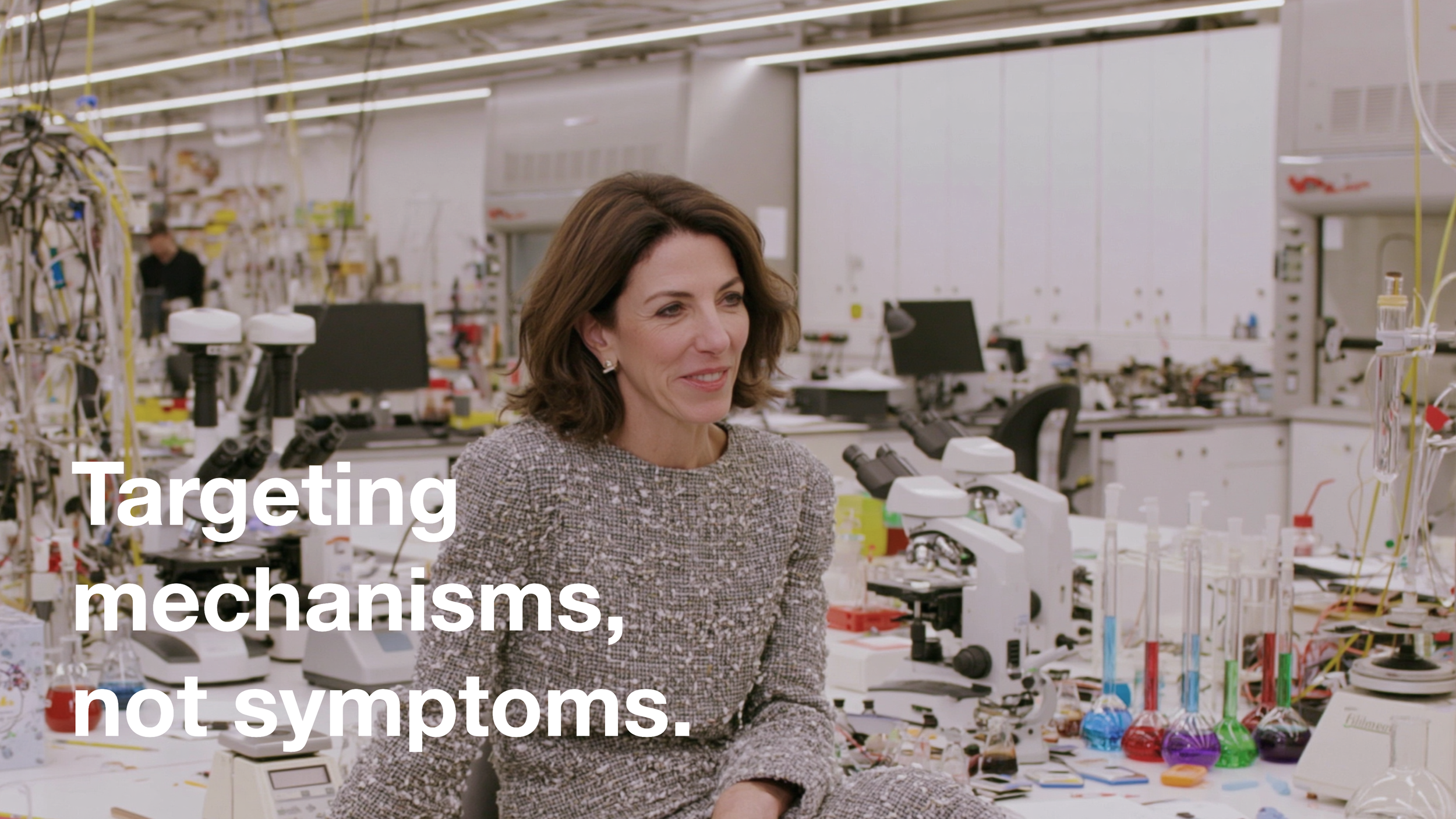
Linguistic Authority: Frame the brand as "Bio-hacking, but by scientists." Use the validated messaging: "Targeting mechanisms, not symptoms"
De-risking the Asset: Highlight the regulatory rigor (TGA/GMP compliance) as a competitive wedge against unregulated online "social media brands".
Retail Viability: Reference the successful conceptual validation by retail specialists and theconfirmation that the brand can support premium price points and high basket sizes
-
We offer flexible pricing based on project type and complexity. After an initial conversation, we’ll provide a transparent quote with no hidden costs.
Redefining Modern Human Performance.
LBSD initiated a strategic manifesto to engineer a total re-evaluation of the consumer's relationship with aging.
We actively rejected the passive 'sick-care' model to engage the modern 'healthspan' shopper.
A system no a supplement
Targeting mechanisms, not symptoms.
Category Disruption Matrix
The Old VMS
THIIS Platform
How do I get started?
Premium tech-forward packs
Fragmented single-ingredients
Modular biological ecosystem.
Vague 'wellness fluff'
Clinical exactness & regulatory rigor.
Passive, reactive health
'Sexy, contemporary, authentic science geek."
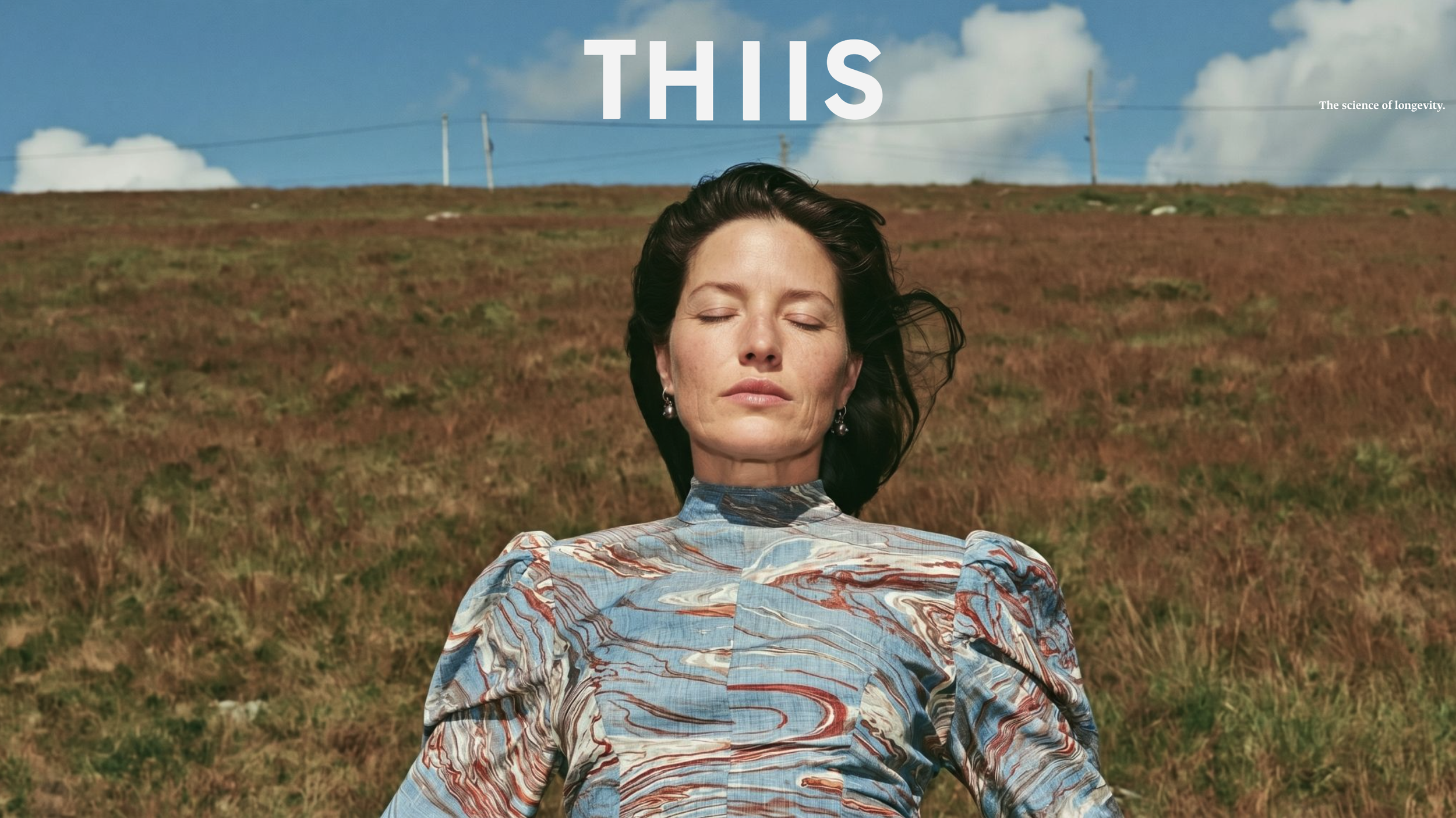
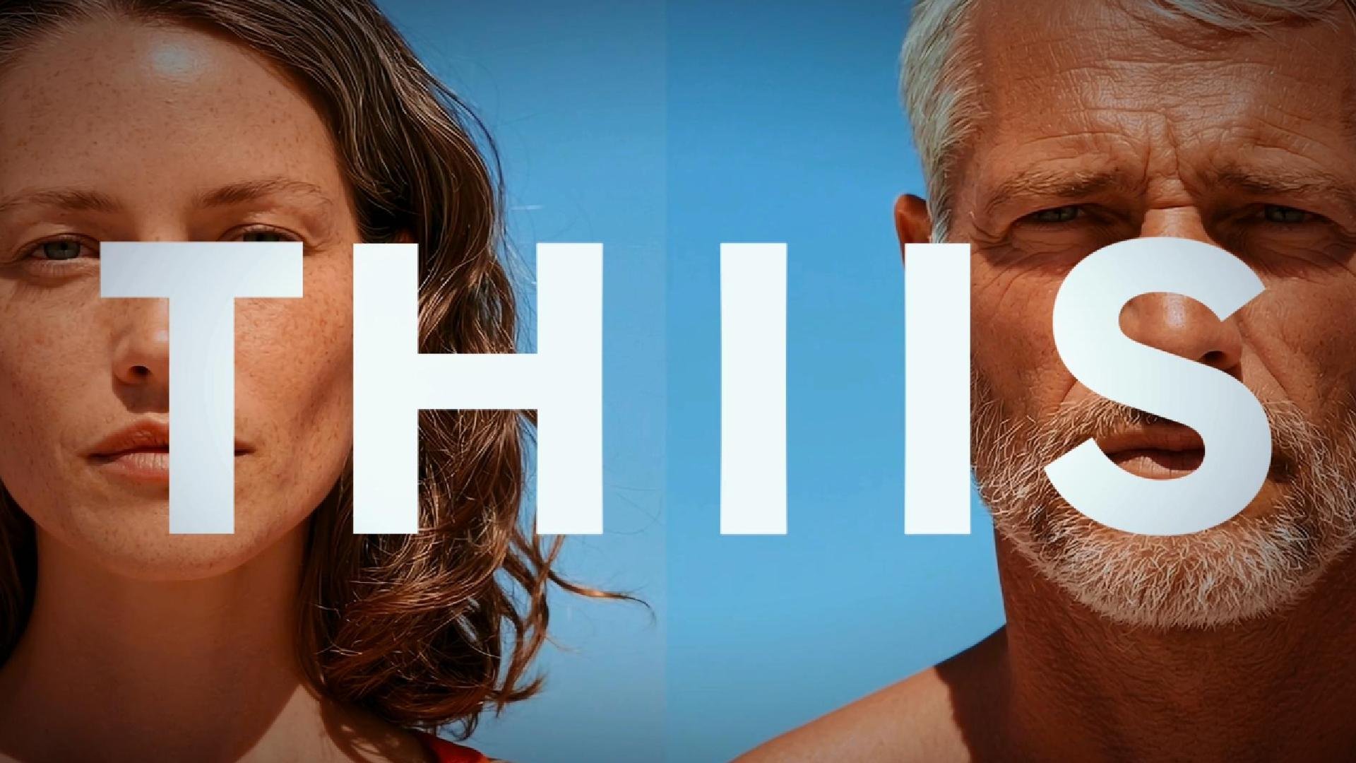
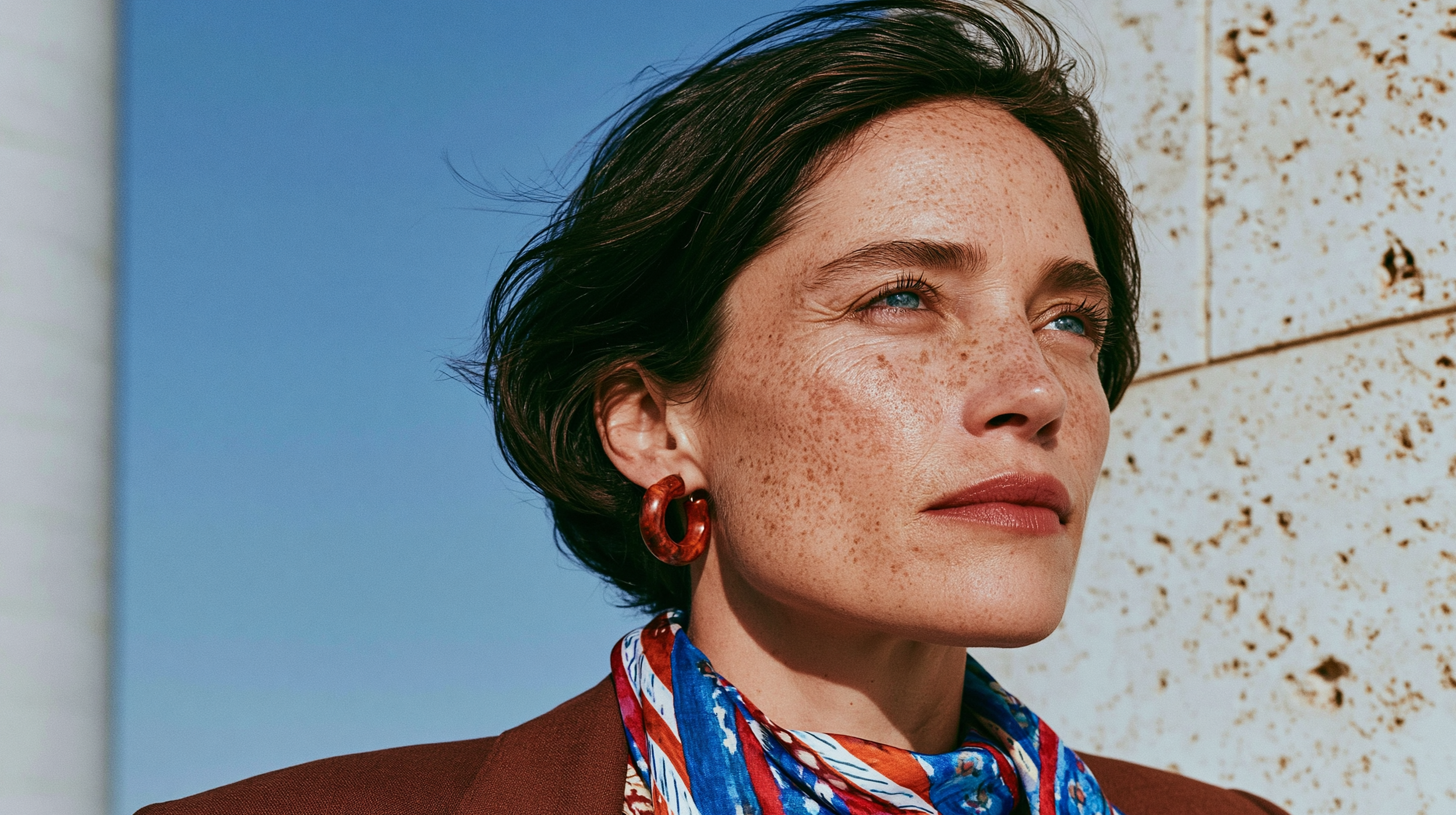
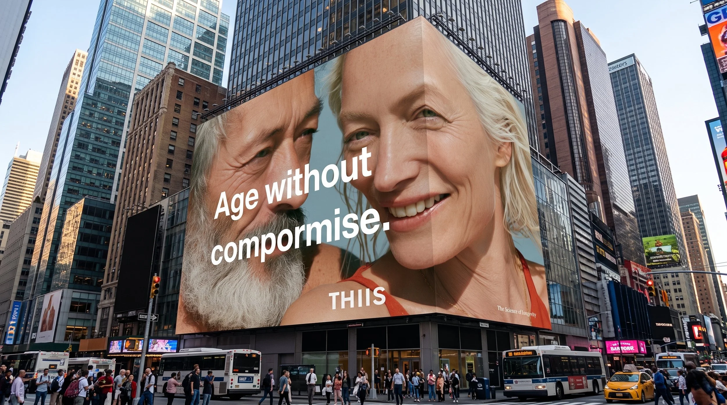
Photography: The depiction of people serves to illustrate abstract biological benefits and establish an aspirational, high-performance category standard.
By completely abandoning the predictable visual codes of the VMS (Vitamins, Minerals, Supplements) industry, THIIS redefines how the modern consumer visualizes cellular optimization and longevity. y treating the human form with sophistication and edge, THIIS transforms the consumer's perception: they are not looking at a vitamin consumer contemporary aspiration who has actively chosen to upgrade their cellular software and pause their biological clock
Because cellular energy, mitochondrial repair, and metabolic youth cannot be seen by the naked eye, human portraiture is used as a metaphorical canvas to illustrate these abstract, internal shifts. People are curated to represent the brand’s highly coveted target personas, shifting the product from a general supplement to an active, data-driven lifestyle protocol
.
The Performance Optimizer ("Gen Therapy"): Depicts young, highly driven biohackers focused on proactive cognitive function, cellular optimization, and "fueling the machinery"
.
The System Manager: Features high-income, high-functioning professionals shown in intense, raw moments of physical and mental focus
. They view their bodies as complex biological machines requiring a structured framework for resilience













Video Style
We bring creativity and expertise to everything we do.
Here, creativity meets opportunity. Whatever you're building, we're here to help you take the first step with confidence.
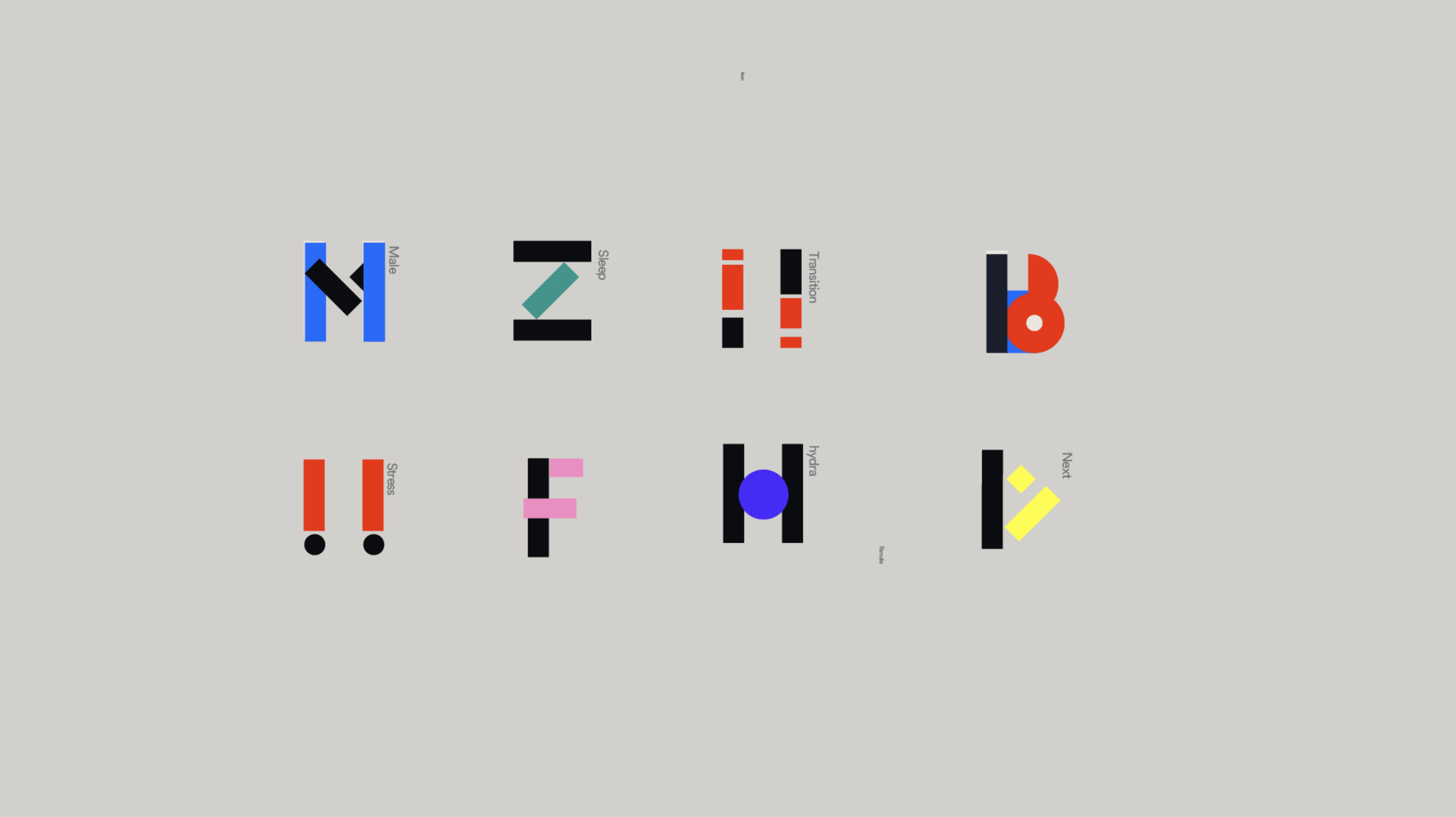
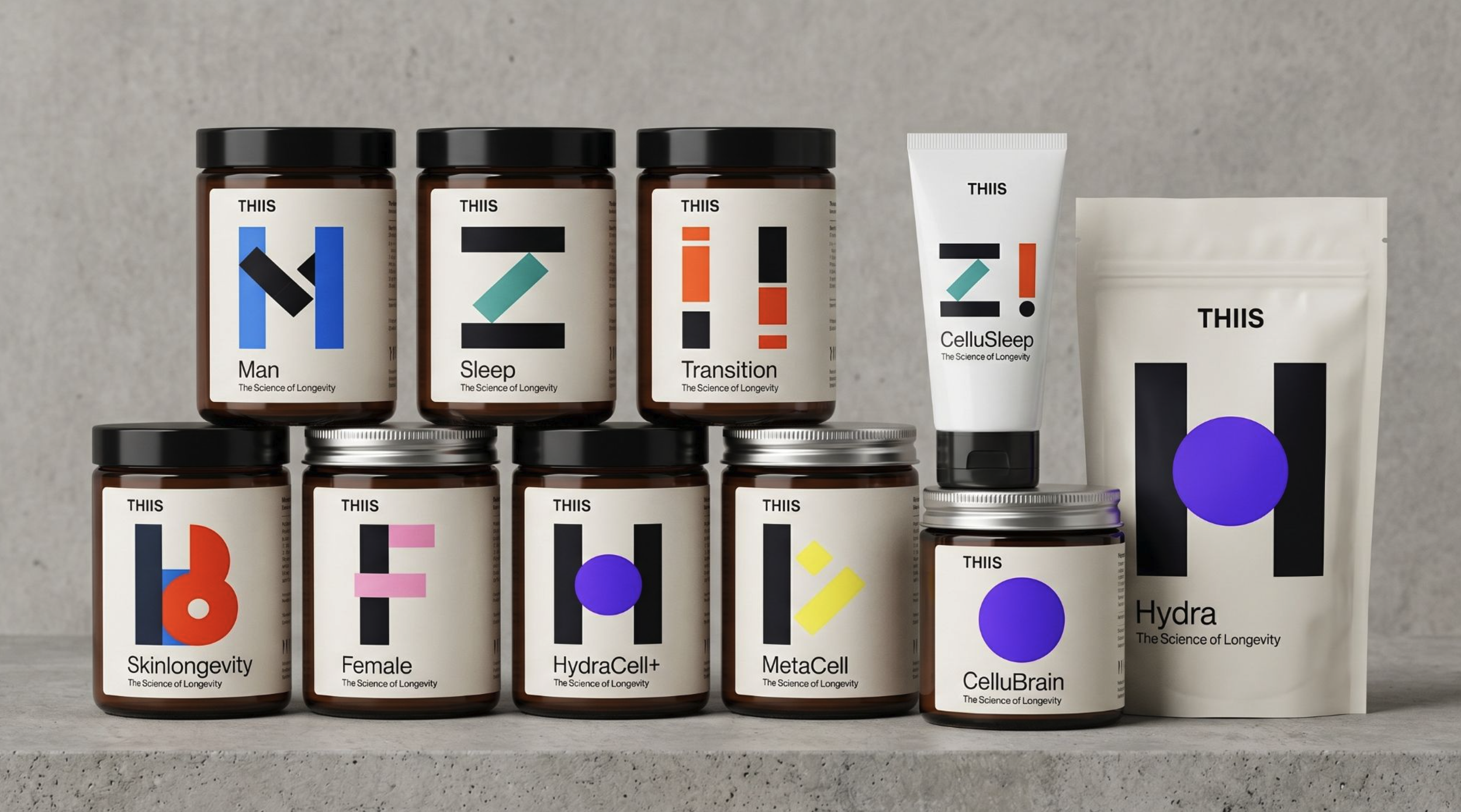
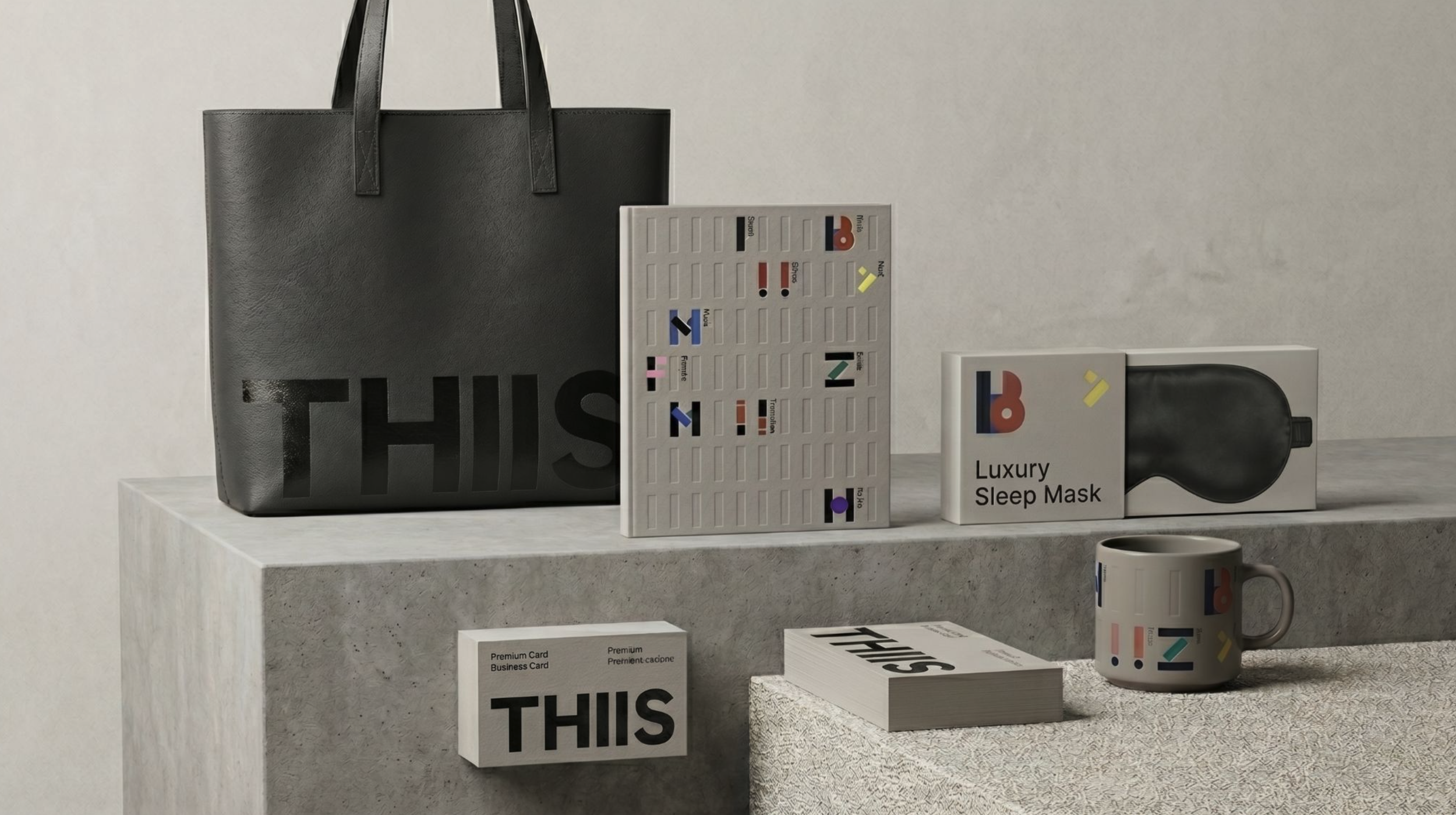
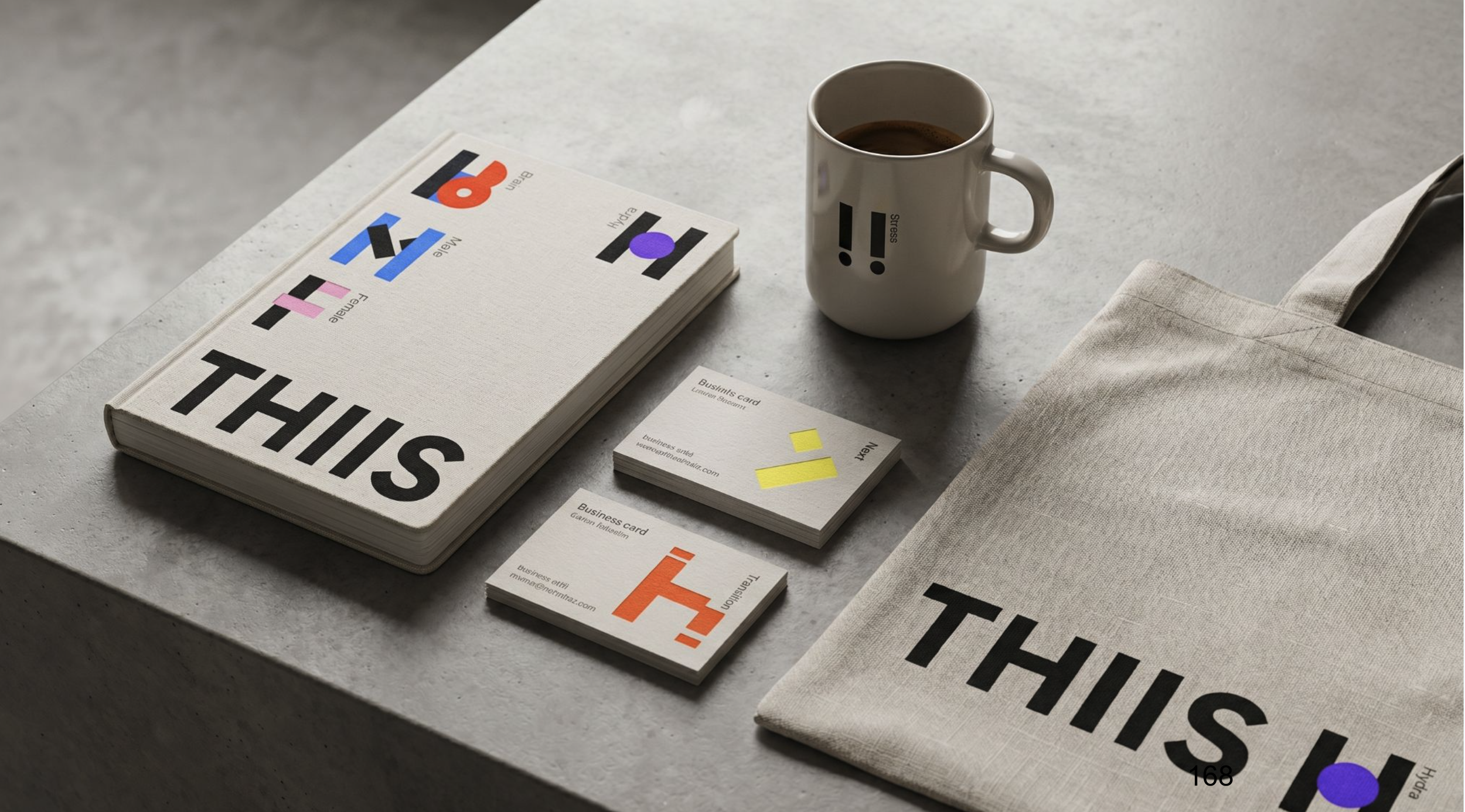
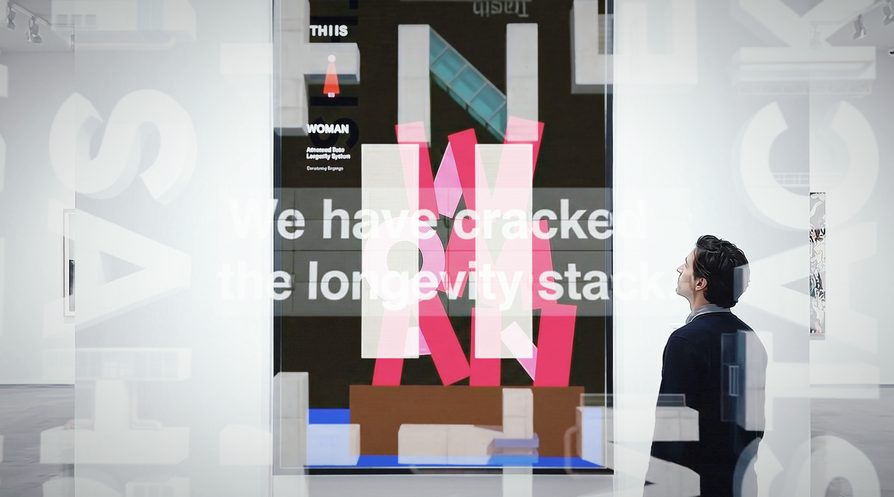
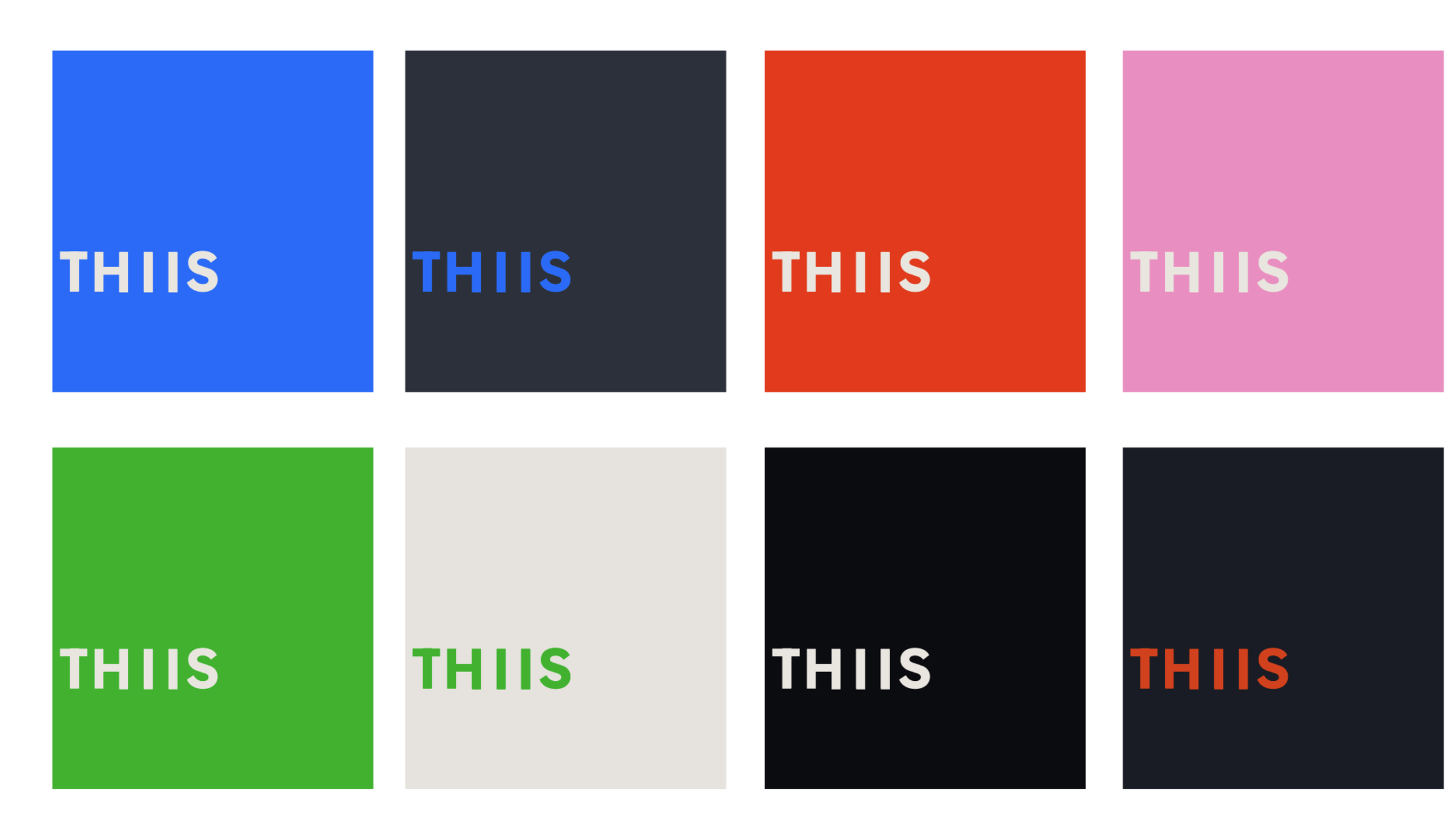
Design Architecture: The Stack. The brand identity acts as a typographic metaphor. The vertical I's in THIIS become a design language for the brand, to communicate system product attributes.
This subtly trains the consumer to view the product not as a standalone pill, but as a foundational core explicitly meant for layering personalized need- state modules.


Built for PossibilityCreate something you're proud of.
Whether you're just starting out or taking things to the next level.
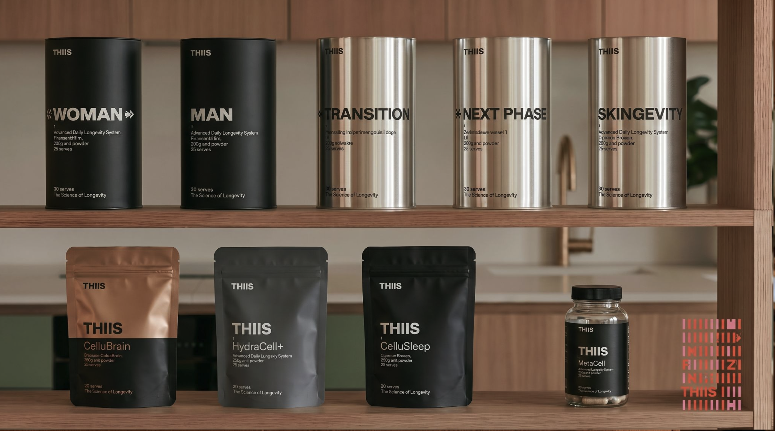
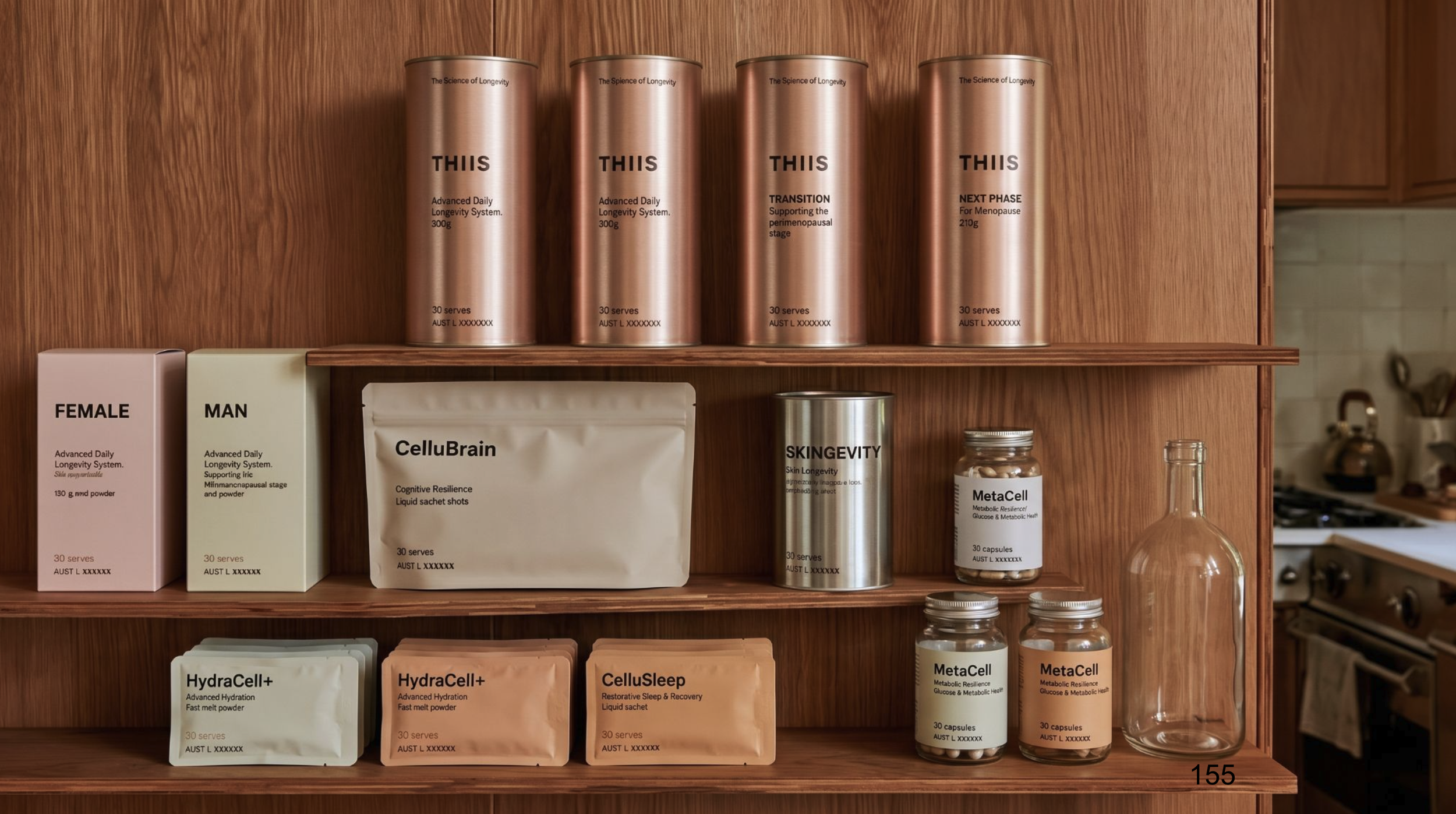
Premium Structural Language. To instantly distance THIIS from the "discount pharmacy" vibration, we deployed sleek, structural metallic canisters in Matte Black and Metallic Silver.
The "Transparent Facts" theme removes the traditional marketing veil. The aggressive, sophisticated aesthetic acts as a visual indicator that the user has graduated from "vitamins" to "longevity science."
The Cellular Software Loop.
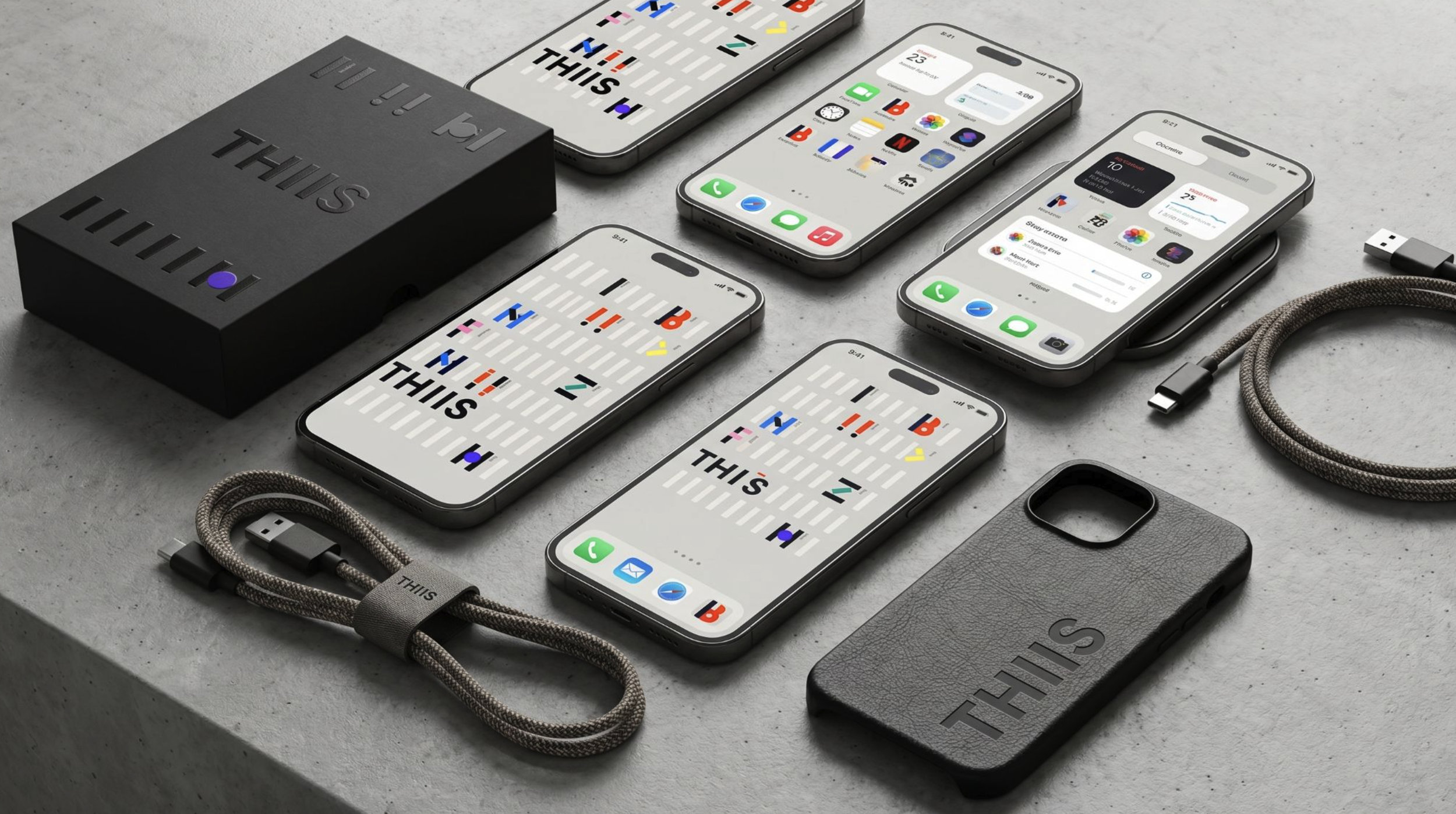
The physical bio-stack is tethered seamlessly to a digital subscription model.
By mirroring the physical packaging within the tracking Ul and integrating a token-gated VIP community framework, THIS successfully transitions one-off retail transactions into sticky Annual Recurring Revenue (ARR).
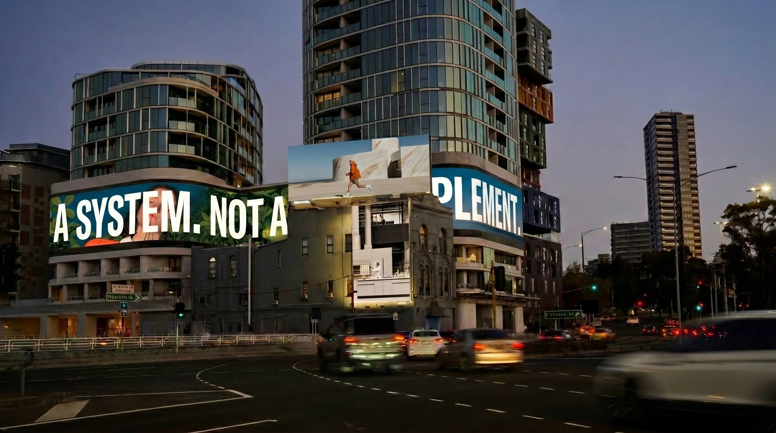
Design Engineering the Basket Multiplier. Because THIIS is positioned as "A system. Not a supplement," shoppers are intrinsically incentivized to build a personalized bio-stack.
This visual and strategic architecture actively cures "pill fatigue." It instantly drives multi-unit companion purchases, locking the consumer into the ecosystem and delivering unparalleled high-margin trade-up for the retailer.
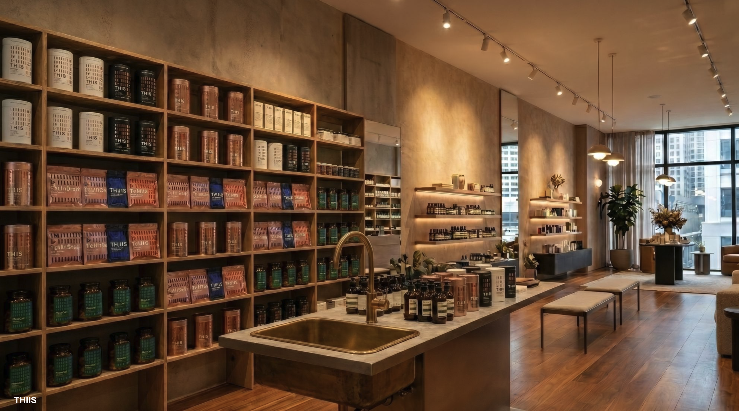
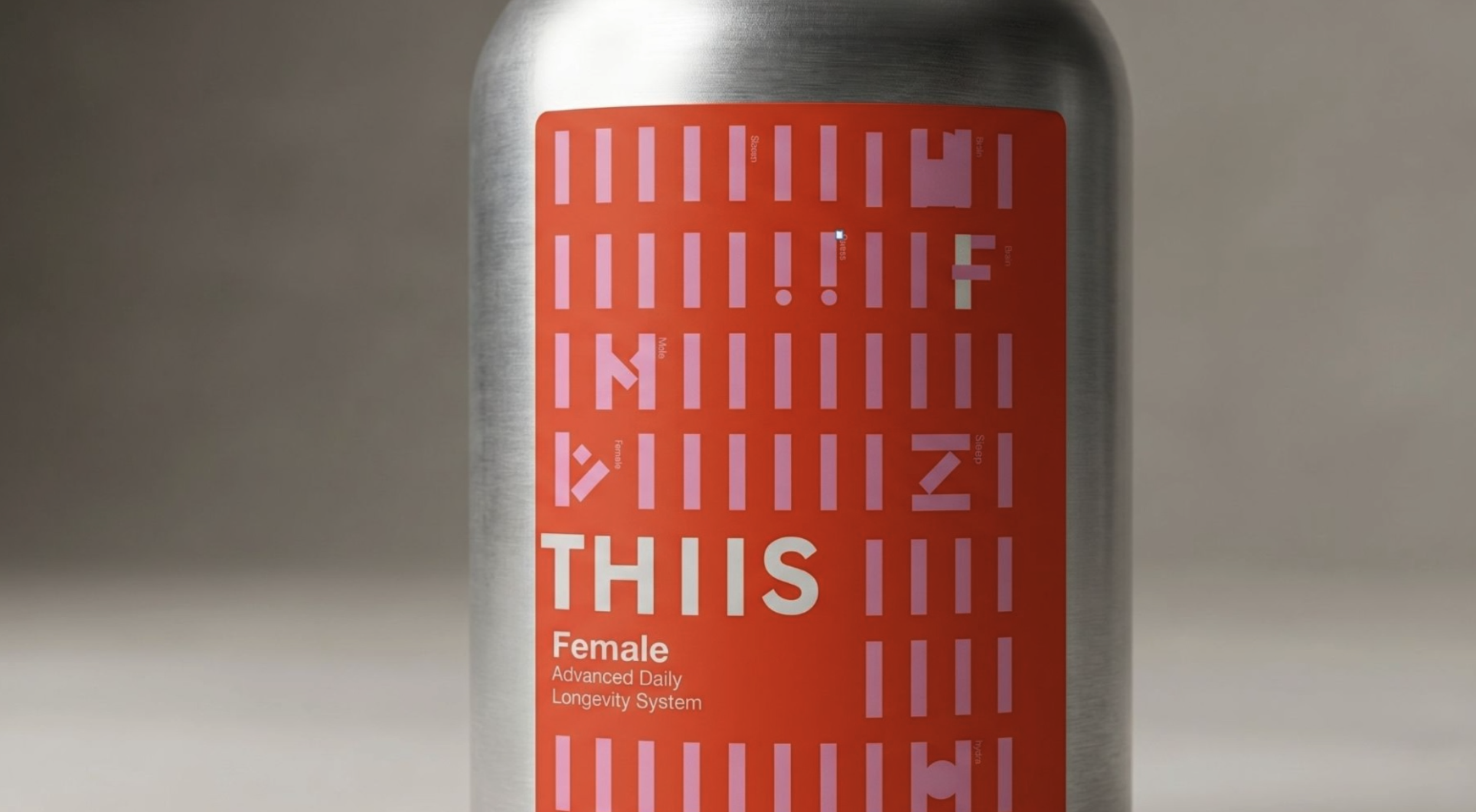
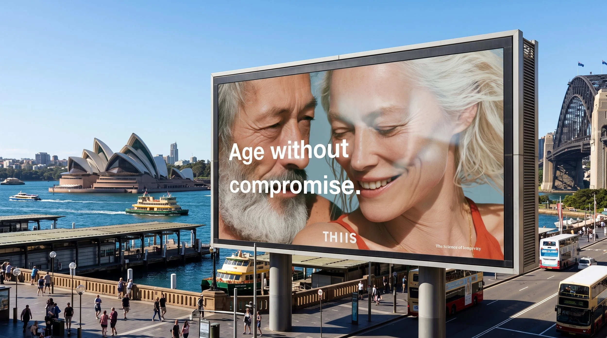
Armed with brand and retail-ready Lucas owned assets, THIIS secured an exclusive national rollout with Australia's largest pharmacy retailer.
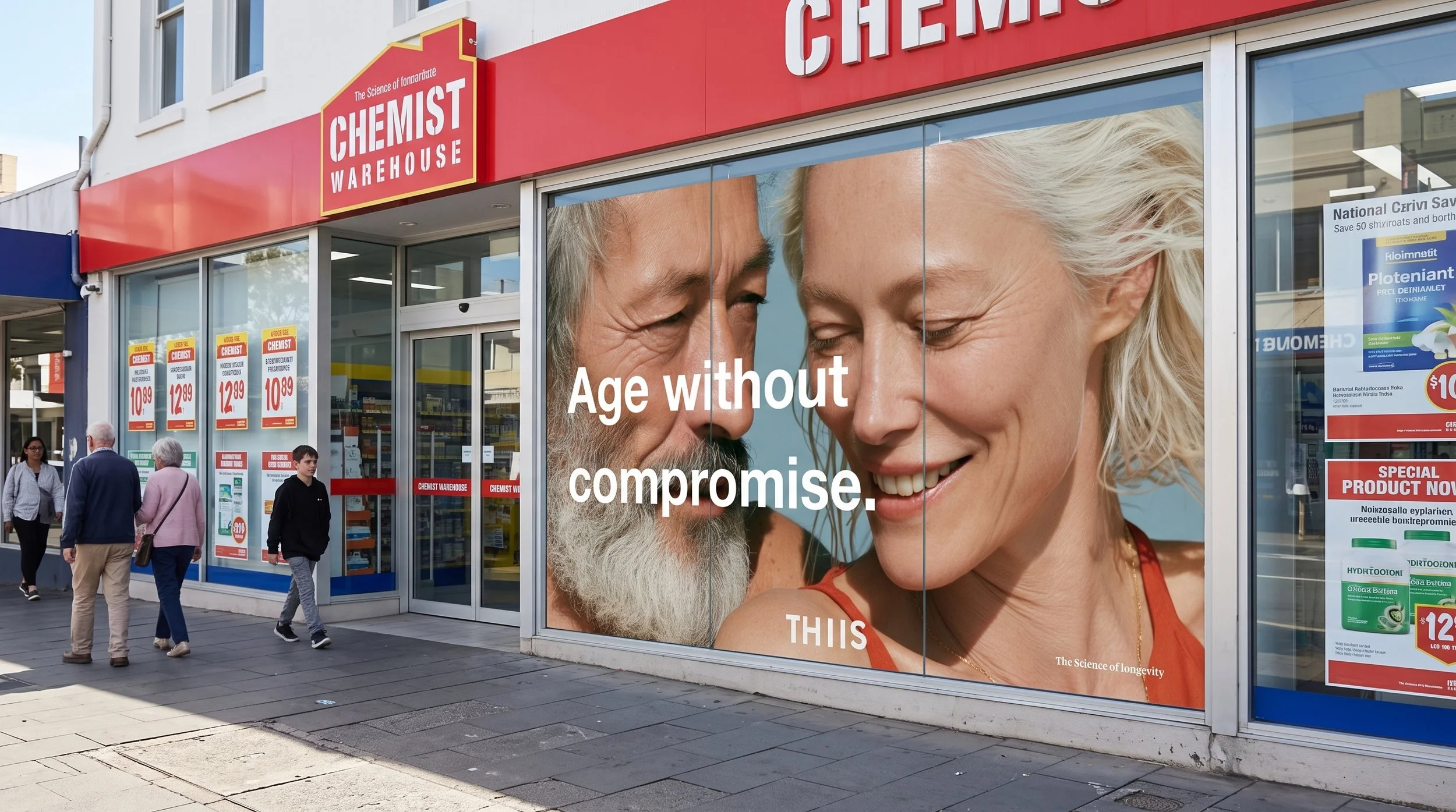
This specific brand execution validated the transition of the retailer from a 'discount' destination to a prestige longevity center.
BUYER FEEDBACK:
"Loved seeing all the activation in CWH."
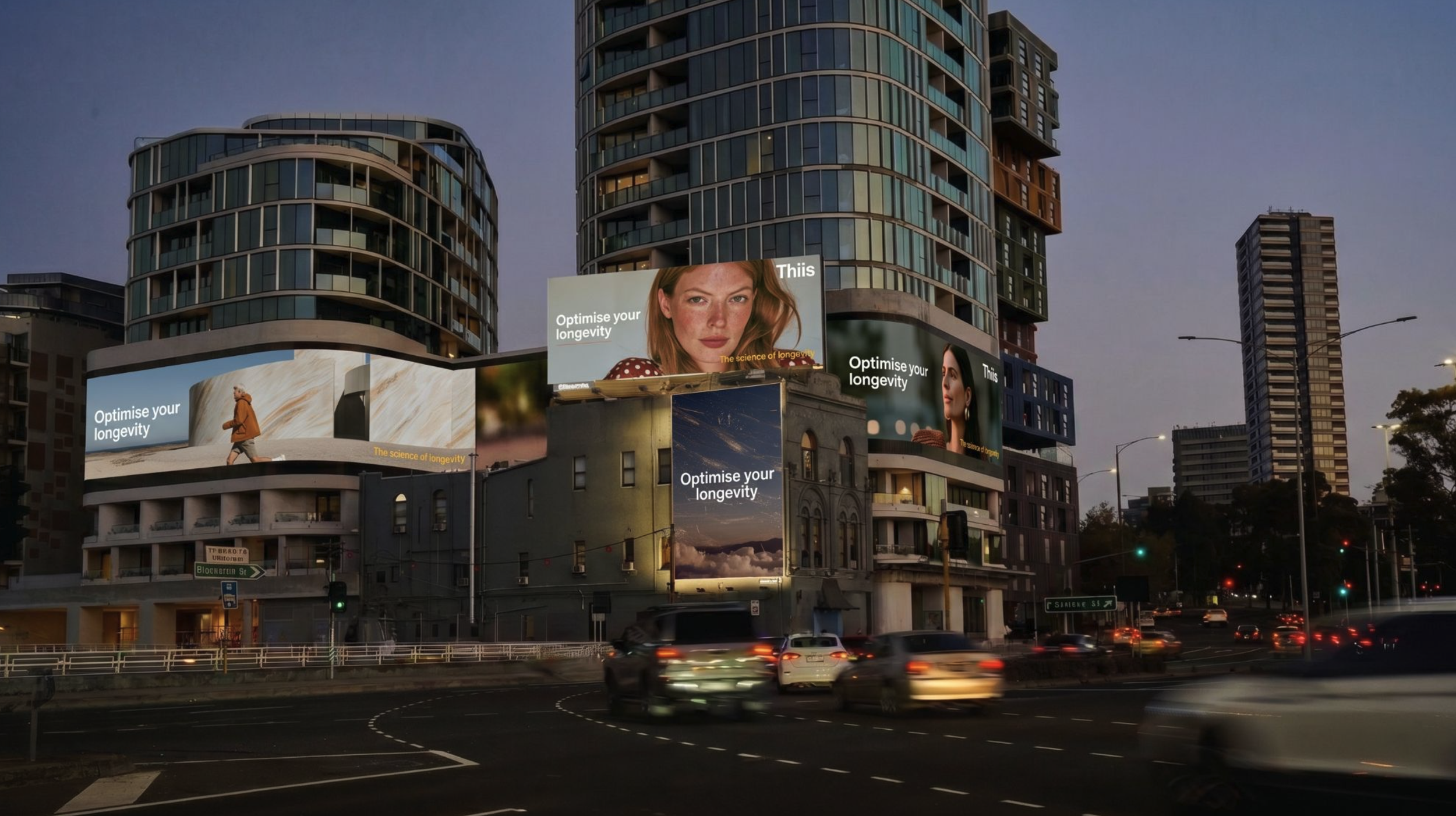
Over a 6 month period The client utilized Lucas Brand Strategy & Design's (LBSD) proprietary assets to secure high-value commercial milestones across nine distinct presentation events.
These included critical presentation meetings national retailers, institutional venture capital networks, and key manufacturing partners. De-risking Institutional Capital.
Our 'Zero to Multimillion Dollar Brand' transformation served as the central vehicle used to solicit institutional capital across nine distinct presentation events.
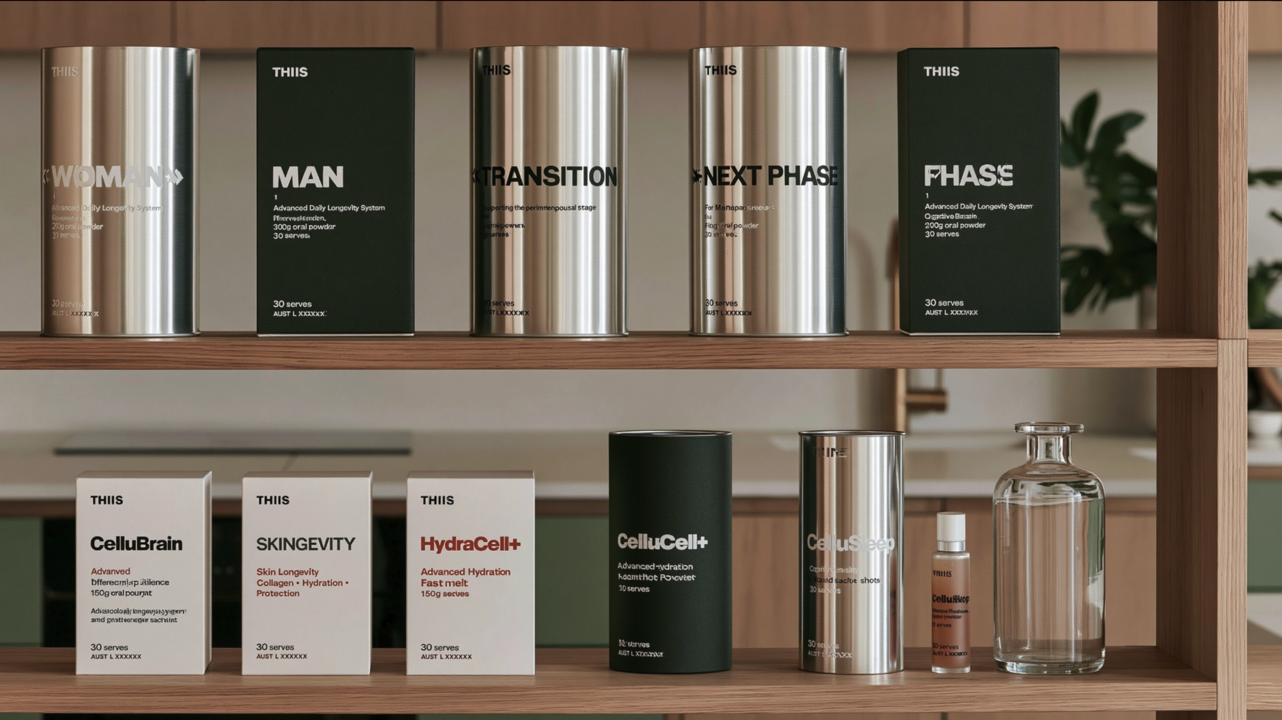
By utilizing these proprietary strategic blueprints and visual frameworks, the client unlocked up to $10 million+ AUD in private seed capital. A potential Retail Monopoly Win with largest retailer for category nationally
Establishing a potential commercial enterprise value exceeding $100M+
From Zero to $100M+ Entity.
Lucas brand strategy and design assets de-risked the entire
venture for capital partners and retail gatekeepers alike.
THIIS Founder
Milestones
-
Strategic Deliverables:
Authored the master brand strategy and positioning narrative: "A system. Not a supplement.".
Drafted The THIIS Declaration containing the three foundational identity statement anchors: "Thiis is different," "Thiis is scientific," "Thiis is you".
Defined the brand personality and tone of voice guidelines ("Sophistication and Edge"), establishing the brand persona as a "sexy, contemporary, authentic science geek".
Designed the Biological Icon System (custom geometric vector graphics representing cells, DNA, mitochondria, and neural pathways) and the vertical typographic logo modification known as "The Stack".
-
Strategic Deliverables:
Designed and Structured the 6-Pathway Biological Framework targeting the primary mechanisms of biological aging (Cellular Energy, Cellular Protection, Cellular Renewal, Metabolic Resilience, Recovery & Regeneration, and Communication & Balance).
Design strategy and concepts for Formulated the Gender-Specific Dimorphism Strategy (Men’s Core and Women’s Core baseline essentials), providing the commercial thesis to double retail basket sizes.
Designed the premium metallic canister line (Matte Black, Metallic Silver with Red Detailing, and bold colored Need-State Modules).
Designed the structural, CNC-machined aluminum integrated silver measuring cap to replace cheap, unhygienic plastic scoops under the directive: "Precision. Not guesswork."
-
Milestone: De-risking the Retail Shelf and Mapping the GTM Channel.
Strategic Deliverables:
Designed the 2-Bay "Intelligent Ageing" planogram (POG) brand-block layout, placing foundational Core canisters at eye level flanked by need-state modules to visually direct the bio-stacking journey.
Developed retail point-of-sale overlays, in-aisle wobblers, shelf-strips, and storefront automatic door wrap mockups utilizing bold directives ("How old are you? No, really." and "A system. Not a supplement.").
-
This phase represents high-impact, private presentation events where client utilized LBSD's completed strategic and creative assets to secure institutional backing, capital, and manufacturing contracts.
May 8, 2026 — Private Equity Seed Pitch Meeting:
Audience: Private family office investor
Creative Assets Shared: Early commercial models, GTM strategic assumptions, and initial brand directions.
Strategic Outcome: Secured immediate investor interest. The partner pitch-presented the concept to his broader team the following week, validating early commercial interest.
Mid-May 2026 — Corporate Law & Tax Advisory Review:
Audience: Legal and financial advisors
Creative Assets Shared: Market search trend analyses and international corporate entity blueprints.
Strategic Outcome: Granted the venture immediate institutional de-risking and structuring templates used to bypass massive overheads on international IP registrations.
June 2, 2026 — Major Venture Capital & Institutional Fundraising Pitch:
Audience/Channel: Private equity networks and institutional investors, facilitated directly through personal family introductions from Chris Lucas's brother
Creative Assets Shared: LBSD GTM master decks, the 6-pathway biological framework, ARR-based software margins, and Lucas brand thesis.
Strategic Outcome: LBSD's presentations served as the core vehicle to successfully solicit between $1.5 million and $10 million+ AUD in private seed capital, de-risking the startup and validating its viability to VCs.
June 2, 2026 — CWH Preliminary Retail Pitch:
Audience: Chemist Warehouse corporate retail buyers and category stakeholders.
Creative Assets Shared: The curated compilation portfolio "Brand Concepts_culled.pdf", logo guidelines, 3D canister renders, and storefront window wraps.
Strategic Outcome: Secured immediate, enthusiastic buy-in from CWH buyers, who reported they "loved seeing all the activation in CWH".
June 2, 2026 — Commercial Strategy & Advisory Review:
Audience: THIIS commercial strategy advisor.
Creative Assets Shared: Raw presentation layouts, product positioning and packaging
Strategic Outcome: Facilitated a deep-dive commercial strategy review, allowing the startup to stress-test financial models and pricing structures against concrete visual assets.
June 4, 2026 — Packaging Manufacturer & Prototyping Briefing:
Audience: Manufacturing partners, container suppliers, and prototyping technicians.
Creative Assets Shared: Custom visual identity rules, "Scandi" minimalist layouts, and custom metallic canister renders.
Strategic Outcome: Secured the supplier's commitment to tooling and prototyping the custom 345g metal canisters with integrated measuring caps, validating LBSD's premium category packaging design.
June 10, 2026 — Investor Pitching Pre-Prep Session:
Audience: Prospective private seed investor.
Creative Assets Shared: Updated strategic GTM slides, clinical pricing tier comparisons, and biological framework slides.
Strategic Outcome: Successfully locked in the investor's structural valuation metrics before drafting final term sheets.
June 12, 2026 — Retail Readiness & Brand Scoping Consultation:
Audience/Partner: Glowpath Retail Strategy / Design.
Creative Assets Shared: LBSD's master brand, visual media assets, and tagline architectures.Strategic Outcome: Confirmed that LBSD's high-contrast, mechanism-led design solution and execution of messaging perfectly positioned the system as a highly distinctive category disruptor, prompting the creation of the clear front-of-pack "Step 1 / Step 2" visual hierarchy to secure the listing.
June 19 – 22, 2026 — Labor Day "Forced Labor" Weekend Sprint:
Trigger: Client executed a strategic pivot away from "academic" structures, demanding immediate, retail-ready assets for her final pitch.
Deliverables Finalized: Completed a massive 48-hour sprint executing the narrative-focused THIISS CWH Pitch Deck , the 6-Pathway Biological Framework visuals, seven 3D premium canister renders, and the 1.2m CWH shelf block planograms.
-
June 25, 2026 (Thursday) — Final Chemist Warehouse National Listing Pitch & acceptance:
Audience: Chemist Warehouse corporate executive team and senior category buyers.
Lucas Assets: Client presents LBSD's final (pre approved) narrative-focused strategy deck, on-shelf 2-bay planograms, "Step 1 / Step 2" visual navigation labels, 3D canister construction renders, and the iconic tagline ("A system. Not a supplement.").
Strategic Outcome: The presentation successfully positions THIIS for immediate, national "accepted" status unlocking a national retail rollout projected to return of 50 million dollars +
Scope: List of Lucas project deliverables / Lucas assets
What services do you offer?We offer a range of solutions designed to meet your needs—whether you're just getting started or scaling something bigger. Everything is tailored to help you move forward with clarity and confidence.
How do I get started?Getting started is simple. Reach out through our contact form or schedule a call—we’ll walk you through the next steps and answer any questions along the way.
What makes you different?We combine a thoughtful, human-centered approach with clear communication and reliable results. It’s not just what we do—it’s how we do it that sets us apart.
Structural Defensibility and Cognitive Merchandising
The enthusiastic praise from independent retail specialists regarding the "Bio-Stacking" architecture and the explicit "Step 1 / Step 2" retail communication confirms that the brand has a highly viable mechanism for driving sustained consumer retention, simplifying complex biology, and securing high basket sizes at the shelf edge.
Aesthetic Supremacy and Channel Flexibility
The widespread endorsement of the "Scandi" minimalism, the culturally relevant typographical "Pause," and the premium metallic packaging by creative directors, commercial partners, and investors confirms that the brand possesses massive visual equity. This equity is strong enough to command premium pricing in mass pharmacy channels or seamlessly pivot to prestige beauty channels (the "Mecca play") if required.
Retailer Acceptance and Market Timing:
The Chemist Warehouse feedback, characterized by a direct confirmation of the macro-consumer shift toward preventative health and followed by intense procurement due diligence, validates that the brand has successfully positioned itself as a major commercial player capable of initiating category disruption.
Founder-Brand Synergy and Authenticity:Founder-Brand Synergy and Authenticity: The creative work achieved the rare feat of entirely capturing a highly technical founder's vision without diluting the science. This resulted in extreme emotional confidence from the founder and profound validation of the linguistic translation, proving that AI-assisted copywriting and strategic frameworks can successfully bridge the gap between R&D and consumer marketing.
Structural Defensibility and Cognitive Merchandising
The enthusiastic praise from independent retail specialists regarding the "Bio-Stacking" architecture and the explicit "Step 1 / Step 2" retail communication confirms that the brand has a highly viable mechanism for driving sustained consumer retention, simplifying complex biology, and securing high basket sizes at the shelf edge.
Aesthetic Supremacy and Channel Flexibility
The widespread endorsement of the "Scandi" minimalism, the culturally relevant typographical "Pause," and the premium metallic packaging by creative directors, commercial partners, and investors confirms that the brand possesses massive visual equity. This equity is strong enough to command premium pricing in mass pharmacy channels or seamlessly pivot to prestige beauty channels (the "Mecca play") if required.
Retailer Acceptance and Market Timing:
The Chemist Warehouse feedback, characterized by a direct confirmation of the macro-consumer shift toward preventative health and followed by intense procurement due diligence, validates that the brand has successfully positioned itself as a major commercial player capable of initiating category disruption.
Founder-Brand Synergy and Authenticity:Founder-Brand Synergy and Authenticity: The creative work achieved the rare feat of entirely capturing a highly technical founder's vision without diluting the science. This resulted in extreme emotional confidence from the founder and profound validation of the linguistic translation, proving that AI-assisted copywriting and strategic frameworks can successfully bridge the gap between R&D and consumer marketing.
ConclusionsThe feedback, and market reactions collected throughout the THIIS brand development lifecycle points to a singular, undeniable conclusion: the strategic execution was a resounding success that fundamentally amplified the commercial value of the underlying scientific intellectual property.
Structural Defensibility and Cognitive Merchandising
The enthusiastic praise from independent retail specialists regarding the "Bio-Stacking" architecture and the explicit "Step 1 / Step 2" retail communication confirms that the brand has a highly viable mechanism for driving sustained consumer retention, simplifying complex biology, and securing high basket sizes at the shelf edge.
Aesthetic Supremacy and Channel Flexibility
The widespread endorsement of the "Scandi" minimalism, the culturally relevant typographical "Pause," and the premium metallic packaging by creative directors, commercial partners, and investors confirms that the brand possesses massive visual equity. This equity is strong enough to command premium pricing in mass pharmacy channels or seamlessly pivot to prestige beauty channels (the "Mecca play") if required.
Retailer Acceptance and Market Timing:
The Chemist Warehouse feedback, characterized by a direct confirmation of the macro-consumer shift toward preventative health and followed by intense procurement due diligence, validates that the brand has successfully positioned itself as a major commercial player capable of initiating category disruption.
Founder-Brand Synergy and Authenticity:Founder-Brand Synergy and Authenticity: The creative work achieved the rare feat of entirely capturing a highly technical founder's vision without diluting the science. This resulted in extreme emotional confidence from the founder and profound validation of the linguistic translation, proving that AI-assisted copywriting and strategic frameworks can successfully bridge the gap between R&D and consumer marketing.
ConclusionsFrom the neurocognitive scientist who conceived the formulations to the commercial partners financing the venture, and from independent retail strategists to the procurement desks of national pharmacy chains, the creative and strategic identity of THIIS has been uniformly validated as highly disruptive, visually stunning, and commercially potent. The feedback unequivocally demonstrates that the brand transcended the traditional boundaries of the supplement aisle, utilizing intelligent copywriting, innovative structural merchandising, and premium art direction to establish a new vanguard in the global healthspan market.
Various Stakeholders
TBC
-

'Bremworth'
Changing the name of NZ’s most trusted carpet brand.Simplifying the brand name from Cavalier Bremworth to Bremworth confidently communicated change. The shorter, more digestible evolution of name modernised the brand.
The wordmark’s footprint has been reduced, this allows the brand to be applied at a larger scale. The simpler name is more adaptable across a range of touch points.
Research shows the shorter name is more memorable, has greater recall and improves long term-brand recognition.
-

‘Let’s go good together’
A fresh, aspirational, modern tagline.The new tagline grows with the brand – it has more contextual meaning the more it is applied.
It sets the direction for Bremworth to tell it’s stories. Interesting stories. Publicly. Honestly. Authentically.
As a sentence, the line isn’t grammatically correct, this is intentional. It aims to be interesting by being ‘the right amount of wrong’. It’s a modern convention, that’s progressive, memorable and a little bit challenging at the same time.
-

New brand. New direction.
Design made for transformation.The fresh, modern, handwritten wordmark is instinctually positive, human and universally appealing. It has a scripted style, is relaxed and organic, as if born from wool itself.
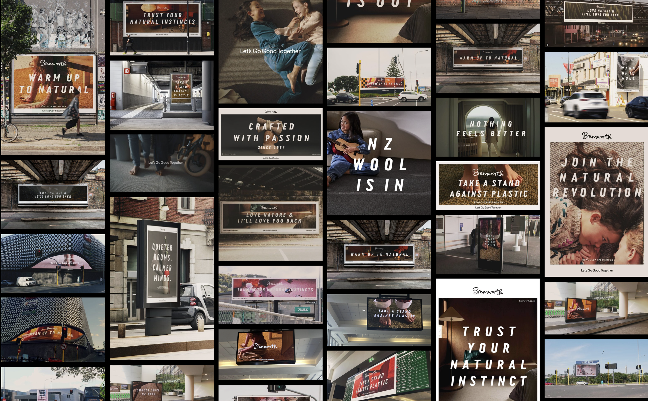
Bremworth’s future focused positioning is supported by a contemporary, bold brand language. The revolutionary system defines typographic, template, photographic, illustrative, colour, video and motion graphic styles. See details below;
Project Deliverables TBC
-
![A woman sitting on a textured orange carpet under a wooden table, looking upward with a joyful expression.]()
Bremworth Moments
Talent shoots focus on people interacting with carpet, in genuine personal ‘moments’.
-
![Close-up of red yarn with a knitted texture and a knot in the loop.]()
Bremworth Materials
Wool is in. Plastic is out. Bremworth is backing wool. Bremworth’s material images collection highlights the brands appreciation of New Zealand wool.
-
![Interior view of a living space with earthy tones, featuring modern furniture including a curved white chair, a small side table, a wooden chair, a built-in cabinet with decorative objects, and a spiral staircase with dark steps.]()
Bremworth Spaces
Location shoots are strategically selected and curated to align with Bremworth’s design values. Locations typically feature quality natural raw materials. Objects within the space are contemporary and considered to compliment Bremworth carpets and rugs.
-
![Collage of outdoor and indoor advertising billboards and signs promoting natural and sustainable themes, including messages like 'Trust Your Natural Instinct,' 'Warm Up to Natural,' and 'Take a Stand Against Plastic.' The images feature urban streets, transit stations, and people, including a girl playing guitar and children interacting, emphasizing eco-friendly and natural lifestyles.]()
White frame templates
The simple white frame device differentiates Bremworth brand communications. It’s flexible enough to apply to any brand touch point. The minimal design aesthetic compliments a wide range of content.
-
![A cartoon sheep with a white fluffy body, a simple face, and two tiny legs standing in front of a large red flame shape on a dark green background.]()
Handmade, human and honest Illustrations
A simple hand drawn style has been developed to communicate product benefits. The style aligns with Bremworth natural positioning.
-
![Collection of black and white posters with motivational and nature-related quotes, including 'Warm up to natural,' 'Trust your natural instincts,' and 'Love nature & it'll love you back,' featuring various font styles.]()
Typographic tone of voice
We introduced a bold, graphical and distinct typographic style to offset the hand-scripted logo and confidently communicate messages. The upper case italic style modernised their message. It’s at its strongest with bold short, sharp sentences.
-
![]()
‘World of Wool’ Quality certifier
An aspirational wool symbol designed to help the brand lift itself up to a new kind of ‘eco-premium’ positioning. As a likeable and engaging graphical device, the symbol acts as a brand certifier, or a symbol of quality to help us build out the broader wool and natural materials story.
-
![Abstract sculpture featuring a tall beige textured cone, a red rectangular block, and a thin metallic grid balanced on a dark wooden base, with cotton and clear glass elements, set against a brown background.]()
Still Life Moodboards
A unique approach has been developed to showcase material. The art inspired moodboards explore relationships between wool and quality natural materials.





The project compressed brand strategy, brand concepts, brand design and brand rollout into 1 stage, over a reduced timeline