Archipro.
Shifting a global Platform from functional index to design authority globally.
-
Brand Audit: Conducting a thorough diagnostic evaluation of ArchiPro’s dual ecosystem.
Competitive Frame Analysis: Benchmarking against volume incumbents and UI pioneers to pinpoint strategic market gaps and steer category transformation.
Brand Platform & Messaging: Establishing an elevated "Bridge Language" that seamlessly balances technical architectural terminology with residential design inspiration, ensuring communications are never "dumbed down."
Strategic Brand Architecture: Advising a monolithic "Branded House" framework that centers equity on ARCHIPRO as the primary anchor, detailing distinct segments for ArchiPro Projects, Products, and Professionals while preserving ArchiPro Editorial (Archizeen) to sustain core design authority. -
Masterbrand Symbol Identity: Developing custom visual identities and collateral for ArchiPro's proprietary SaaS tools, including ArchiPro 3D AR visualization.
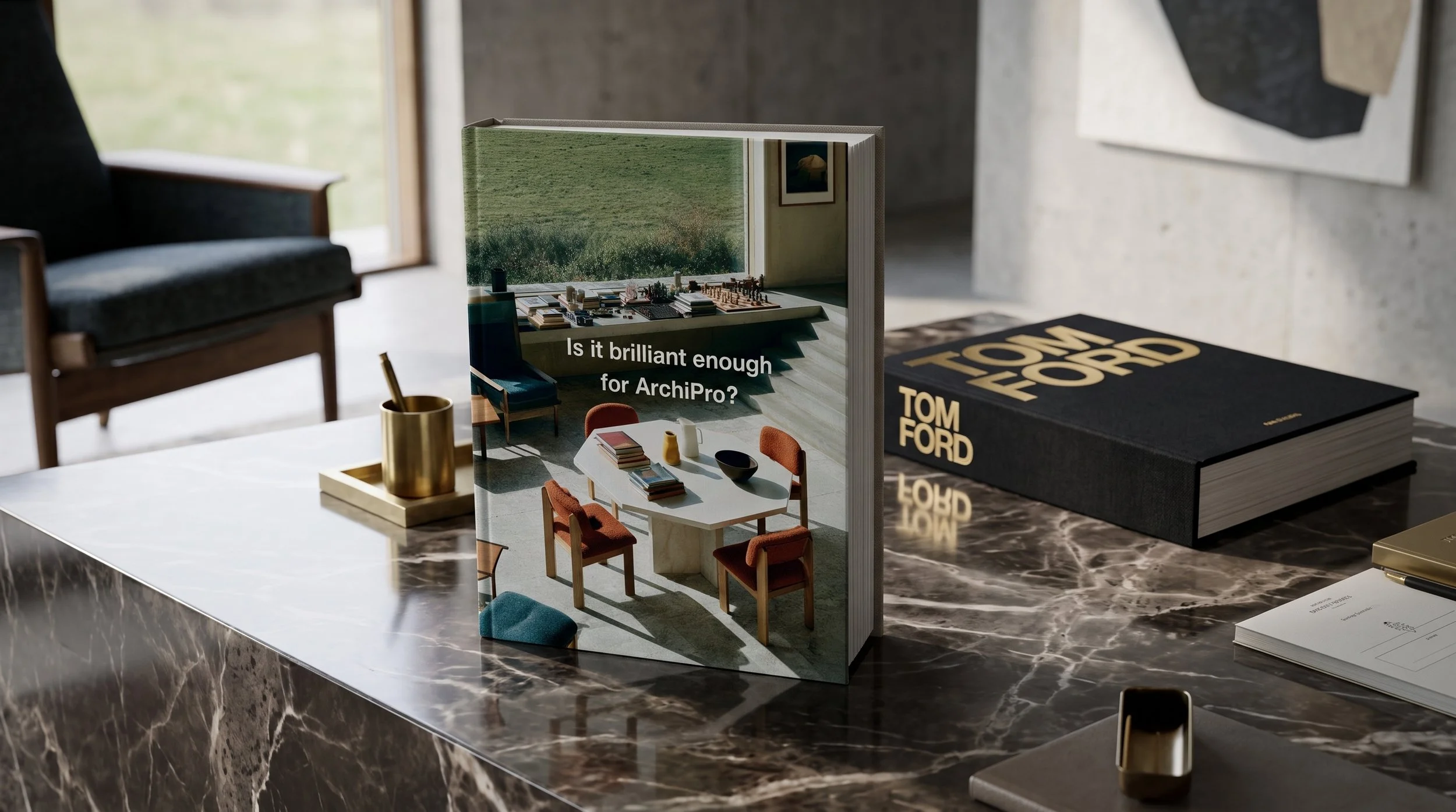
AI Style Models: Custom engineering AI prompt models for consistent image and video styling.
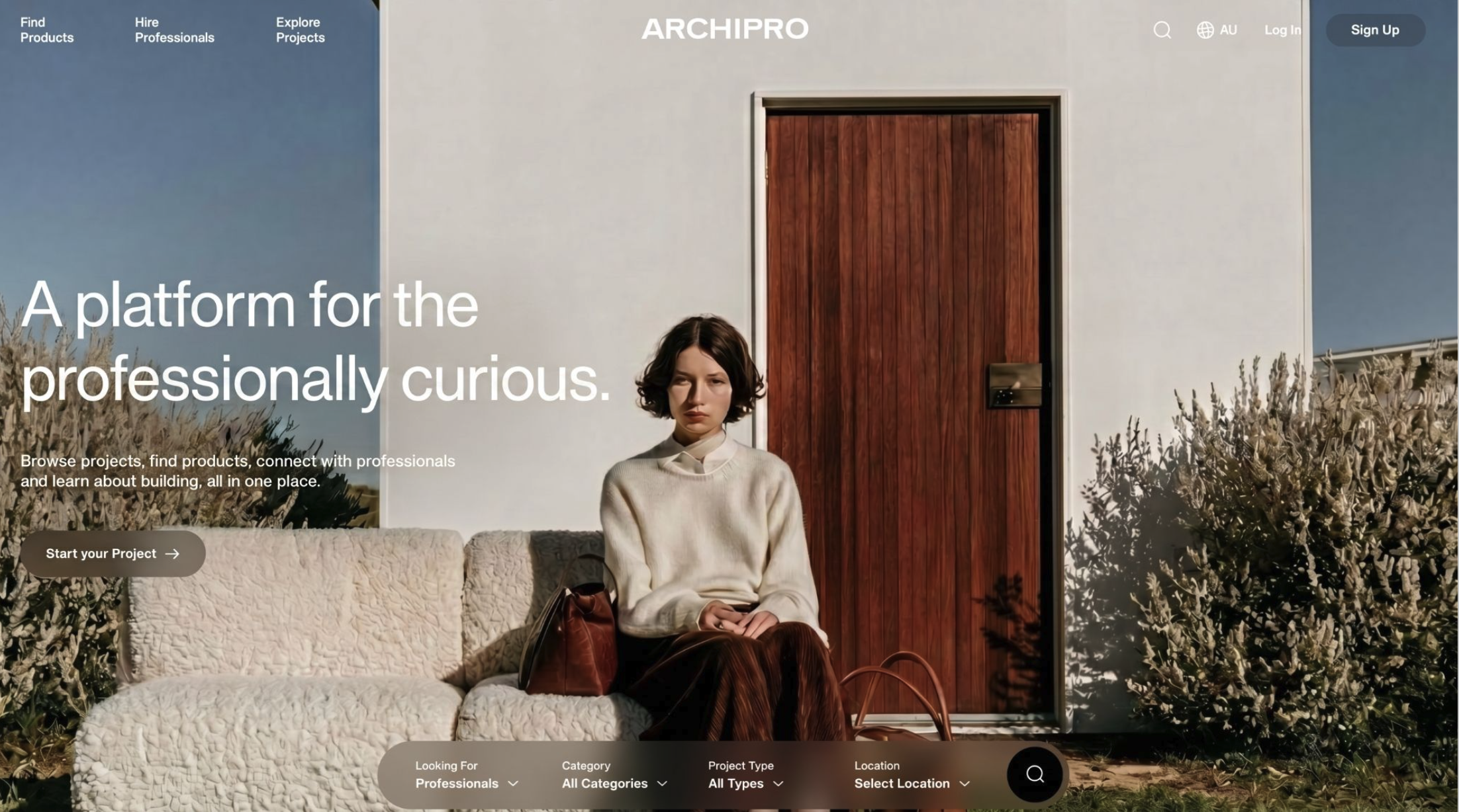
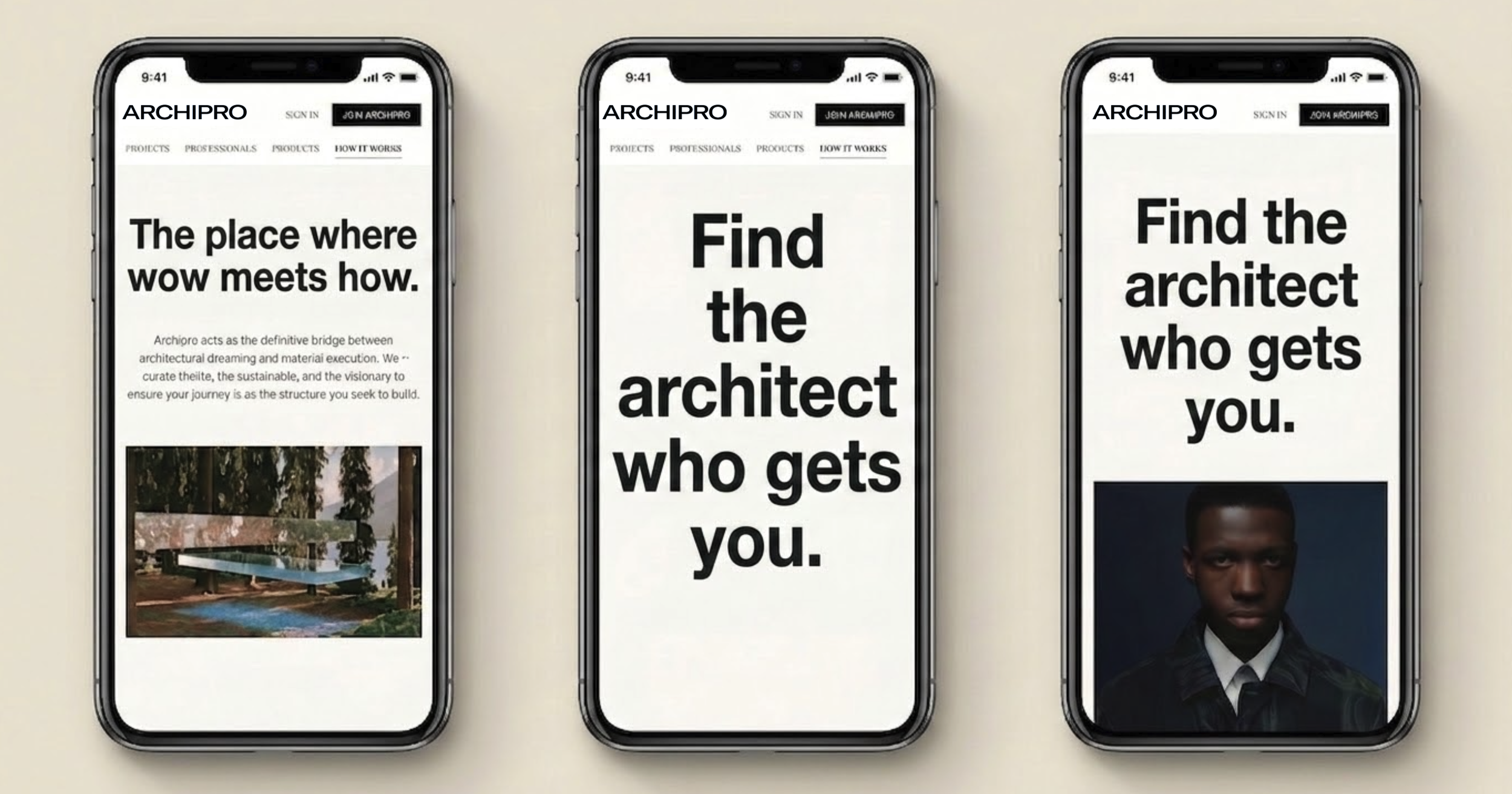
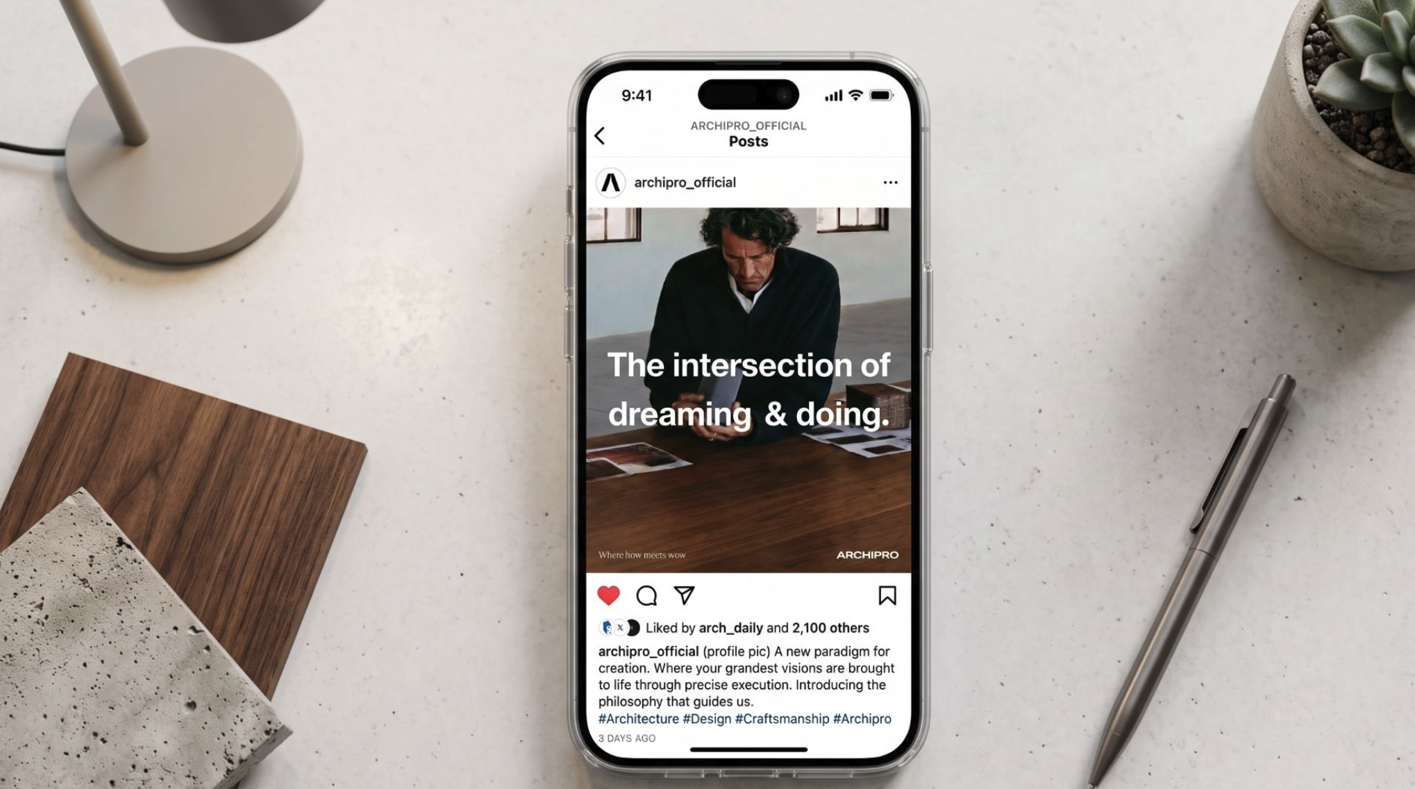
UX & Mockups: Crafting user experience concepts and mockups integrated with core positioning campaign headlines. -
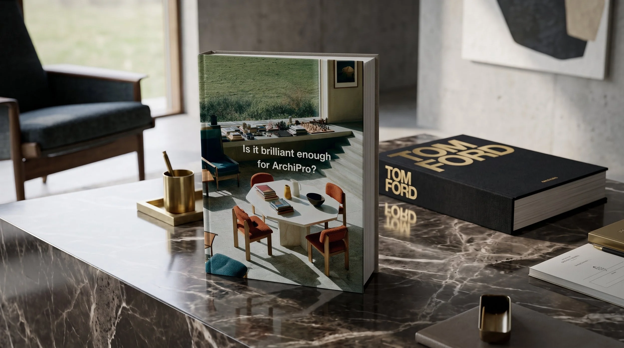
Platform Content: Producing "magazine-quality" visual content tailored for the platform.
Film Exploration: Curating cinematic storytelling through ArchiPro Film explorations. -
Brand Animation: Creating looping brand animation videos.
Digital & E-Commerce Design: Developing concept designs for digital platforms and e-commerce interfaces.
Image Curation: Compiling and managing the core brand image collection.
Brand Transformation and North American Launch
Project Type: Global Brand Transformation, Platform Redesign, & Content Architecture
Deliverables: Brand Audit, Strategic Brand Architecture, Visual Identity System, UI/UX Framework, AI Lookbook Collection / Engine, and AI Film Blueprint [8]
The Scale: 4M+ Active Users, 12M+ Monthly Page Views, 400K+ Subscribers
The Mandate: To transition a rapidly scaling tech platform from a regional, transaction-heavy directory into a prestigious global design authority
The Disconnect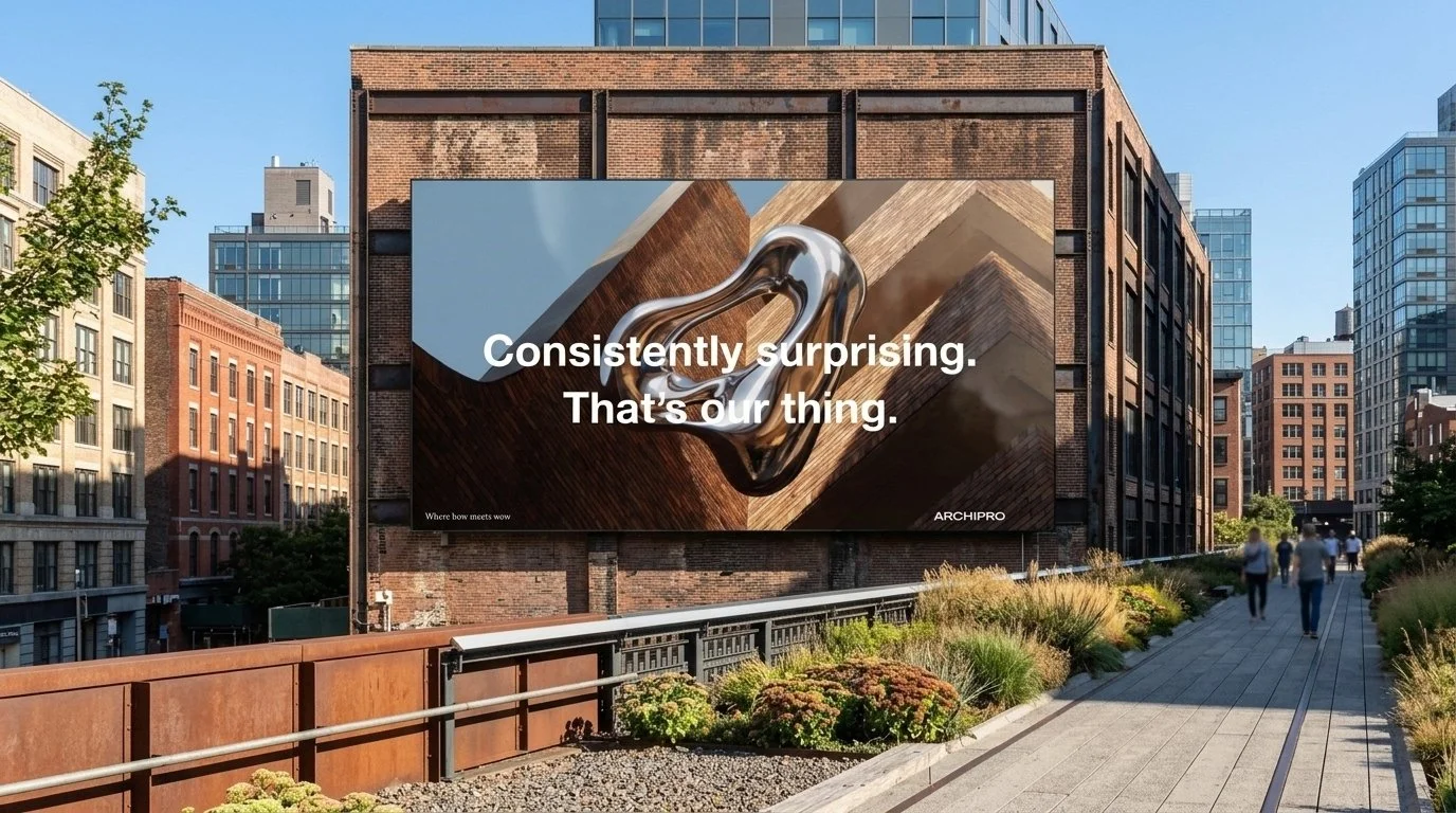
The Challenge: ArchiPro scaled rapidly from a New Zealand-centric tech startup into a household architectural platform across Australasia. However, as the company prepared for a planned IPO and an aggressive, highly competitive launch into the North American market, it faced a critical strategic hurdle.
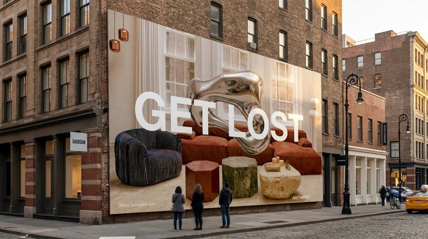
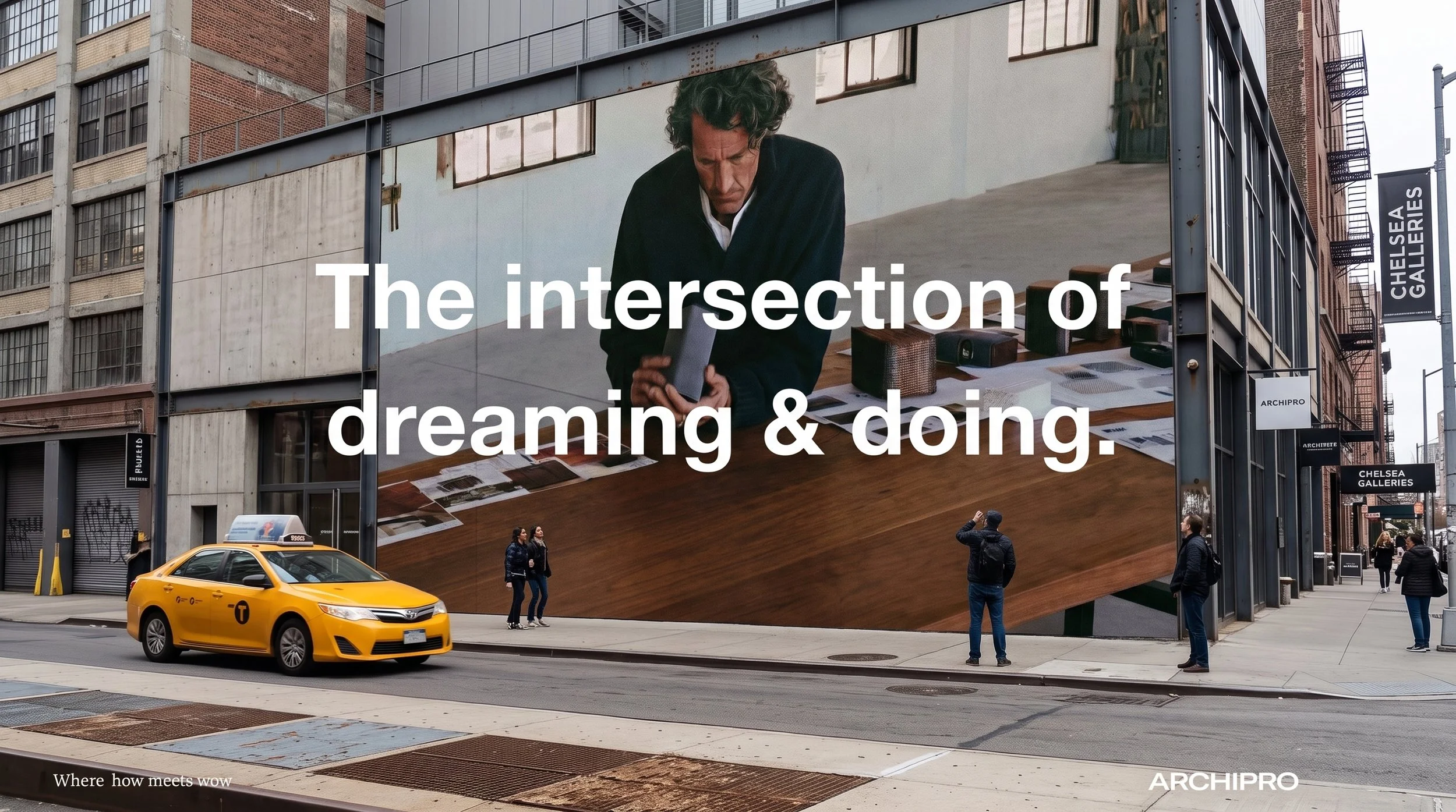
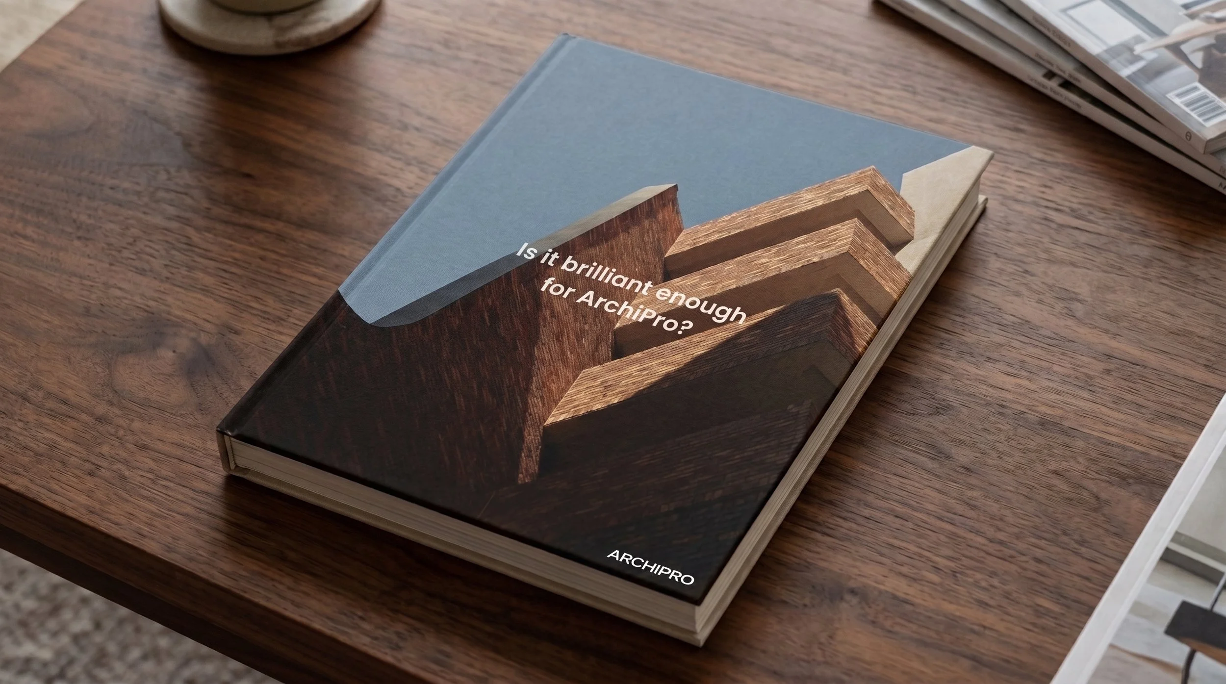
The ShiftWhile highly successful at connecting homeowners with local trades, the platform’s legacy visual and verbal experience did not have its own voice. Operating as a functional, B2B lead-generation directory, it was constrained by a funtional positioning. To capture leading global suppliers, architects, and high-net-worth consumers, ArchiPro needed to shift its identity from a functional utility to a genuine creative tastemaker.
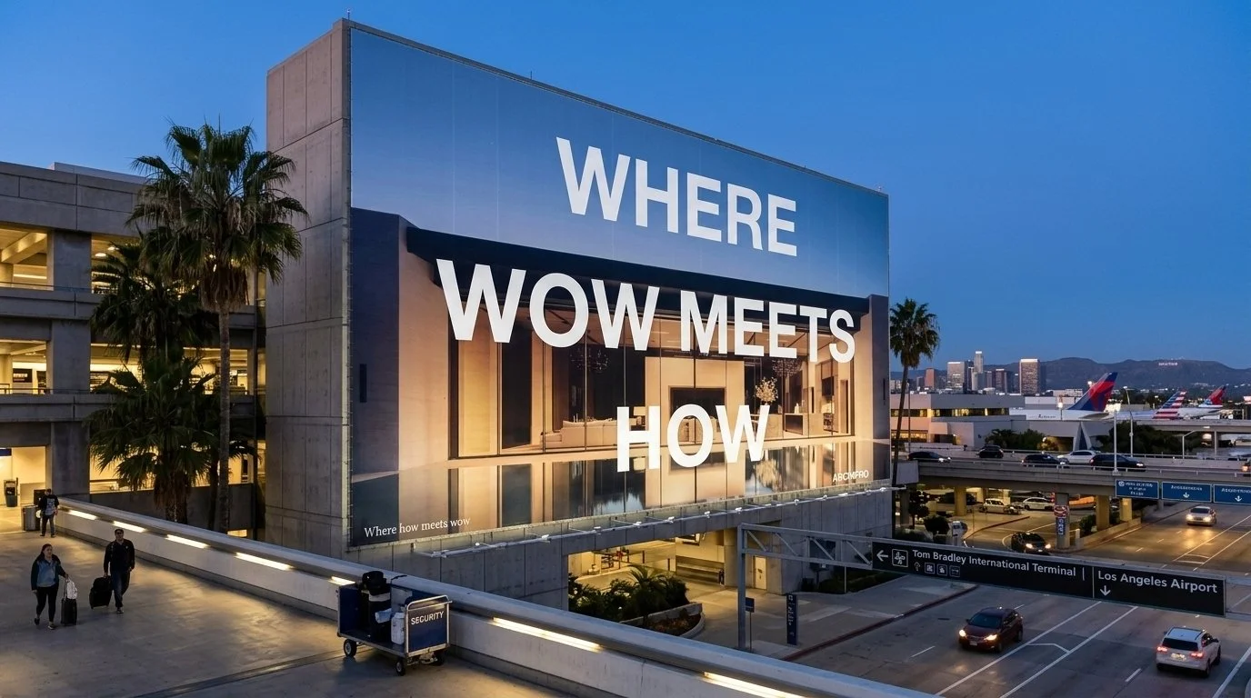
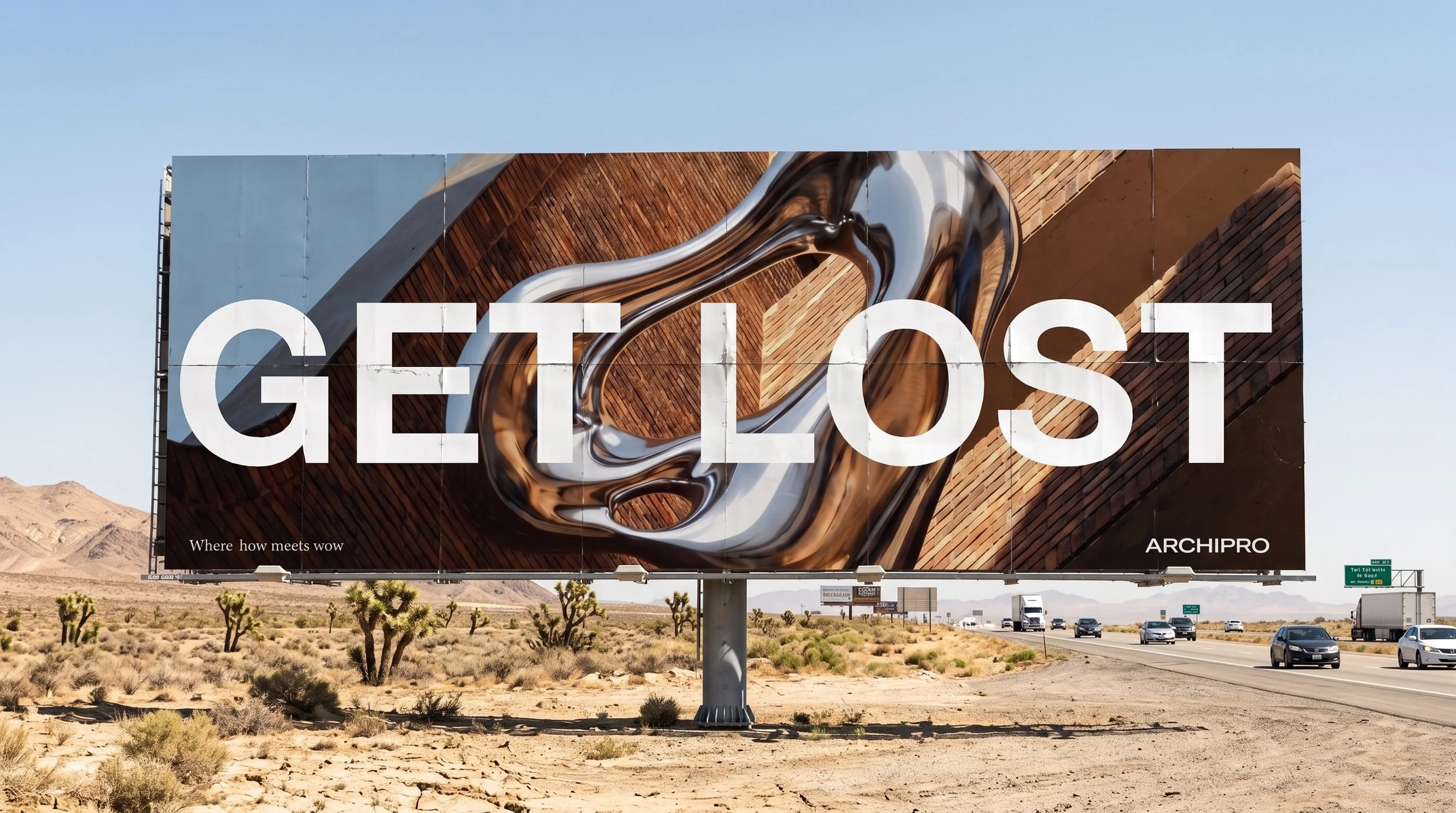
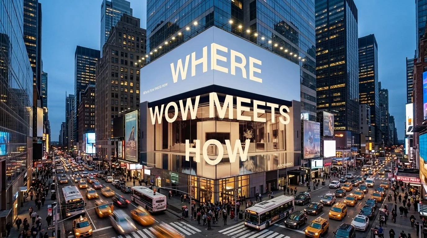
The ObjectiveThe Strategic Core: "Wow meets How"
The objective of the global brand transformation was to re-engineer ArchiPro's market positioning. This meant moving away from cold, transactional, volume-based communications and creating a considered, unified visual and verbal ecosystem that would appeal to new global markets.
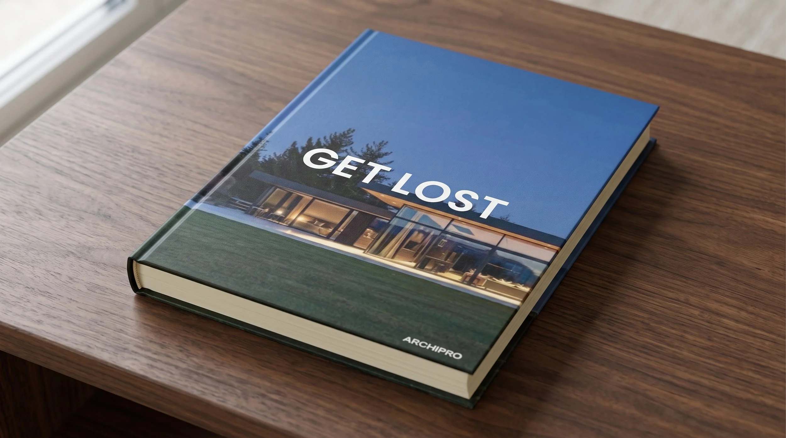
Layering messages and design systemsTo achieve this, we integrated two opposing forces into a single, seamless digital loop: ‘Wow’ and ‘How’
"Wow" (Aspirational Source): Cultivating extreme brand desire through cinematic architectural visual storytelling - establishing a design authority
"How" (Practical): The wow had to frictionless fit within the critical functionality of the huge platform.
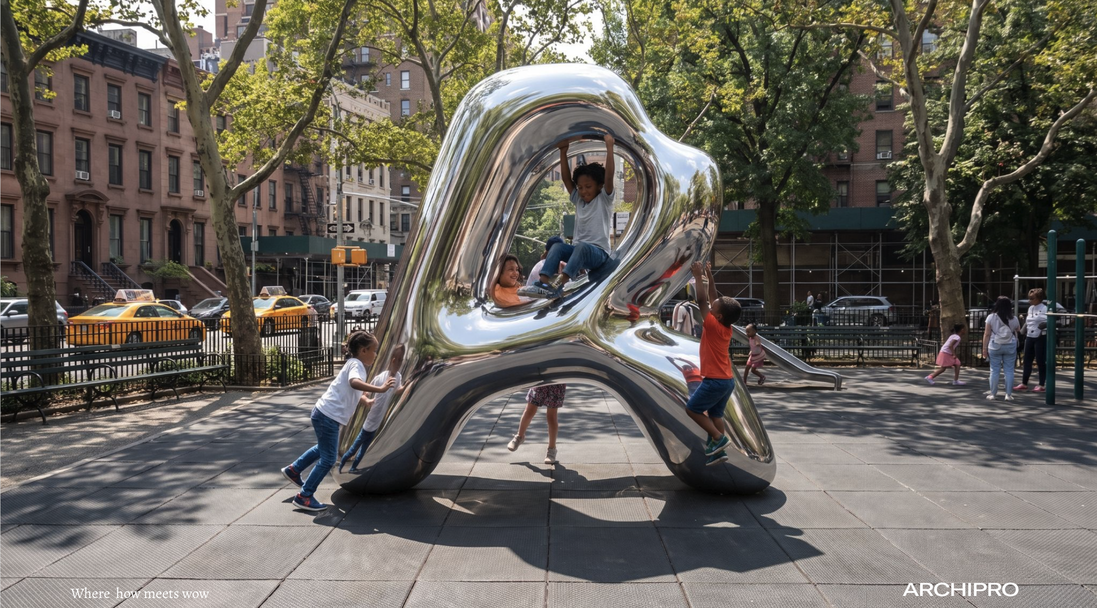
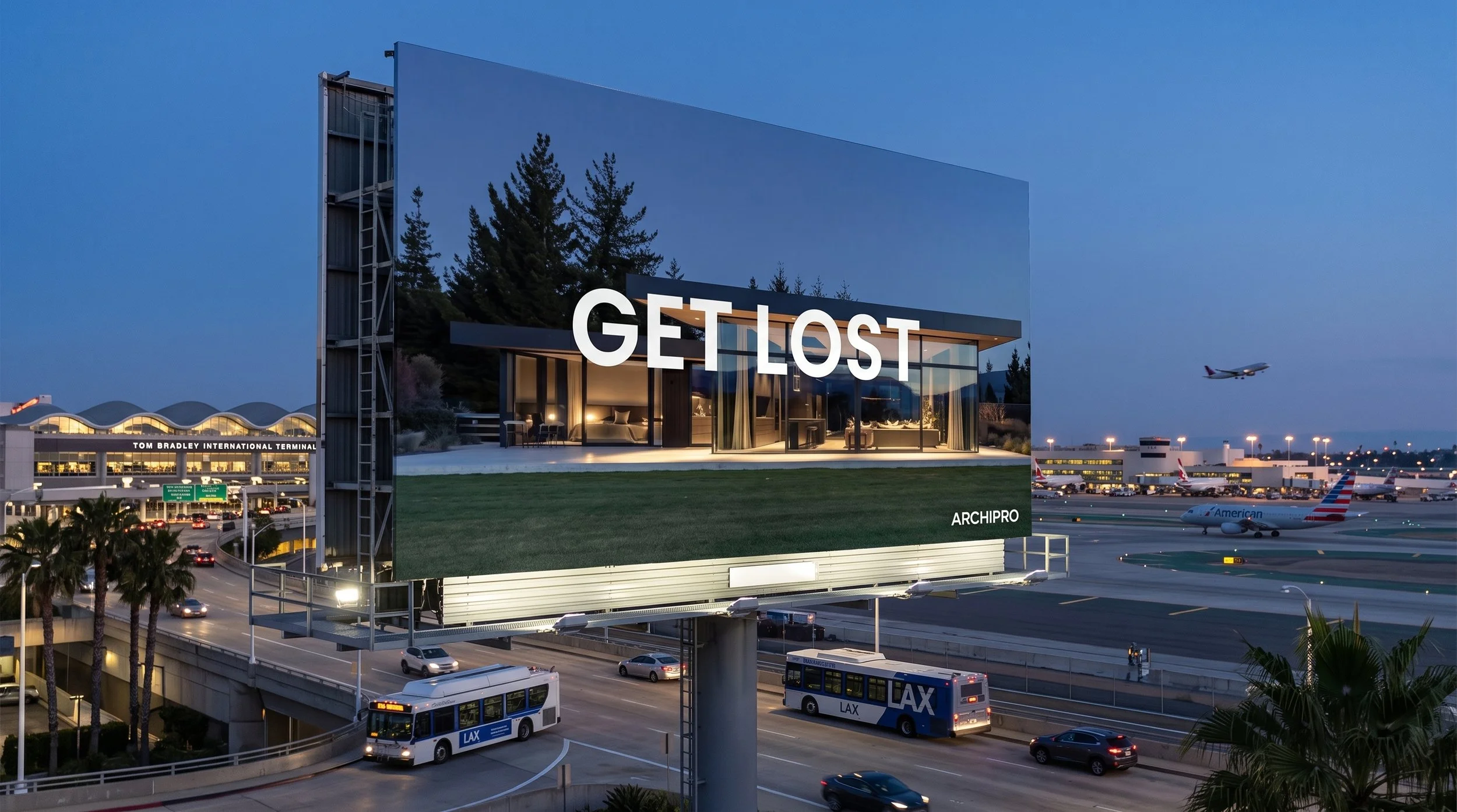
Execution: The strategic transformation was executed systematically across a strategic series of stages
01. DISCOVER:Brand Audit,. Competitive Frame and implementation of monolithic architecture. 02. DESIGN New Symbol identity and style models 03. DIRECT Film Exploration and Lookbook Asset development. 04. DELIVER Image curation, US website mockups animated loop brand identity, Liquid brand language
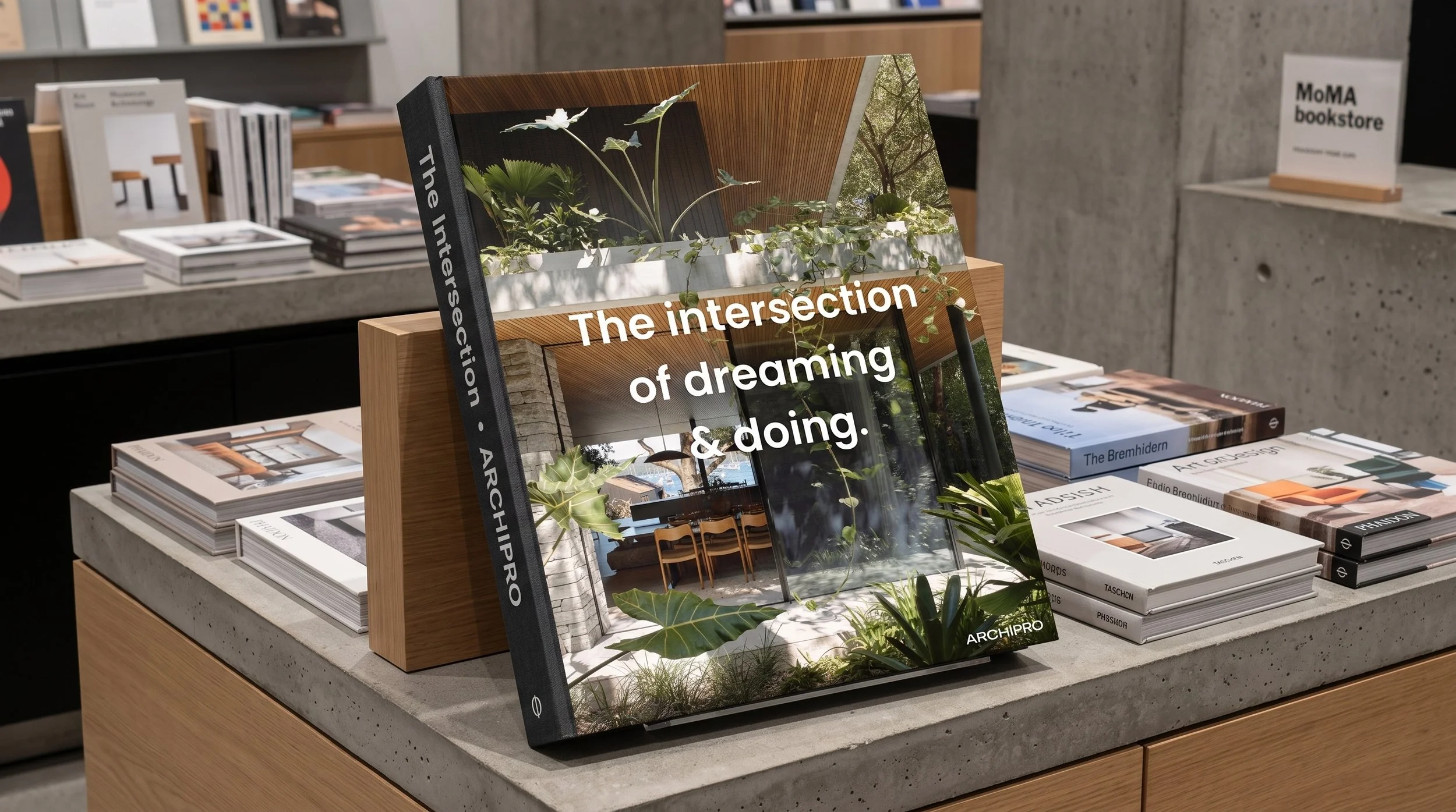
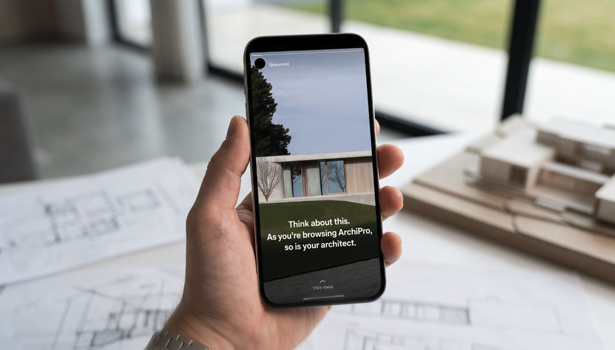
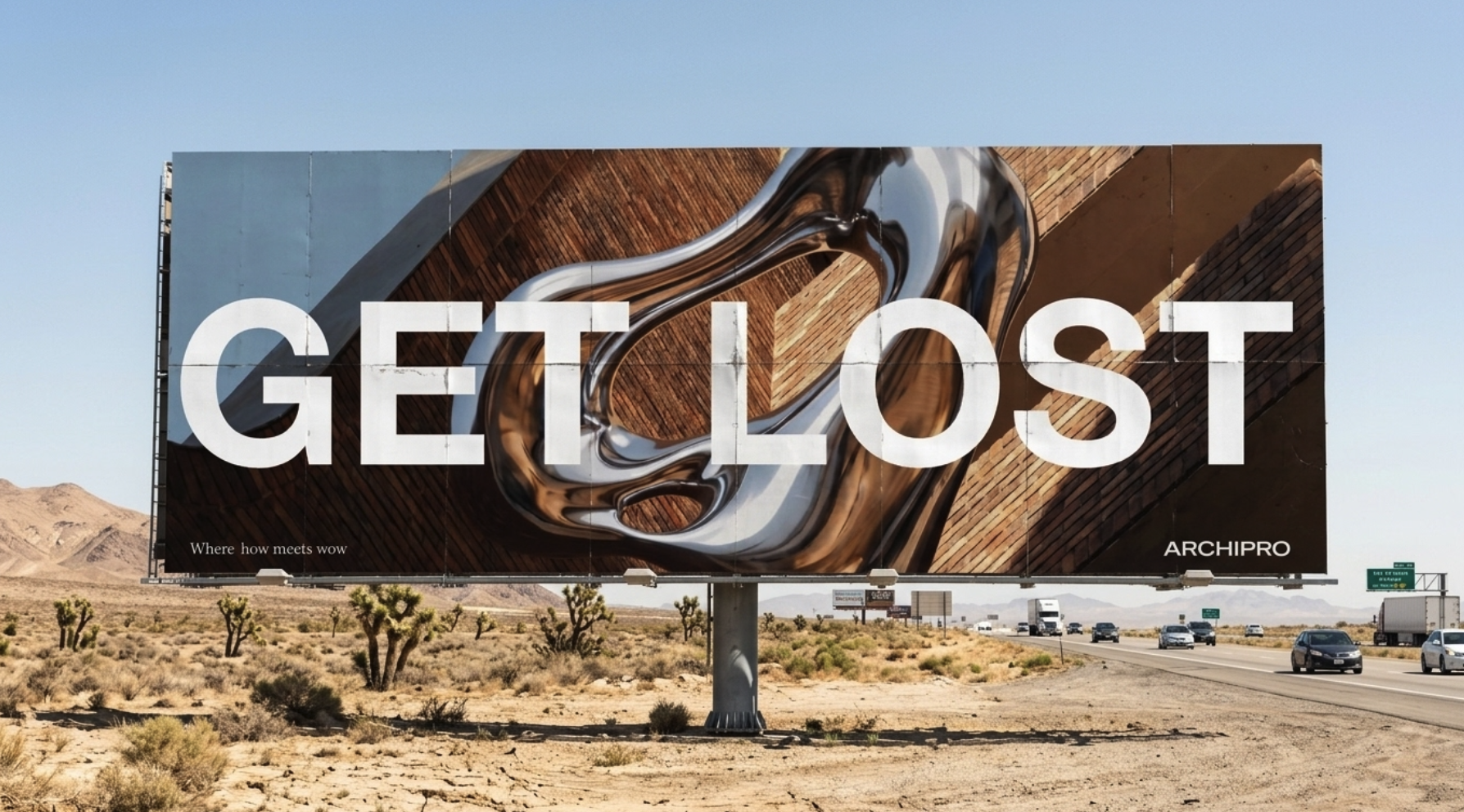
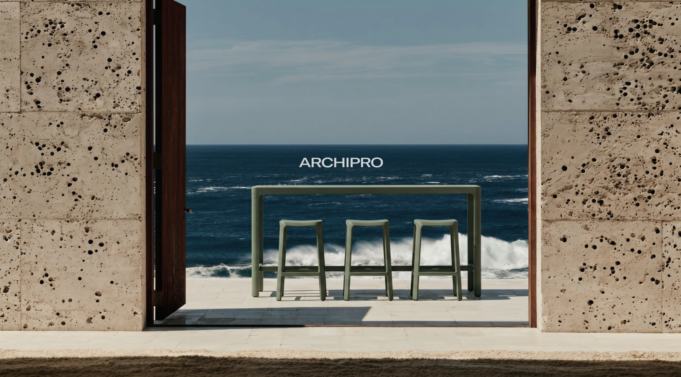
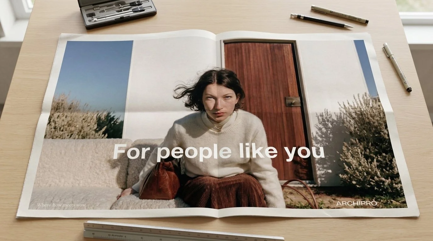
Stage 1 Discover (Strategic Foundation)
Brand Audit & Diagnostic: Conducted an in-depth diagnostic evaluation of ArchiPro's dual-sided ecosystem (homeowners vs. design professionals) to eliminate functional friction
Competitive Frame Analysis: Benchmarked the platform against volume incumbents and digital UI pioneers to pinpoint strategic market gaps and identify opportunities for category dominance
Brand Platform & "Bridge Language": Established an elevated communication dialect that seamlessly balanced complex, technical architectural terminology with residential design inspiration. This "Intelligent Energy" tone of voice ensured that communication remained highly sophisticated and was never "dumbed down" [10].
Strategic Brand Architecture: Advised and structured a monolithic "Branded House" framework to consolidate equity on ARCHIPRO as the primary trust anchor
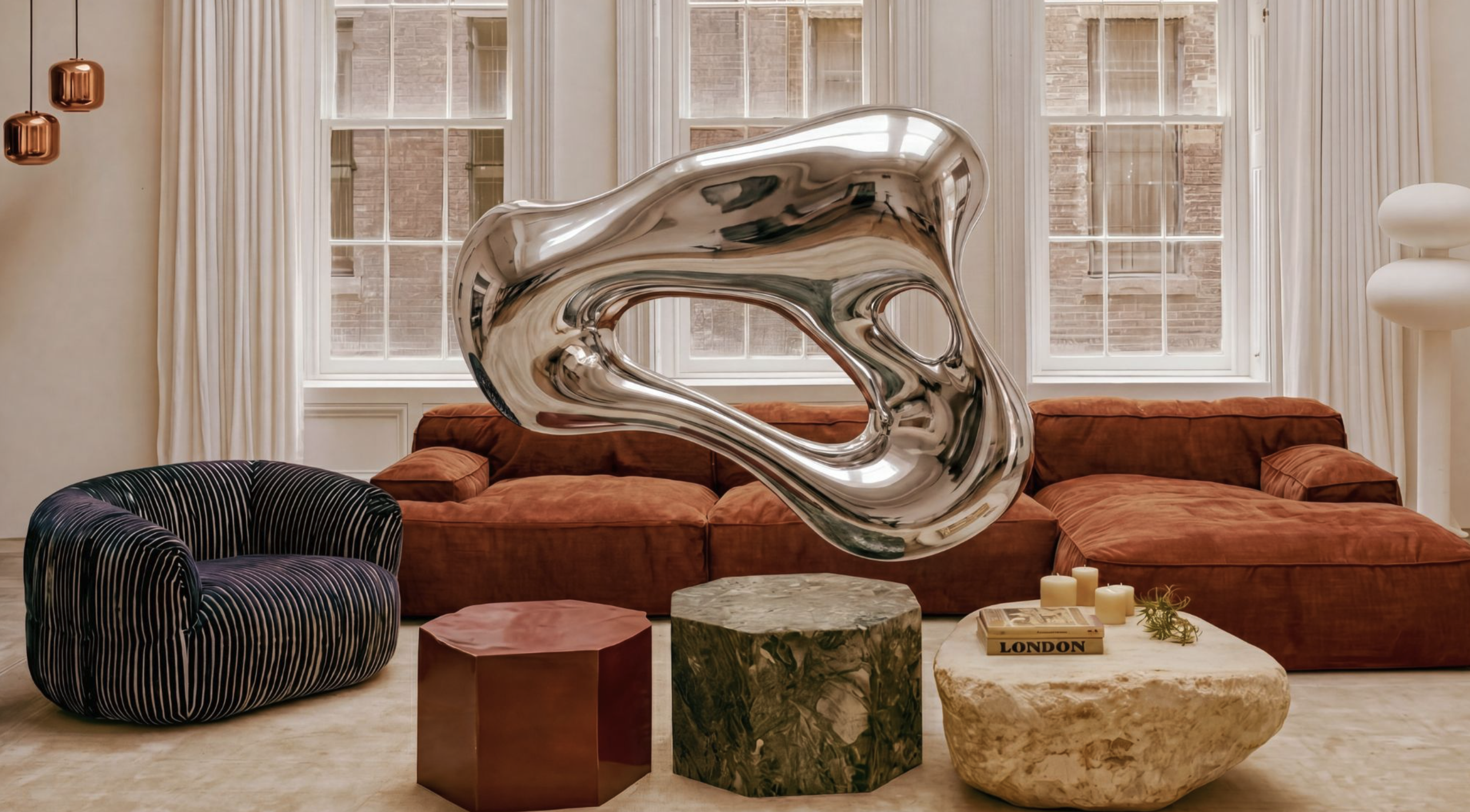
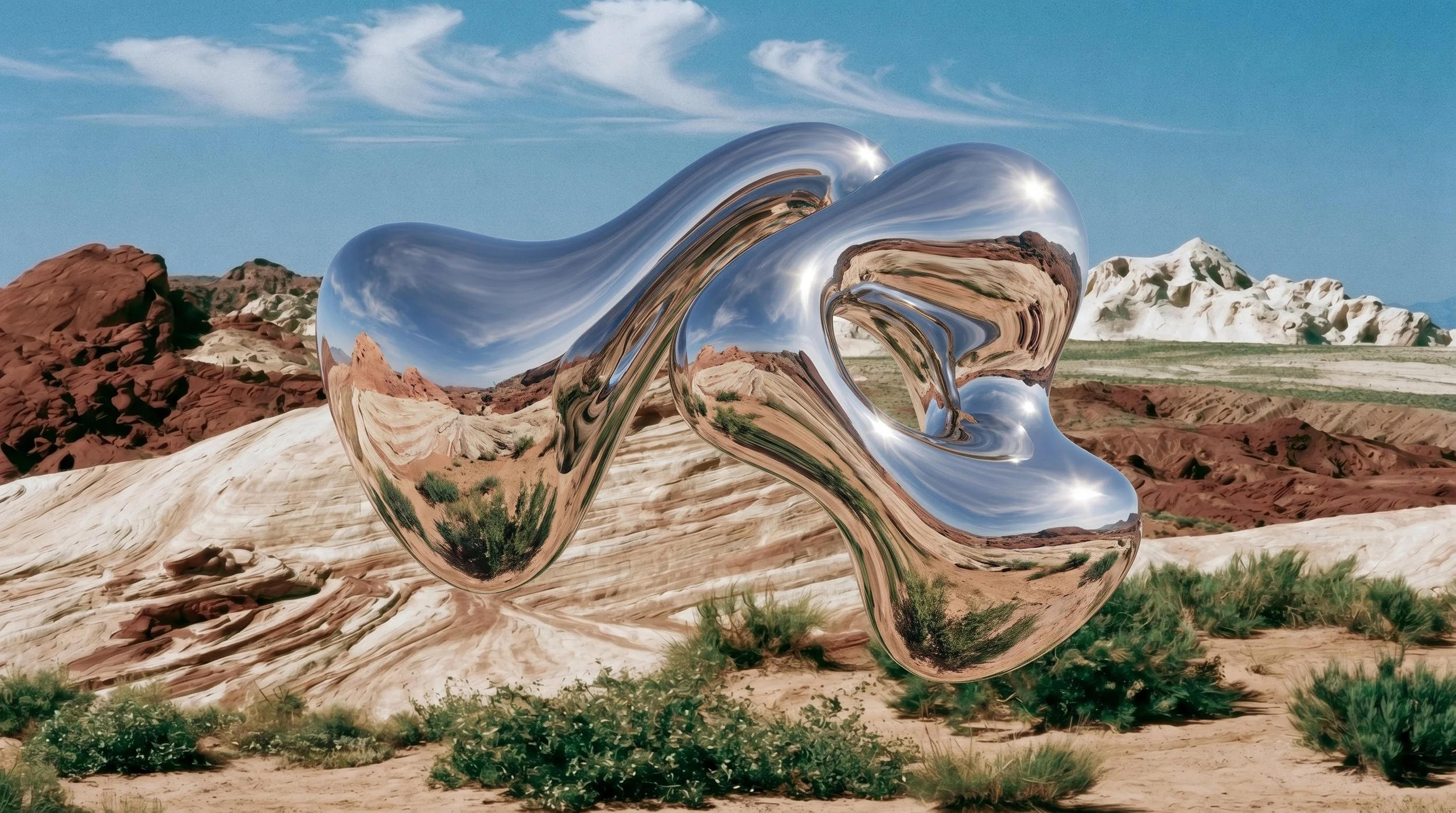
Stage 2: DesignBrand Identity Systems & Design Language
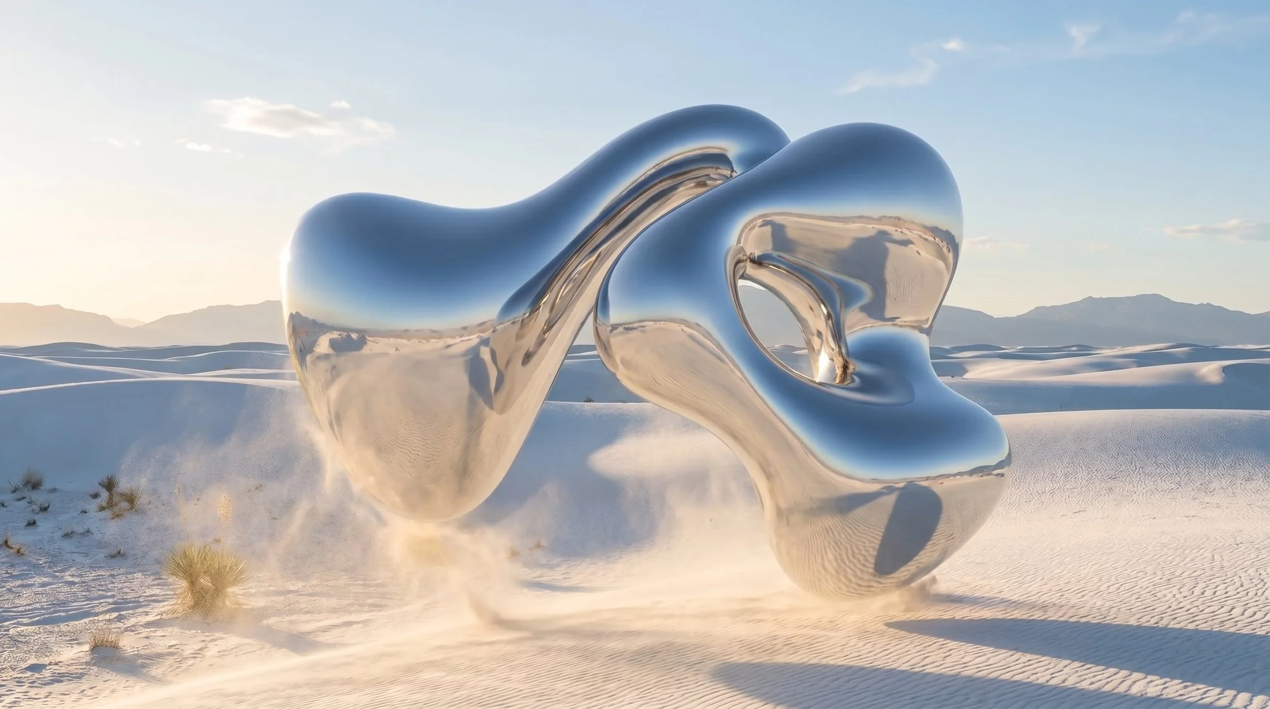
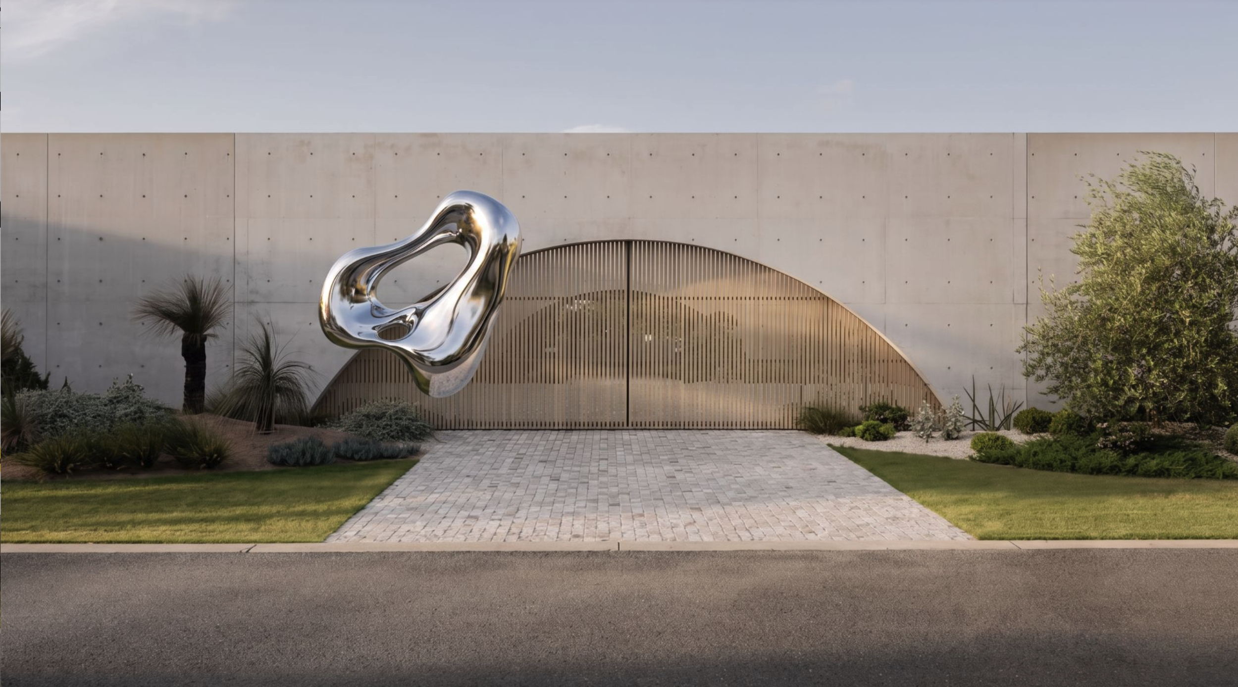
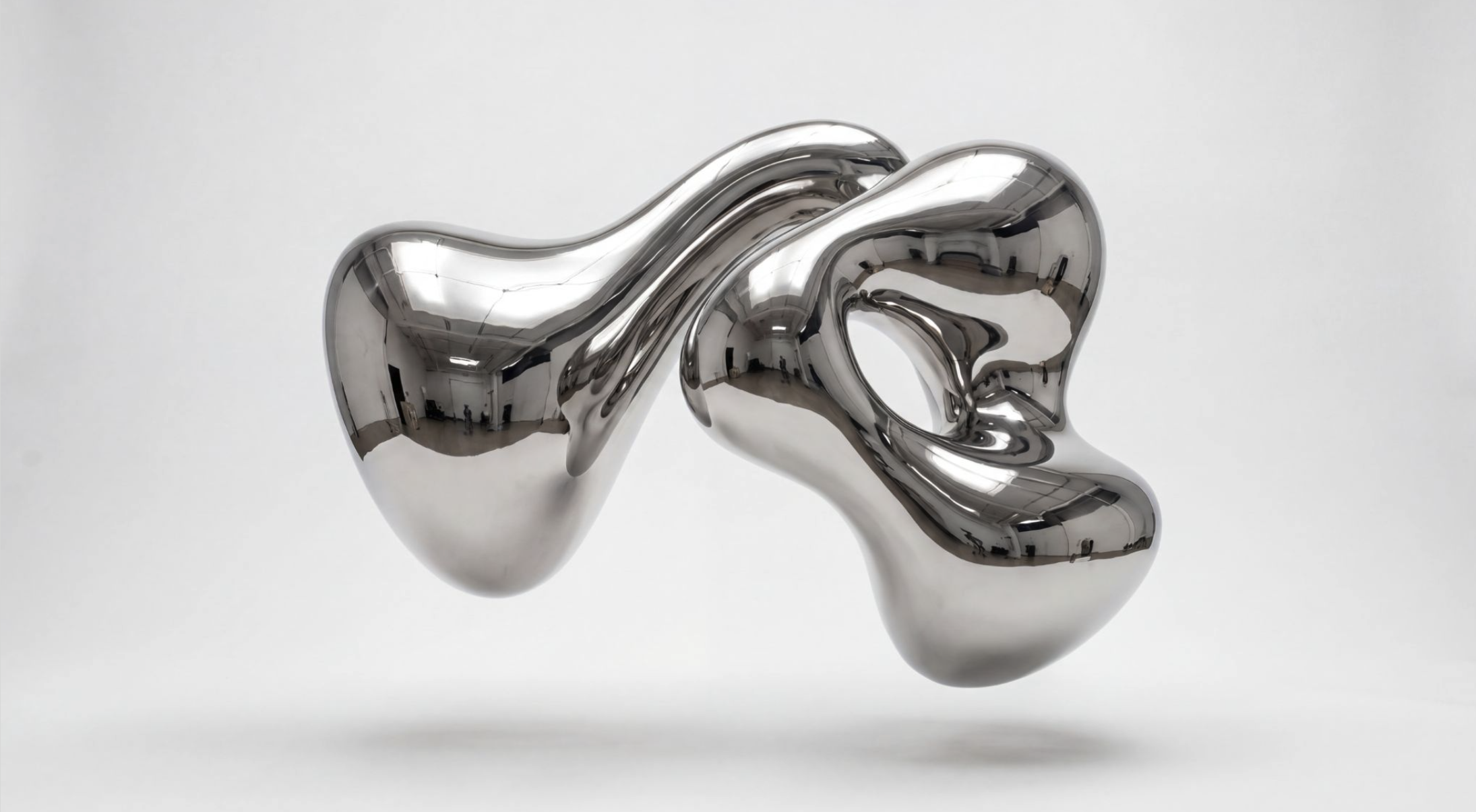
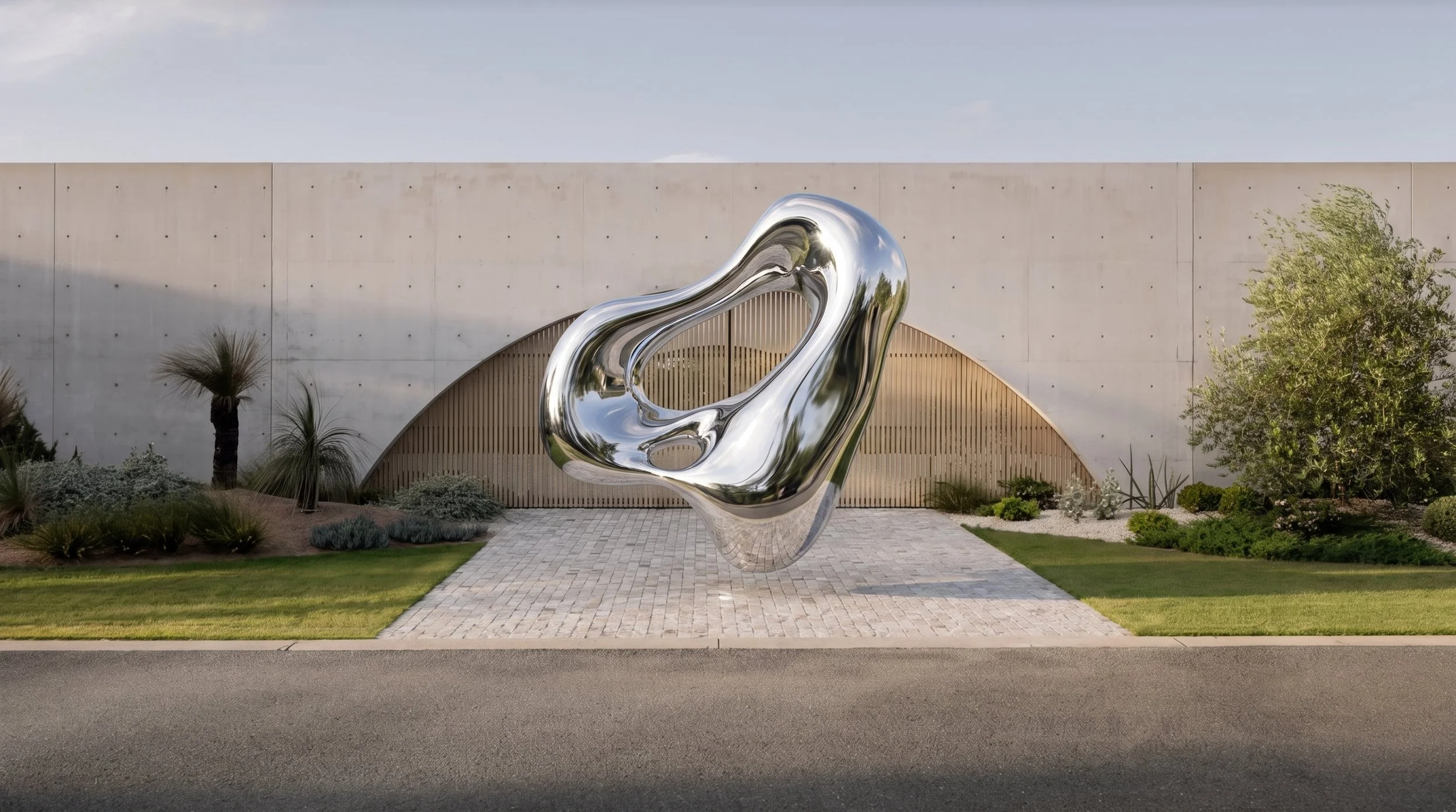
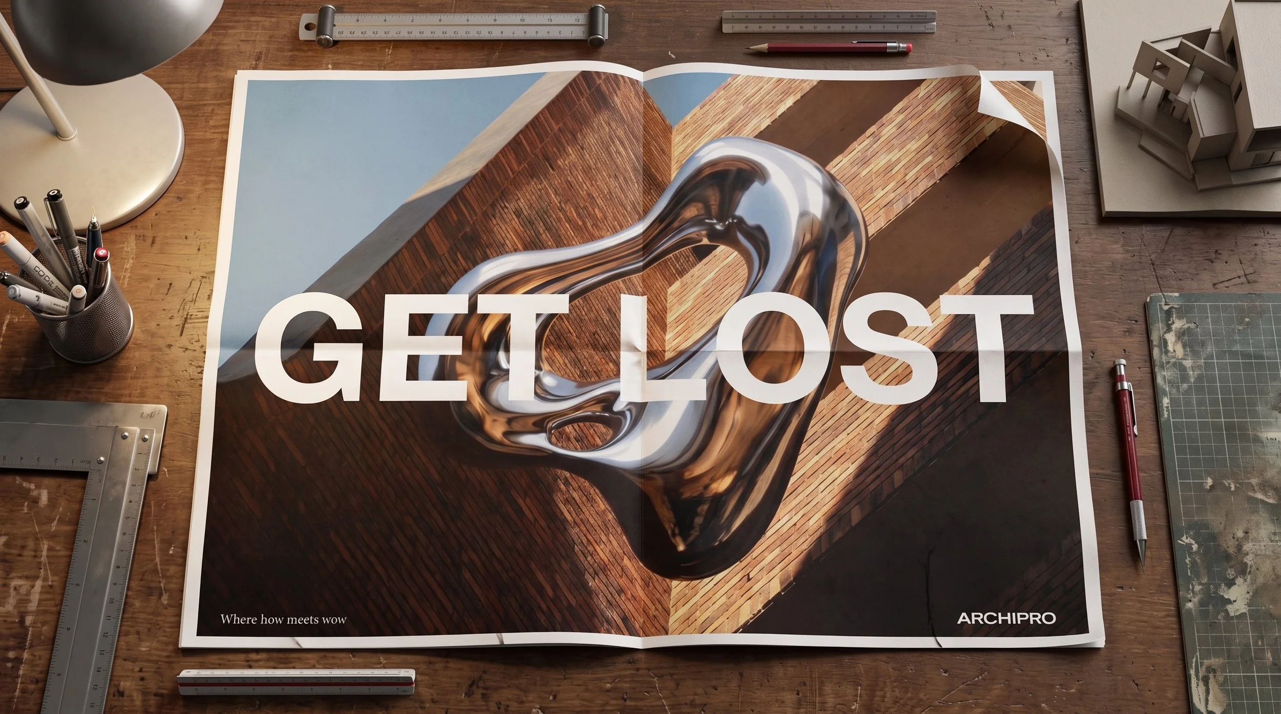
Masterbrand Symbol Identity: Developed liquid brand master symbol and broader brand language, allowing ArchiPro to own the image.
AI Style Models: Custom engineered proprietary generative AI prompt models to establish consistent, high-fidelity visual assets, solving the challenge of scaling magazine-quality imagery across millions of platform views].
UX & Typogrpahic Systems: Suggested and Crafted clean, Swiss-minimalist user experience concepts and interactive wireframe mockups embedded with core campaign headlines
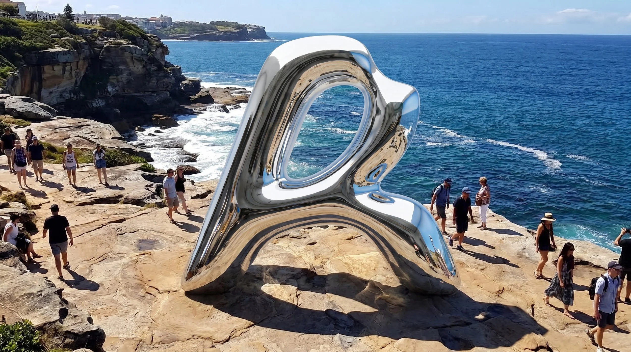
Stage 3: DirectContent Production & Curation
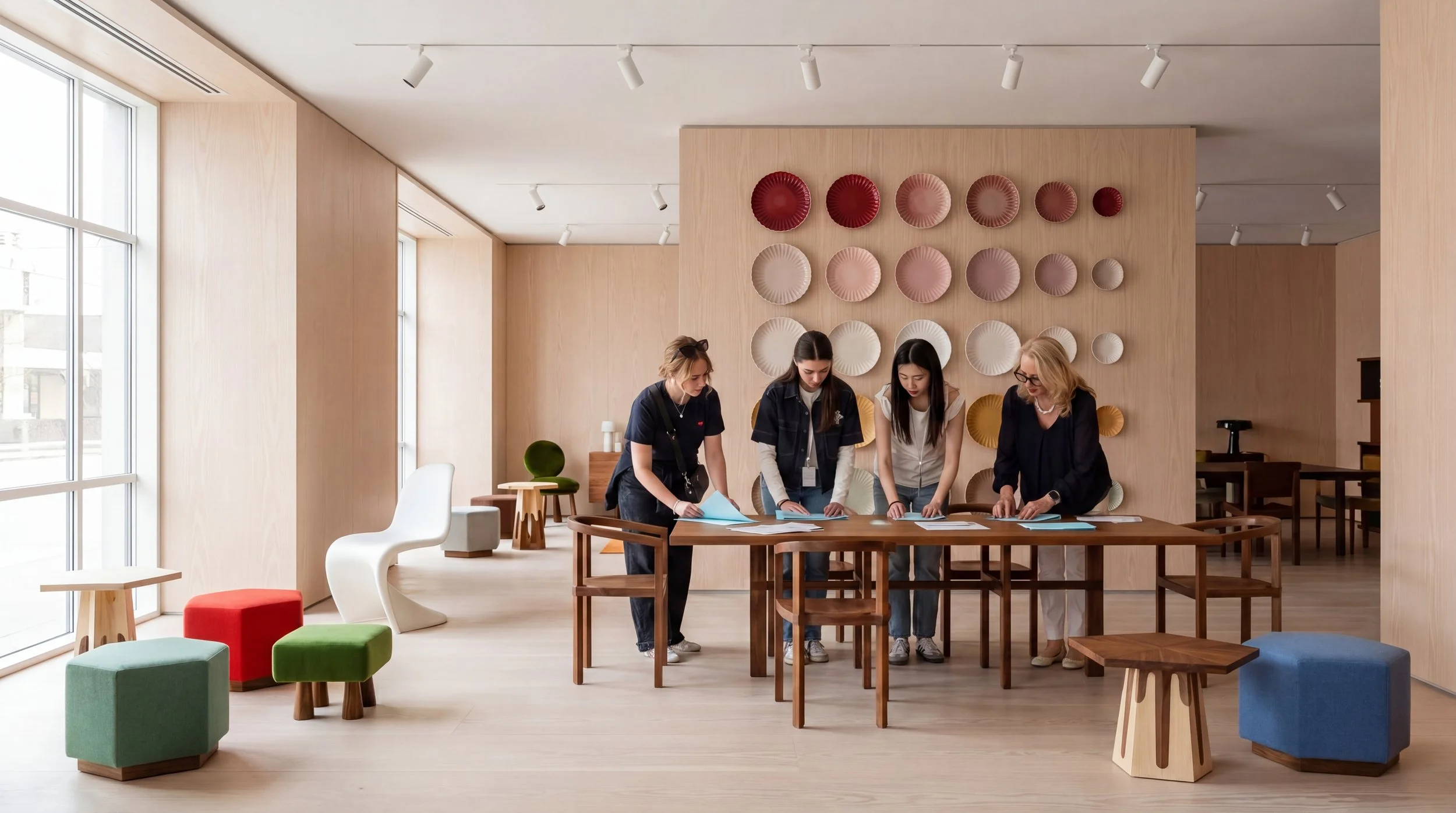
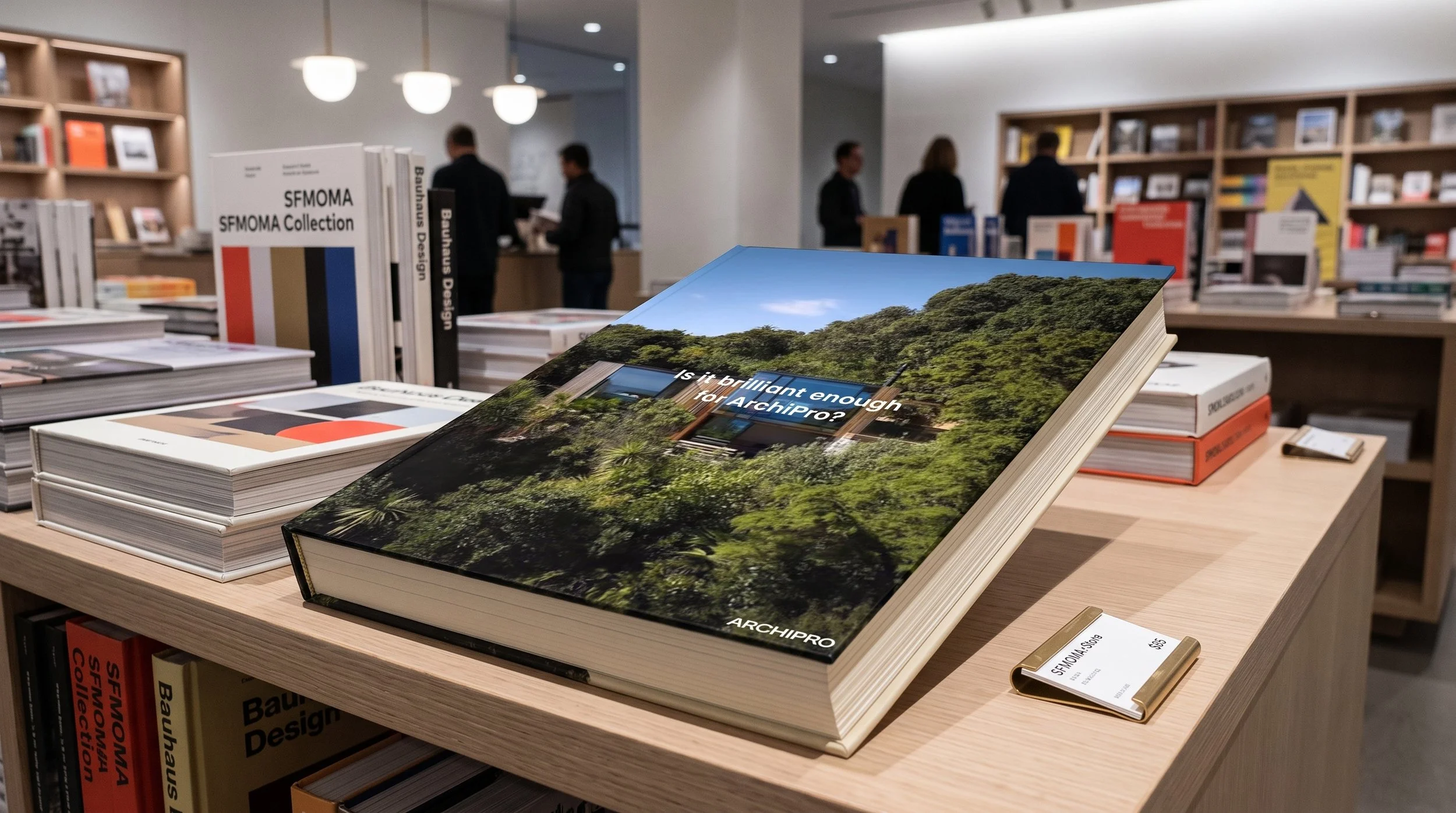
Platform Content Studio: Produced "magazine-quality" visual assets and lookbook photography specifically tailored to reflect the new premium brand standards.
Cinematic Film Explorations: Ventured into high-end storytelling, curating rich, cinematic content through ArchiPro Film concepts and narrative-led video previews
Stage 3: DirectGlobal Rollout & Launch
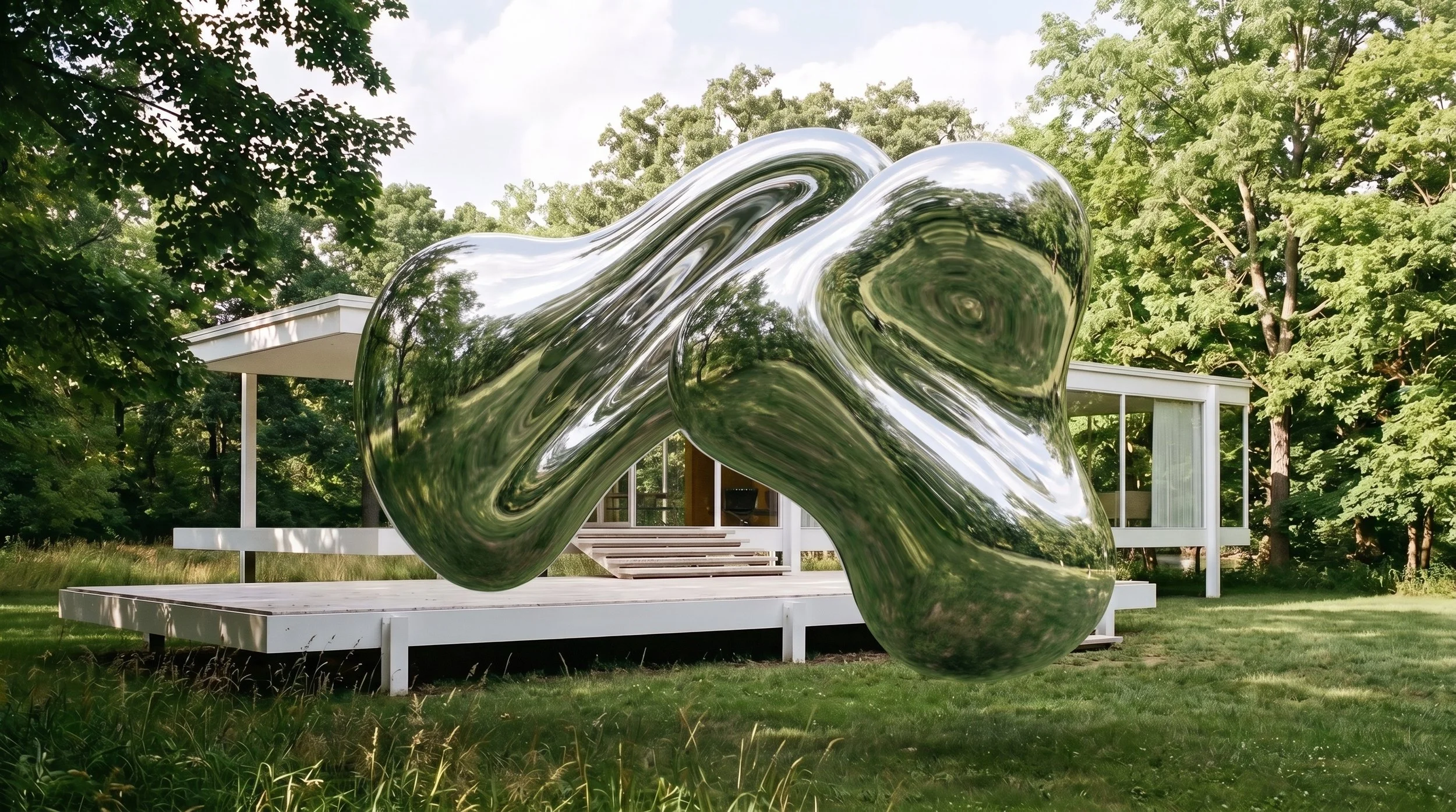
Dynamic Brand Animation: Designed looping metallic 3D brand animations (Project archi008) to transition ArchiPro's static mark into a dimensional, fluid architectural symbol.
Digital & E-Commerce Design: Developed high-converting layout concepts for e-commerce checkouts and professional subscription portals.
Core Image Curation: Compiled, cataloged, and managed the foundational global brand image library used to anchor the U.S. and Australian platform launches
Stage 4: DeliverImpact: The brand transformation successfully armed ArchiPro with the cultural authority and technical scalability required to transition from a regional player into an internationally competitive tech powerhouse
Dynamic Brand Animation: Designed looping metallic 3D brand animations (Project archi008) to transition ArchiPro's static mark into a dimensional, fluid architectural symbol.
Digital & E-Commerce Design: Developed high-converting layout concepts for e-commerce checkouts and professional subscription portals.
Core Image Curation: Compiled, cataloged, and managed the foundational global brand image library used to anchor the U.S. and Australian platform launches
Stage 4: DeliverImpact: The brand transformation successfully armed ArchiPro with the cultural authority and technical scalability required to transition from a regional player into an internationally competitive tech powerhouse
Dynamic Brand Animation: Designed looping metallic 3D brand animations (Project archi008) to transition ArchiPro's static mark into a dimensional, fluid architectural symbol.
Digital & E-Commerce Design: Developed high-converting layout concepts for e-commerce checkouts and professional subscription portals.
Core Image Curation: Compiled, cataloged, and managed the foundational global brand image library used to anchor the U.S. and Australian platform launches
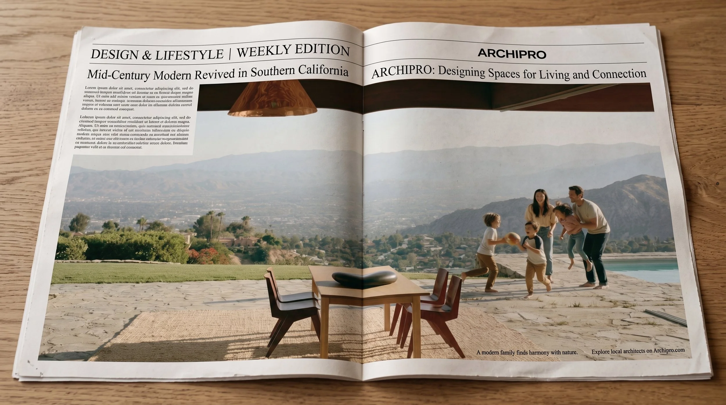
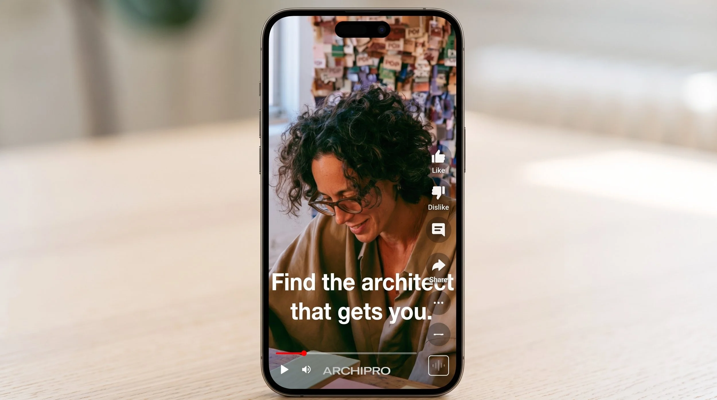
ResultsElevated ArchiPro’s visual identity to match the exact high-end caliber of the world's most distinguished architects, designers, and manufacturers.
Streamlined Enterprise Value: The monolithic "Branded House" structure prevented equity dilution, directing 100% of the platform's digital footprint back into the core ArchiPro trademark .
Scalable Asset Production: Custom AI style models enabled ArchiPro's marketing teams to generate, curate, and distribute premium visual assets at a global scale, effectively lowering content overhead [10
Unblocked US Launch & IPO Positioning: Provided the ultimate proof-of-concept visual language to secure investor confidence, unblock upcoming developer sprints, and confidently position ArchiPro for its highly anticipated public listing and North American expansion